
Snap Labels
who they are
For the past 13 years, Snap Labels has provided quick project turnaround times and hassle-free custom label solutions for local businesses across the Okanagan. They use advanced technologies and equipment to produce labels of the highest quality. They work closely with you to ensure that your business gets what it needs on time, every time.
industry
package type
website
project type
contributors
 Vigilante Marketing
PUBLISHER
Publisher
 Snap Labels
CONTENT
Content
 Tina Raposo
DESIGNER
Designer
Tina RaposoDEVELOPER
Developer
The Challenge
what they needed
The client’s previous website was more of a placeholder landing page than a functional site. It was full of lorem ipsum text and did not list their products or give the customer a way to order stickers or labels. So, they needed a complete overhaul of their online presence, including a redesigned brand, updated content, and increased user functionality.
how we tackled it
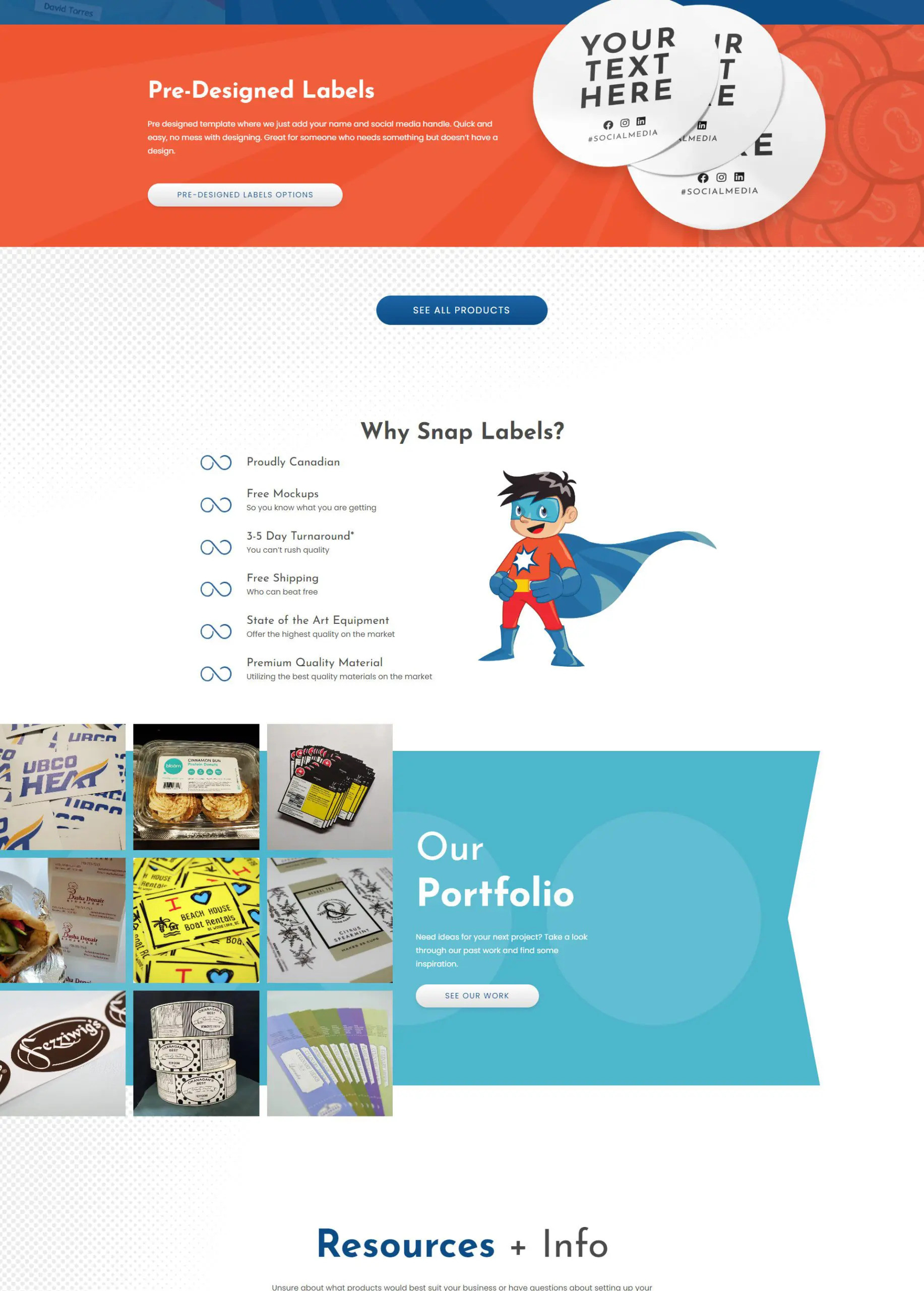
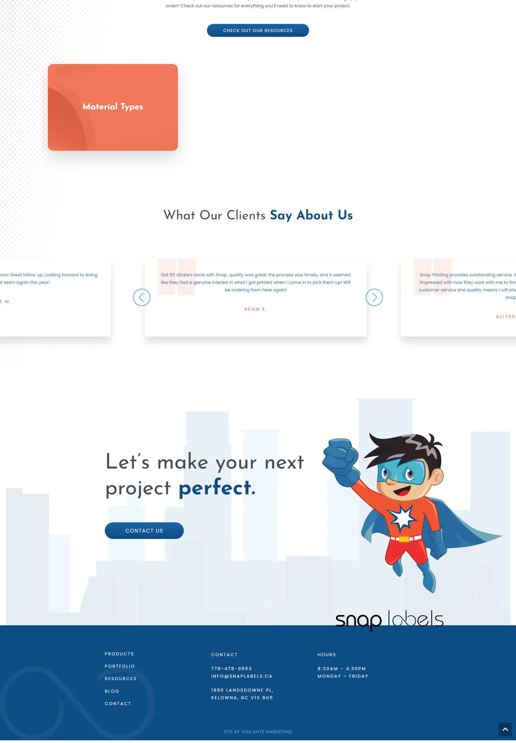
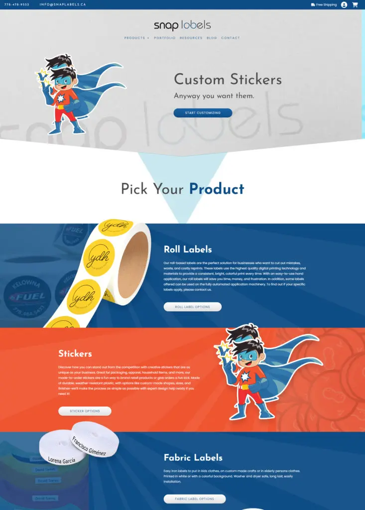
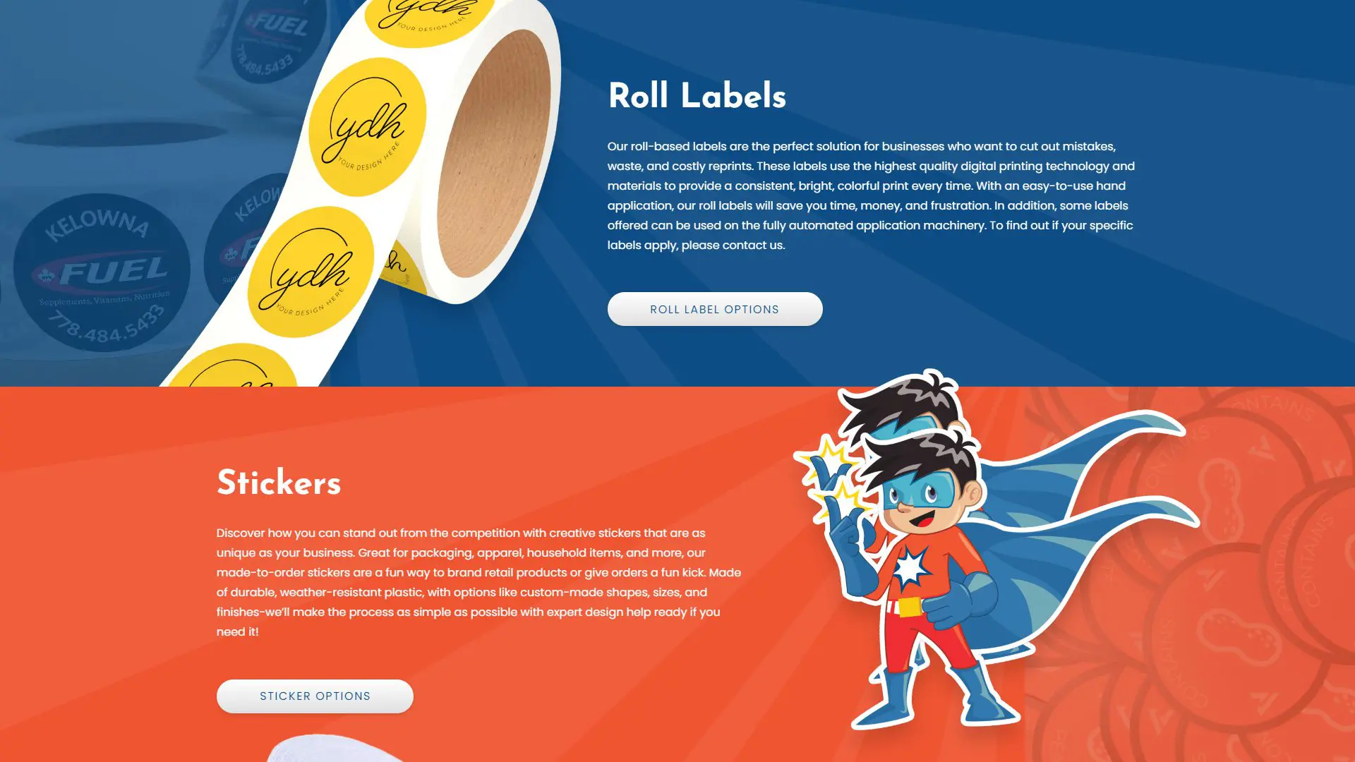
The goal of this website was to create a fun, vibrant, modern online presence that would be easy to use and easy on the eyes. Tina Raposo pulled colours from the mascot “Snappy” and used them throughout the site. She also used his art in the final CTA, with city vector art to match him.
Halftone gradients were utilized (halftones are commonly used in print to create values/gradients) to add depth and dimension to some areas of the site. Sunburst backgrounds were also used for sections with dynamic design mockups (clients can swap these out) and some sections that look like roll labels or stickers.
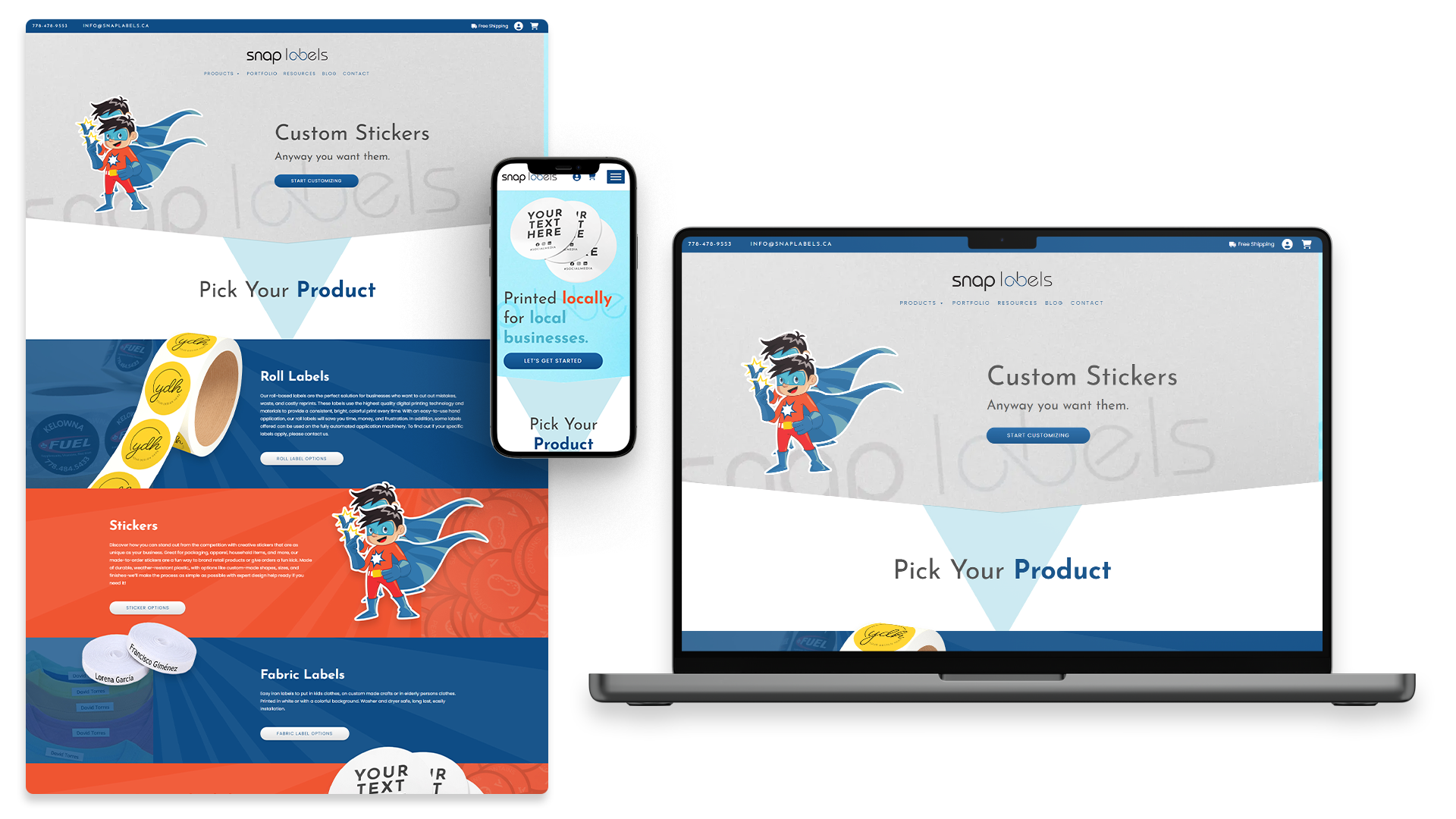
In addition, Tina applied bold, vibrant, fun, eye-catching elements with a clean UI design throughout the site to make browsing and purchasing products simple and straightforward for their customers.
The Website