Kelowna Klosets
who they are
Kelowna Klosets stands as a beacon of expertise in the wardrobe solutions domain, having served their community with distinction for over two decades. Their longstanding reputation is a testament to their depth of knowledge and commitment to excellence.
industry
package type
website
project type
contributors
The Challenge
what they needed
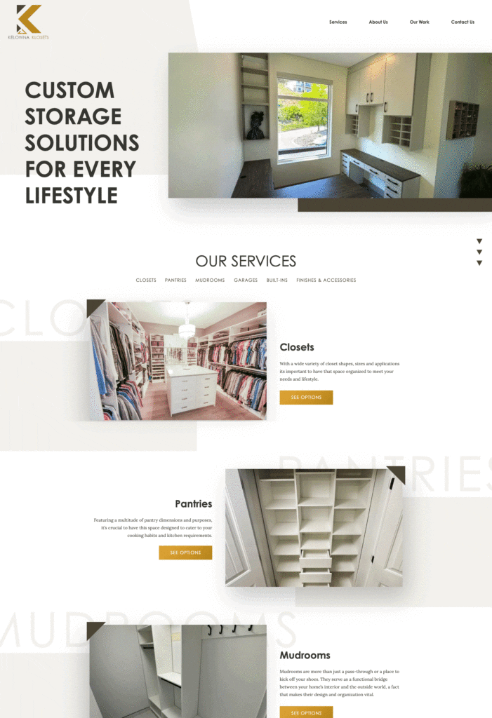
Seeking to rejuvenate their digital presence, Kelowna Klosets envisioned a contemporary yet timeless website. They expressed a preference for designs rooted in simplicity, emphasizing a clean white backdrop that would reflect both their modern outlook and the weight of their longstanding history. Integrating the brand’s unique identity, especially the symbolic elements from their logo such as triangles and geometric shapes, was paramount.

how we tackled it
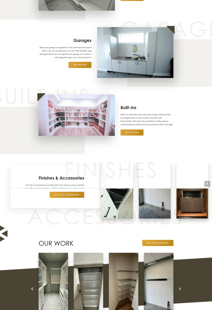
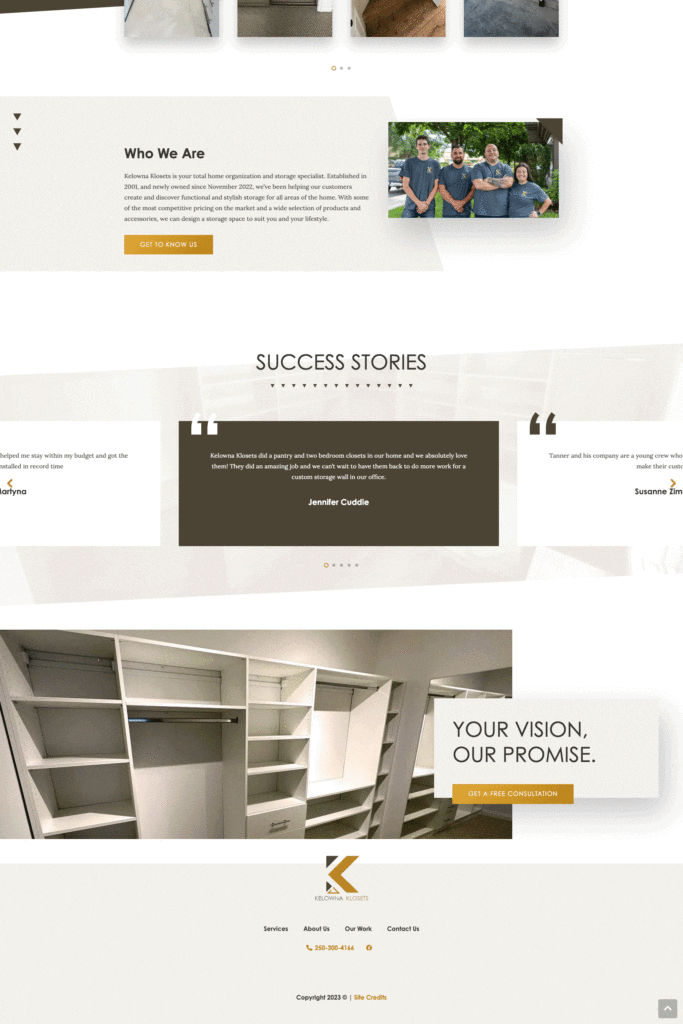
Tina, our talented designer, took the helm of this project, internalizing Kelowna Klosets’ aspirations. She crafted a design that highlighted a fresh, airy feel with predominant white backgrounds. Using typographic techniques, Tina added layers of depth to the site, making sure to embed key brand motifs, including the repeating triangle elements and geometric shapes drawn from their logo.
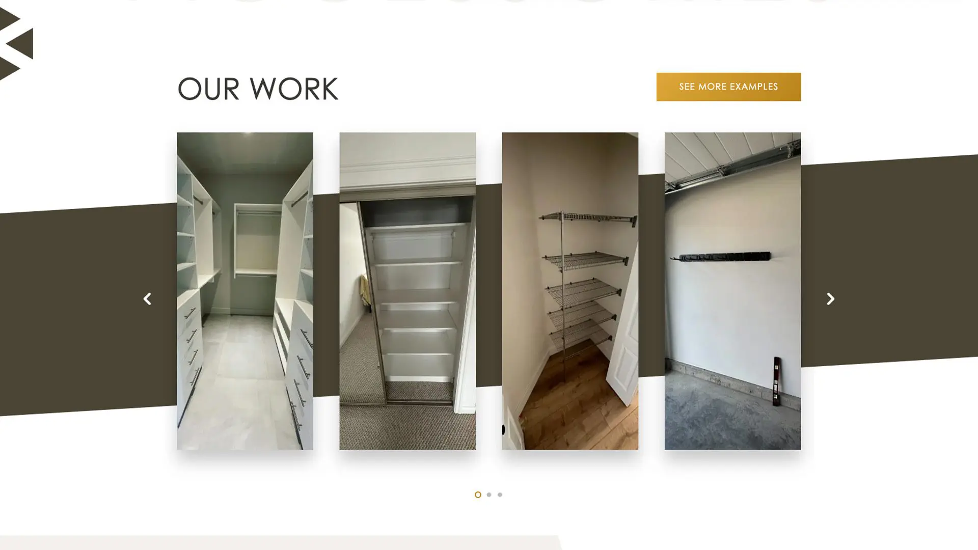
On the technical side, Tina implemented a filterable gallery that allowed users to effortlessly navigate through the various projects. She also ensured that these projects could be showcased on related service pages, enhancing user experience. A custom post type for Services was integrated, providing a pathway for users to directly access specific offerings. The project templates were designed with flexibility in mind, featuring image galleries and descriptions, ensuring room for expansion based on future requirements.
At Vigilante Marketing, it’s more than just design and development; it’s about capturing the essence of a brand. Through Tina’s craftsmanship, Kelowna Klosets’ legacy has found a new digital home.
The Website
