Clear Moves
who they are
Clear Moves Consulting, established by Kevin Moloney in 2001, is a management consulting firm that has built a reputation for delivering tangible results across various industries globally. With Kevin’s extensive experience and a commitment to the highest standards of consulting, Clear Moves has helped numerous organizations in sectors like banking, construction, and technology start-ups achieve significant improvements. Their unique approach combines the art and science of management consulting underpinned by their “Clarity; Performance; Results” methodology.
industry
package type
website
project type
contributors
 Vigilante Marketing
PUBLISHER
Publisher
 Clear Moves
DESIGNER
Designer
 Ben Wilson
DEVELOPER
Developer
The Challenge
what they needed
Clear Moves came to Vigilante Marketing with a website that was lacking in clear navigation and did not effectively communicate their unique value proposition. The existing site suffered from a confusing layout, absence of effective sales funnels, and a disjointed brand design, which hindered their ability to attract and engage their target audience effectively. They needed a digital presence that matched their professional standards and showcased their proven track record in enhancing client outcomes through a coherent and compelling online experience.
how we tackled it
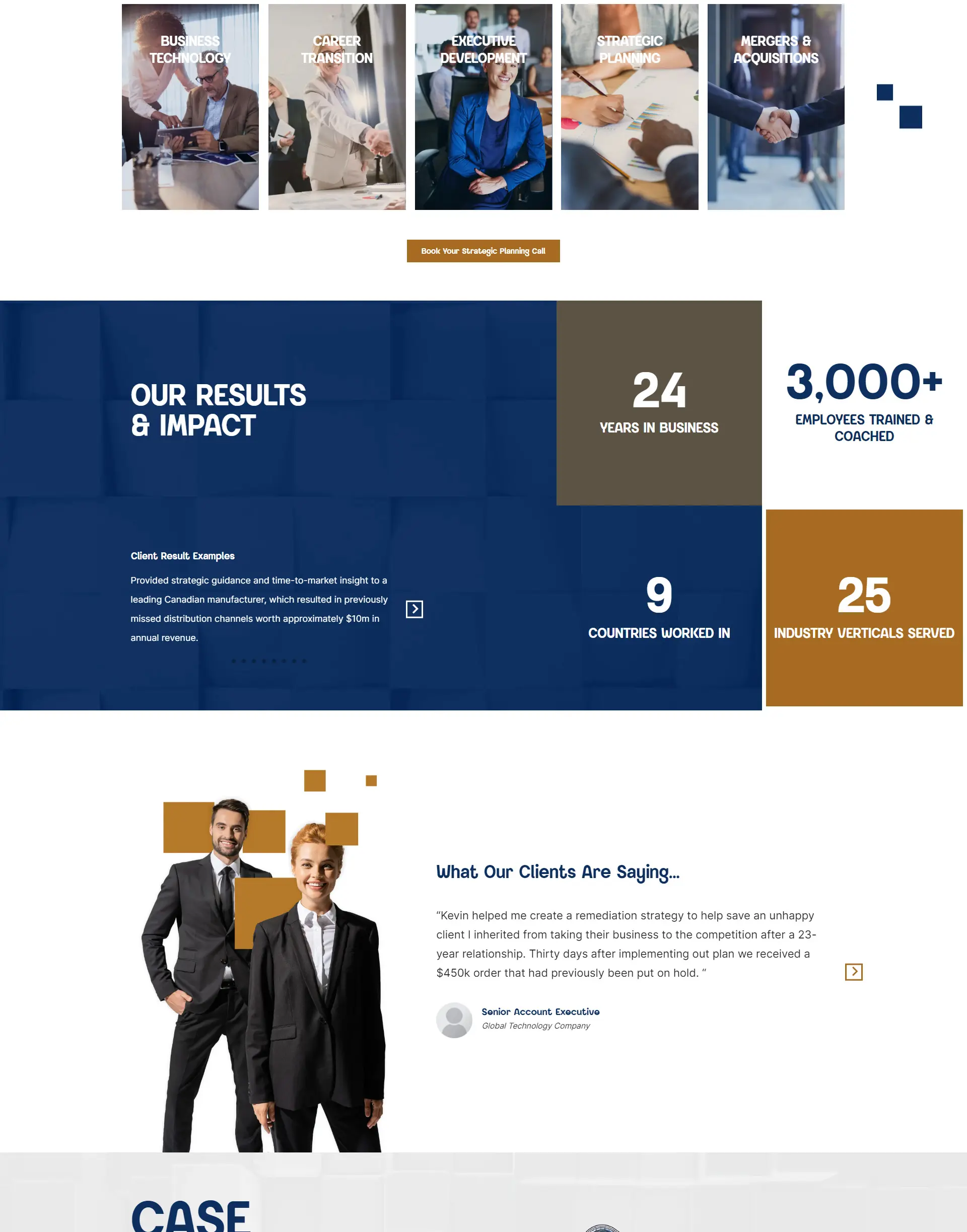
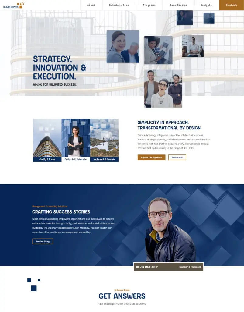
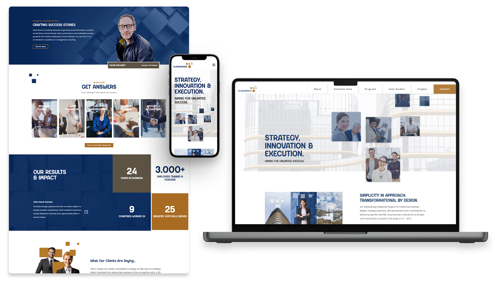
To transform the Clear Moves digital experience, we started by conducting a thorough review of their existing brand. We revitalized their visual identity with a modern, clean sans-serif typeface and introduced a versatile color palette that included primary and secondary shades of blue and gold. This refreshed palette was designed to enhance consistency across their website and other digital platforms.
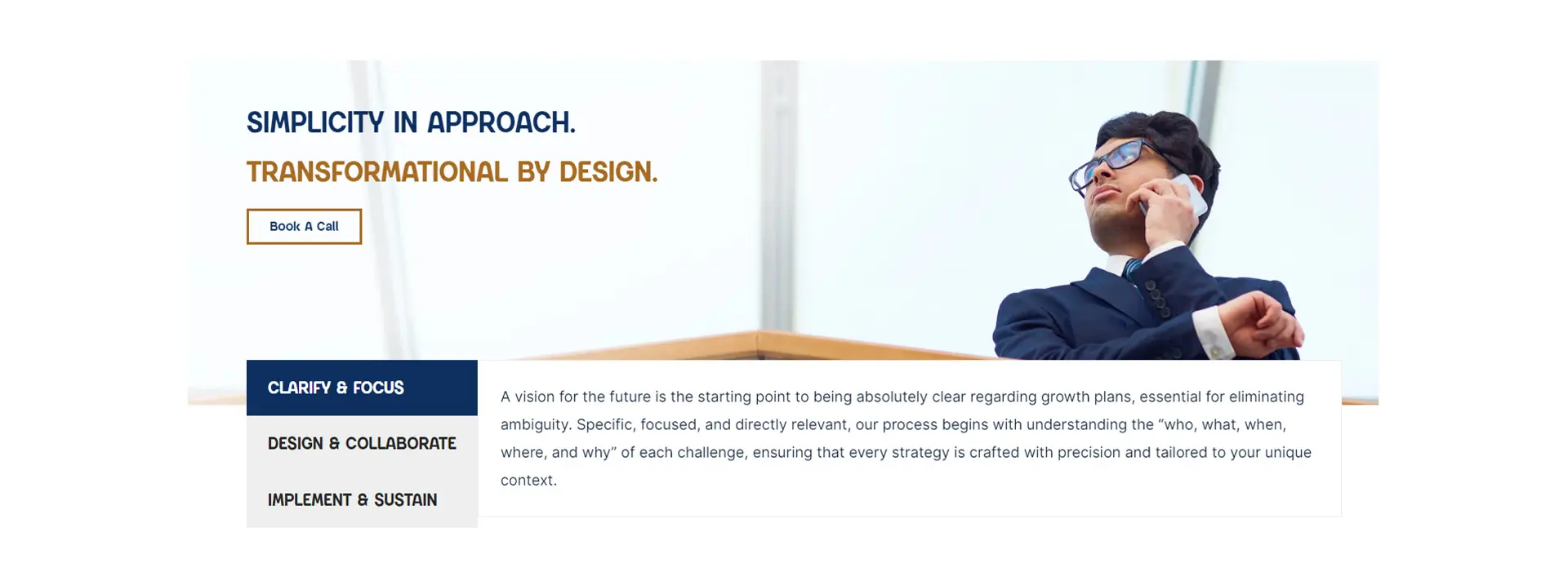
We leveraged their logo, which features square stepping-stones, as a recurring motif throughout the site, enhancing the brand’s thematic consistency. To modernize the site, we incorporated animations that not only added visual interest but also helped in drawing the attention of users, making the site more engaging.
Recognizing the importance of social proof in the consulting industry, we dedicated special attention to the presentation of facts and figures about the company’s successful engagements. These were strategically placed to assure potential clients of Clear Moves’ effectiveness.
To improve site navigation and user experience, we restructured the site hierarchy and main navigation to offer clearer, more intuitive paths for users to access the information they needed. Features like parallax backgrounds and shifting images were implemented to create a dynamic viewing experience, while the site’s responsiveness was enhanced to ensure an optimal viewing experience across all devices.
Finally, we migrated content from their old site, including 10 blogs and 4 categories, and added custom post types for case studies and testimonials, further enriching the content offering and demonstrating Clear Moves’ impact in their field.
The Website