Bruce Ellemo
who they are
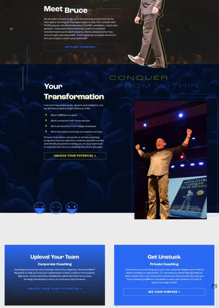
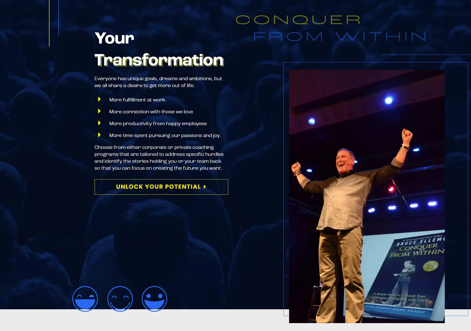
Bruce Ellemo is an entrepreneur, author, consultant, coach, and motivational speaker. He offers private and corporate coaching programs tailored to address specific hurdles and identify the stories holding a person or a team back from being the best they can be.
industry
package type
design style
website
project type
contributors
 Vigilante Marketing
PUBLISHER
Publisher
CONTENT
Content
 Tina Raposo
DESIGNER
Designer
 Peter Vigilante
DEVELOPER
Developer
The Challenge
what they needed
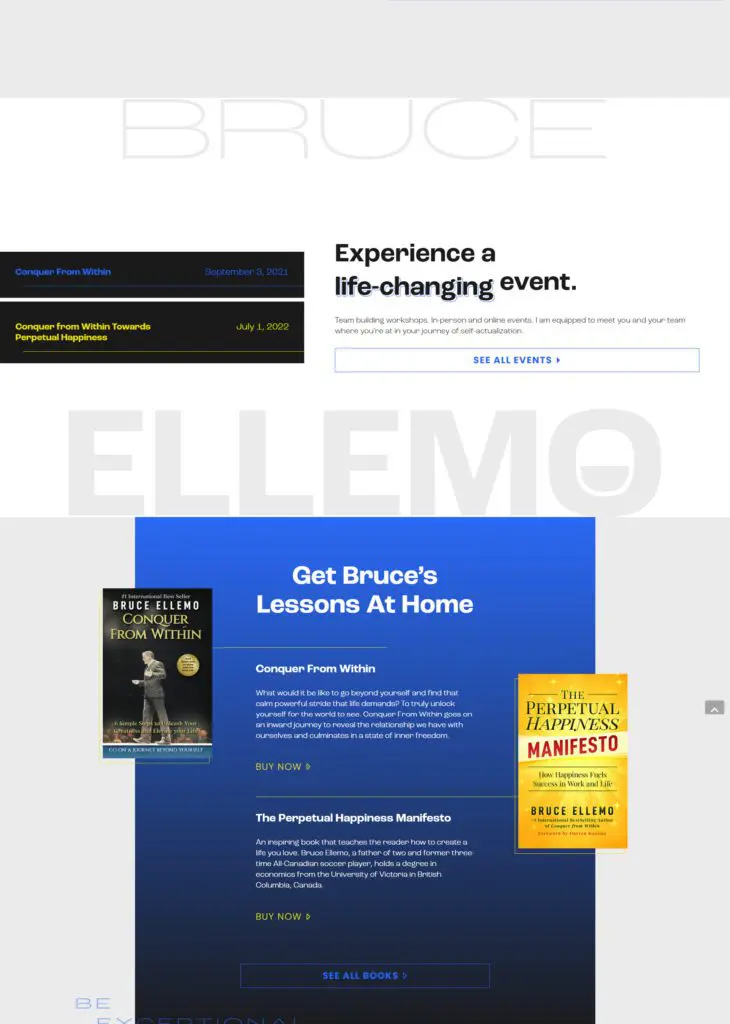
Bruce needed a website to bring him and his business into the 21st century. He wanted the new and updated online presence to give him more credibility and legitimacy to match his brand. In addition, he required a way to showcase the books he has written and publicize the large-scale speaking events he hosts.

how we tackled it
Emily from Emily Chow Marketing completed project management and content development. She ensured the site stayed on budget and on time. Additionally, she strategized and created all site content and on-page SEO.
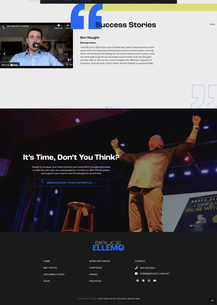
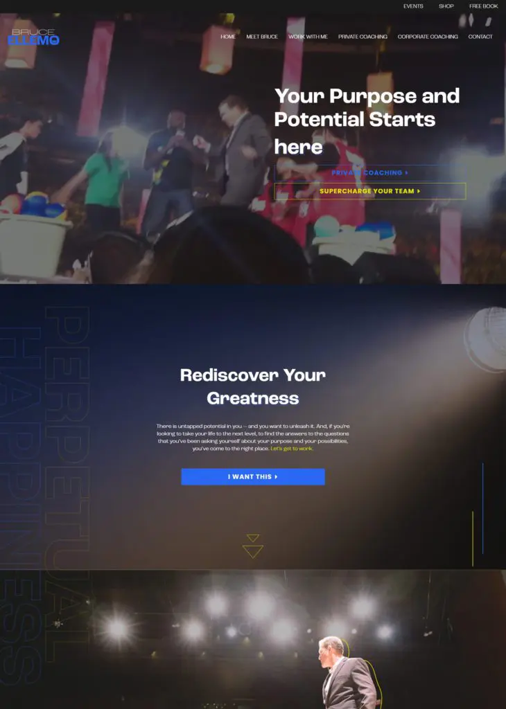
Our resident designer, Tina Raposo, began her design process by creating a bold and modern logo that incorporates a smiley face emblem to represent the positive, glass-half-full emotion of the brand. Her overall website design used broken grid layouts to emulate a feeling of pushing oneself outside their boundaries/comfort zone. Additionally, a darker color scheme was utilized to convey the impression of a stage in a dimly lit hall. Finally, intense electric blues and radical yellows were applied to emphasize a spotlight motif to highlight Bruce being in his element.
Peter Vigilante, our lead developer, built the site on the WordPress platform. He gave the design a sense of depth by applying 3D tilts and perspective on specific elements and creating dynamic line drawing animations to catch users’ eyes as they scroll through the website. Furthermore, he installed an event plugin that allows users to view Bruce’s upcoming events through a functional and highly stylized event list.
The Website