

)
Social Media SEO: Why Your Social Media Branding I…
Social search is reshaping SEO. Why your social media branding now matters as much as traditional SEO, how Google indexes Instagram and TikTok, and five…

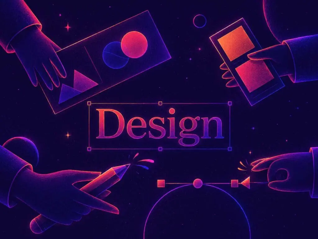
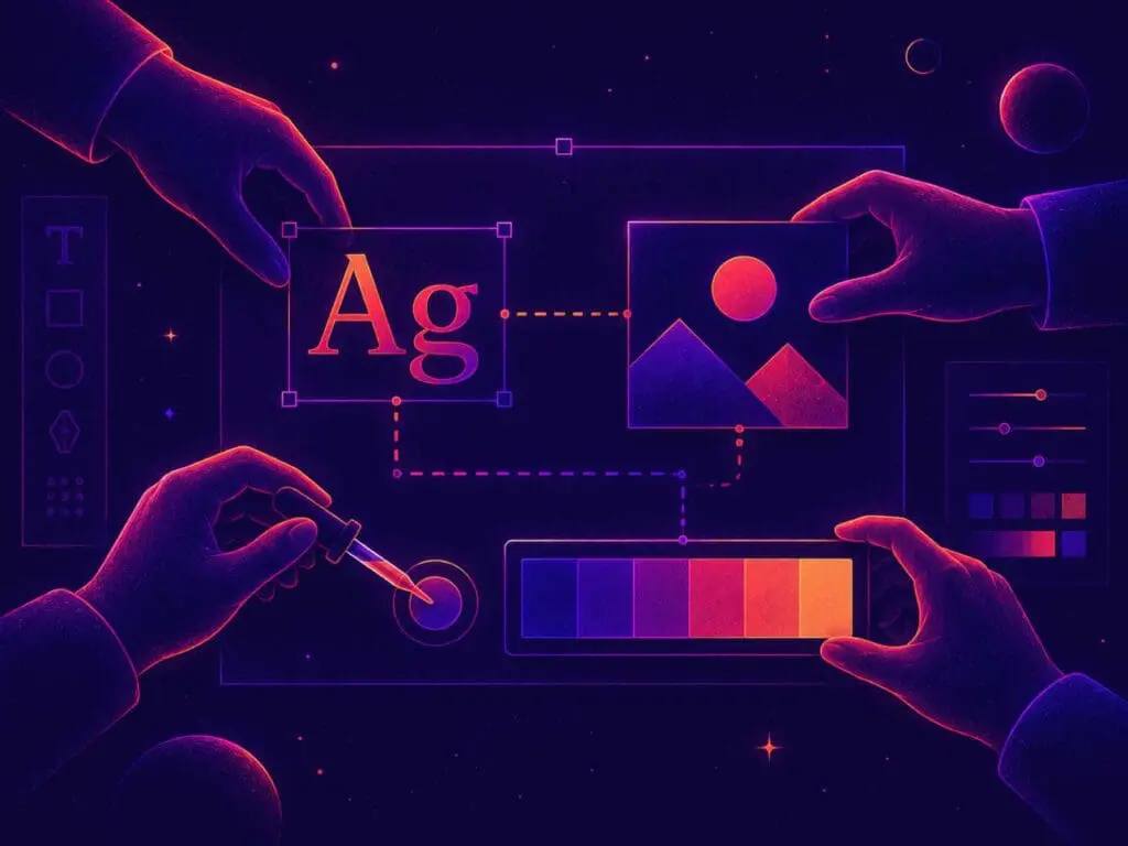
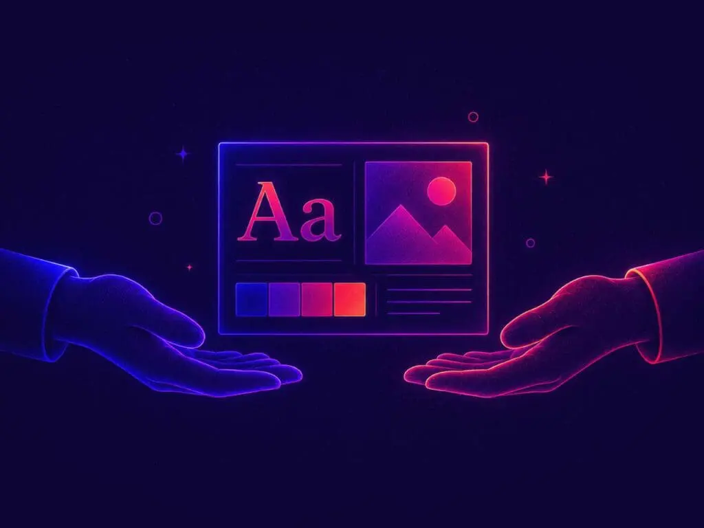
When people think about great design, they usually focus on what they can see: colours, typography, imagery, layouts, logos, and visual style.
While those elements certainly matter, they aren’t what ultimately determine whether a design succeeds.
Good design is judged by something much simpler.
Can people understand it?
Can they trust it?
Can they take action without confusion?
The most effective websites, brands, advertisements, and marketing materials don’t ask people to work harder. They remove friction, guide attention, and make decisions feel easier. When design is doing its job well, people barely notice it at all.
Ironically, that’s what makes great design so difficult to create.
Think about the last time you visited a website and immediately found what you were looking for.
Or read a headline that instantly explained the value of a product or service.
Or opened a proposal, brochure, or social media post and understood the message within a few seconds.
You probably didn’t stop to admire the spacing between elements.
You weren’t analysing the typography choices.
You likely didn’t even notice the structure of the layout.
Instead, you simply moved forward.
That seamless experience is often the strongest indicator of effective design. It creates clarity without demanding attention and removes obstacles before users even realise they exist.
Many businesses assume great design should impress people. In reality, great design often succeeds because it helps people achieve their goals without having to think about the design itself.
One of the biggest misconceptions in marketing and branding is that design exists primarily to make things look attractive.
Visual appeal certainly plays a role, but aesthetics alone rarely generate meaningful business results.
At its core, design is a communication tool.
A website succeeds when visitors quickly understand what a business offers and what they should do next.
A brand becomes memorable when every touchpoint consistently reinforces the same message and personality.
A marketing campaign performs better when its value proposition is clear, relevant, and easy to understand.
In each case, the goal isn’t simply to make something look good. The goal is to help people move from uncertainty to understanding.
That’s why effective design should always begin with questions, not visuals.
What is the audience trying to achieve?
What information do they need?
What obstacles are preventing them from taking action?
The visual solution comes afterwards.
One challenge many businesses face is that they’re simply too close to their own products, services, and industry language.
What feels obvious internally can feel confusing to someone encountering the business for the first time.
As a result, companies often try to solve communication problems by adding more information.
More text.
More features.
More explanations.
More options.
Unfortunately, this usually creates the opposite effect.
When people are presented with too much information at once, they become overwhelmed. Instead of gaining clarity, they experience friction. They stop reading, postpone decisions, or leave altogether.
Good design helps bridge this gap by organising information in a way that feels intuitive and easy to navigate. Rather than overwhelming visitors with everything at once, it prioritises the information they need at each stage of their decision-making process.
The result is a smoother experience that feels natural rather than forced.

Simple design is often mistaken for easy design.
In reality, simplicity is usually the result of significant effort, strategy, and refinement.
Every headline, image, button, colour, and layout decision competes for a user’s attention. Designers must constantly evaluate whether each element is helping or hindering the overall experience.
Questions such as these become critical:
The most effective designs are often shaped through careful editing rather than endless additions.
They remove clutter.
They reduce distractions.
They eliminate unnecessary decisions.
What remains feels effortless to the audience because countless small decisions have already been made on their behalf.
As the saying goes, simplicity is the ultimate sophistication.
Whether you’re reviewing a website, marketing campaign, or brand asset, there are a few practical questions worth asking:
If a visitor lands on your homepage, can they quickly understand what you do, who it’s for, and why it matters?
If not, your messaging may need simplification.
Every page, advertisement, or piece of content should guide people towards a logical action. If users aren’t sure what to do next, they’re unlikely to do anything at all.
Not every message deserves equal attention. Use hierarchy, spacing, typography, and layout to guide people through information in the right order.
Before adding another section, paragraph, button, or feature, ask whether it’s genuinely helping the user achieve their goal.
Often, removing something creates more value than adding something new.
When design creates clarity, the benefits extend far beyond aesthetics.
Businesses often experience:
These outcomes don’t happen because a design follows the latest trend or uses the most sophisticated visual effects.
They happen because effective design reduces friction and helps people understand what matters most.
Whether you’re investing in website design, brand development, digital marketing, or conversion optimisation, clarity is often the highest-return improvement you can make.
The strongest brands aren’t always the loudest.
The most effective websites aren’t always the most visually complex.
And the best design doesn’t compete with the message.
It supports it.
It guides people.
It builds confidence.
It creates momentum.
When design removes confusion and helps people move naturally from curiosity to action, it becomes almost invisible. That’s what makes it so powerful.
Because when design gets out of the way, your message finally has room to do its job.


The latest marketing news, promotions, and tips & tricks in our monthly newsletter
"*" indicates required fields