
Under the Radar Report TEST
who they are
Under the Radar Report is an Australian investment research publication that helps investors discover high-potential ASX opportunities before they become widely recognized. Their research focuses on identifying emerging companies and providing insights to help subscribers build long-term wealth.
industry
package type
project type
contributors
 Vigilante Marketing
PUBLISHER
Publisher
 Tina Raposo
DESIGNER
Designer
 Peter Vigilante
DEVELOPER
Developer
 Yves Stäheli
MARKETING MANAGER
Marketing Manager
 Jyoti Kumari
SEO MANAGER
SEO Manager
The Challenge
what they needed
Under the Radar Report needed a complete brand refresh and modern website to better communicate their value proposition and support subscriber growth. The previous identity lacked the clarity and impact needed to stand out in the competitive financial publishing space, and the website needed to better organize their research offerings and convert visitors into subscribers.
how we tackled it
We delivered a full rebrand and website redesign that positions Under the Radar Report as a confident, modern investment research platform. The new brand identity focuses on clarity and authority, helping communicate their expertise in uncovering overlooked investment opportunities. The website was redesigned with a conversion-focused structure, guiding visitors through the different research products and subscription options. Clean layouts, strong messaging, and intuitive navigation make it easy for investors to understand the service and sign up.
Key Highlights
- Complete brand refresh to strengthen authority and recognition
- Website redesign built to support subscription growth
- Clear presentation of research products and investment insights
- Conversion-focused user journeys guiding visitors toward membership
The Result
A cohesive brand and digital experience that strengthens Under the Radar Report’s credibility and makes it easier for investors to discover, understand, and subscribe to their research.
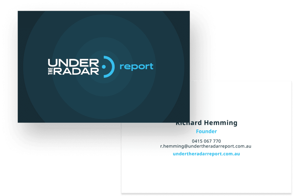
Brand
exploration
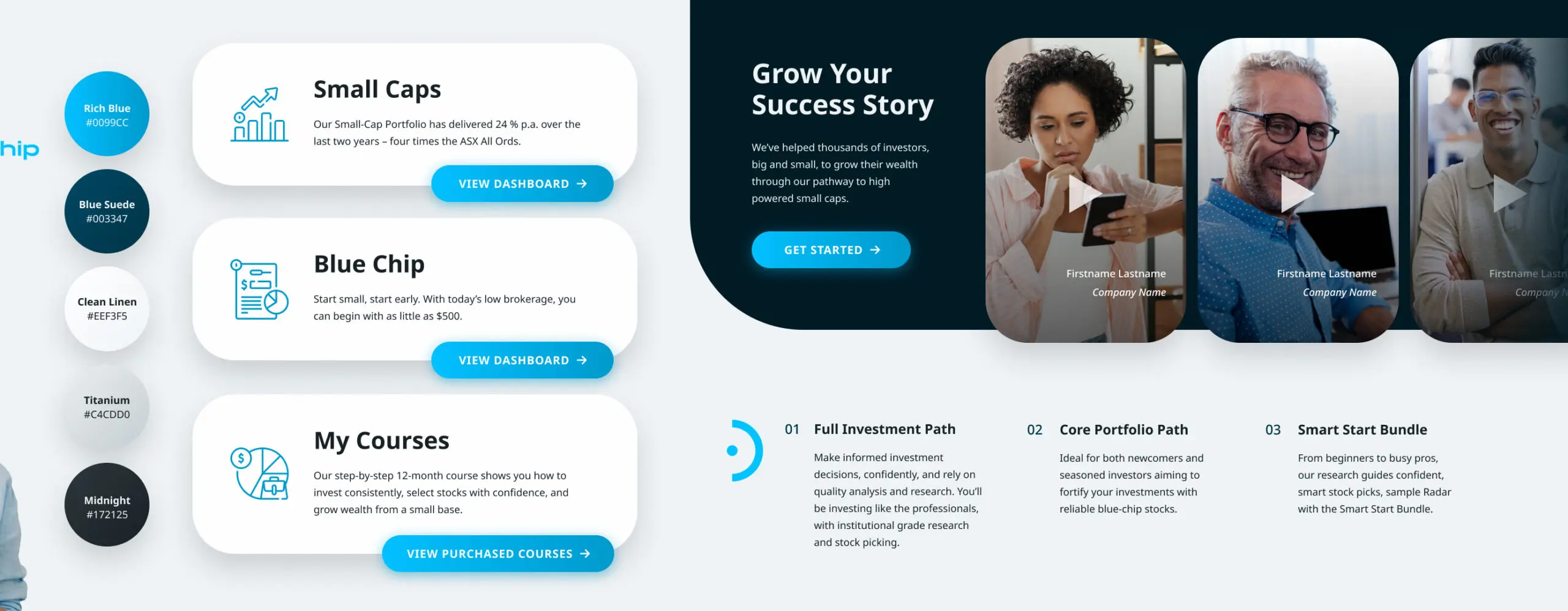
Under the Radar Report’s new branding direction is intended to modernize and show them off as experts in the field. It doesn’t take itself too seriously, so as to not alienate clientele that is new to the investing world, but still appears professional and state of the art. A new shade of blue was introduced to complement the existing blue brand colour, as well as subtly toned shades of grey to subtly create contrast.
logo
Previously, the logo had a dated font that didn’t lend itself to the ahead-of-the-curve nature of the business. This has been remedied, and fits alongside the updated brand font. Radar symbolism has also been created, with a logo animation created for use on the site. The new logo’s different lockups, including the horizontal, vertical, and monogram, allow for very versatile usage across all mediums and sizes.
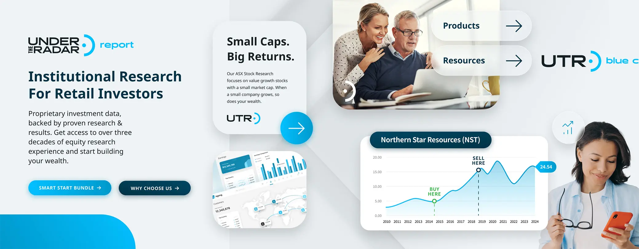
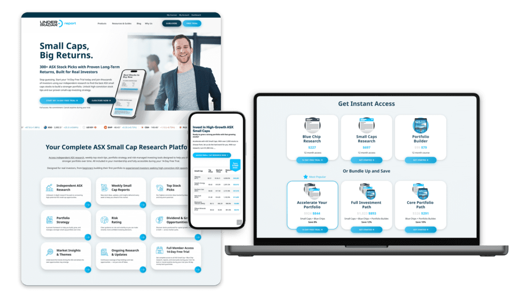
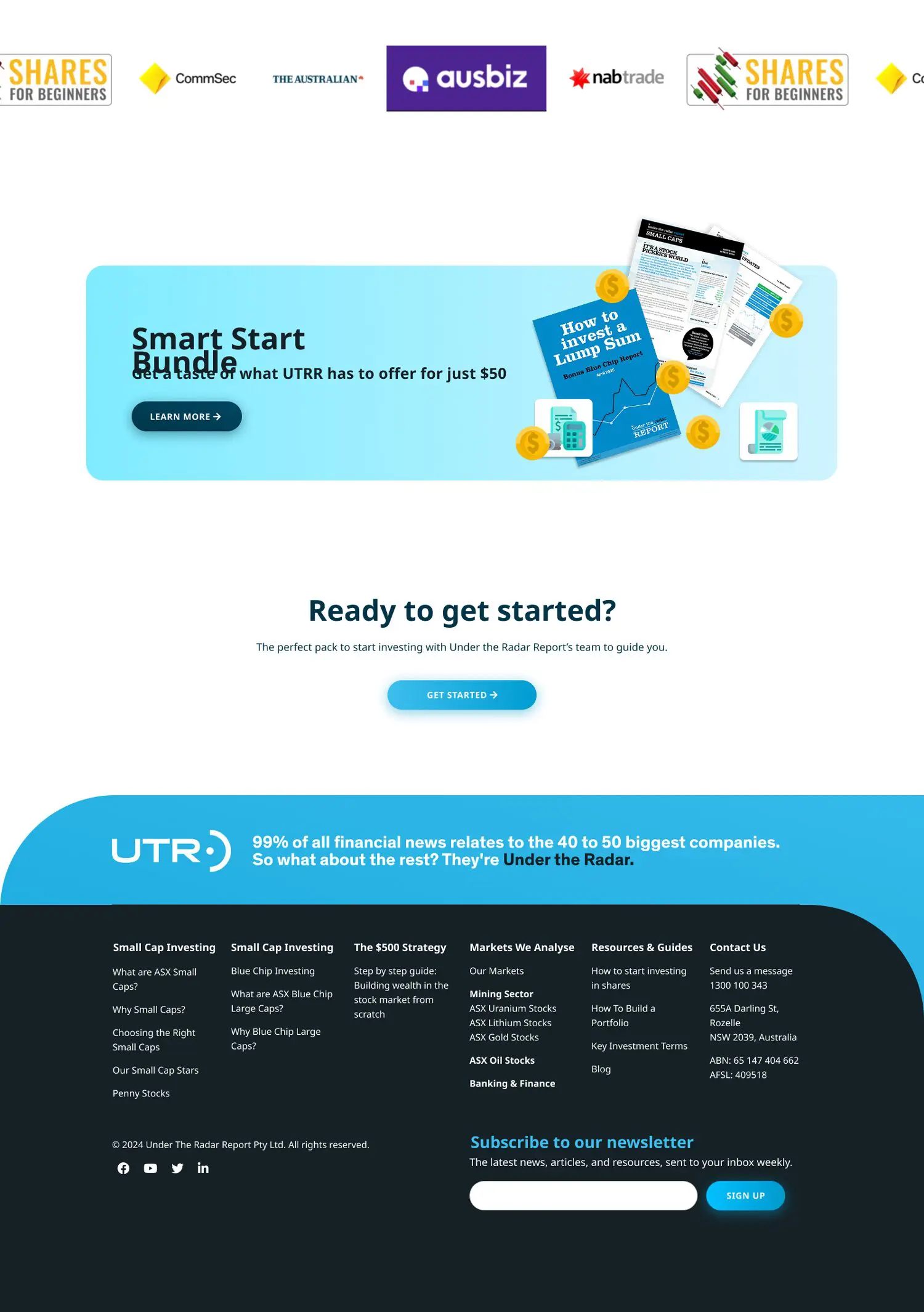
Web
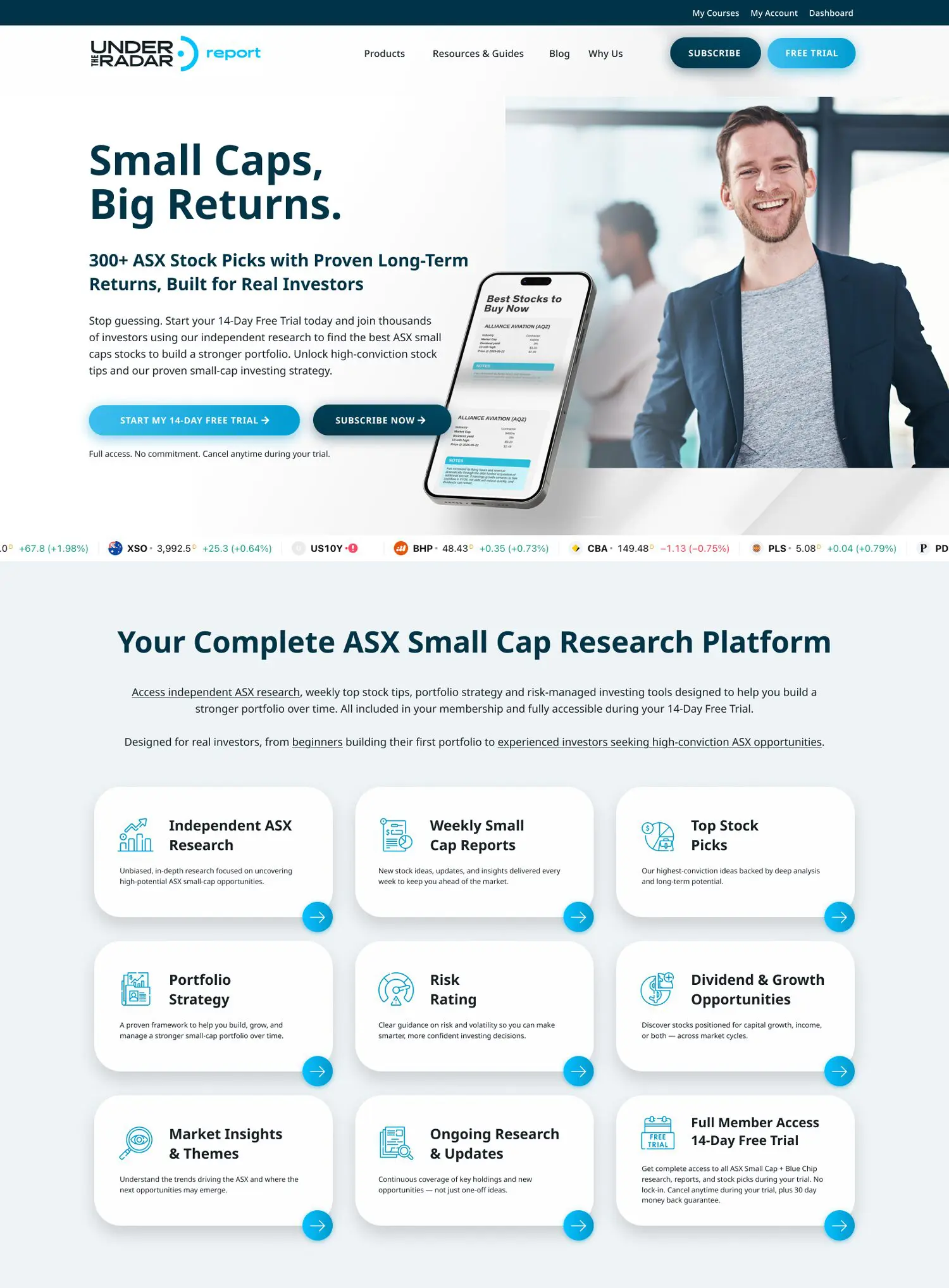
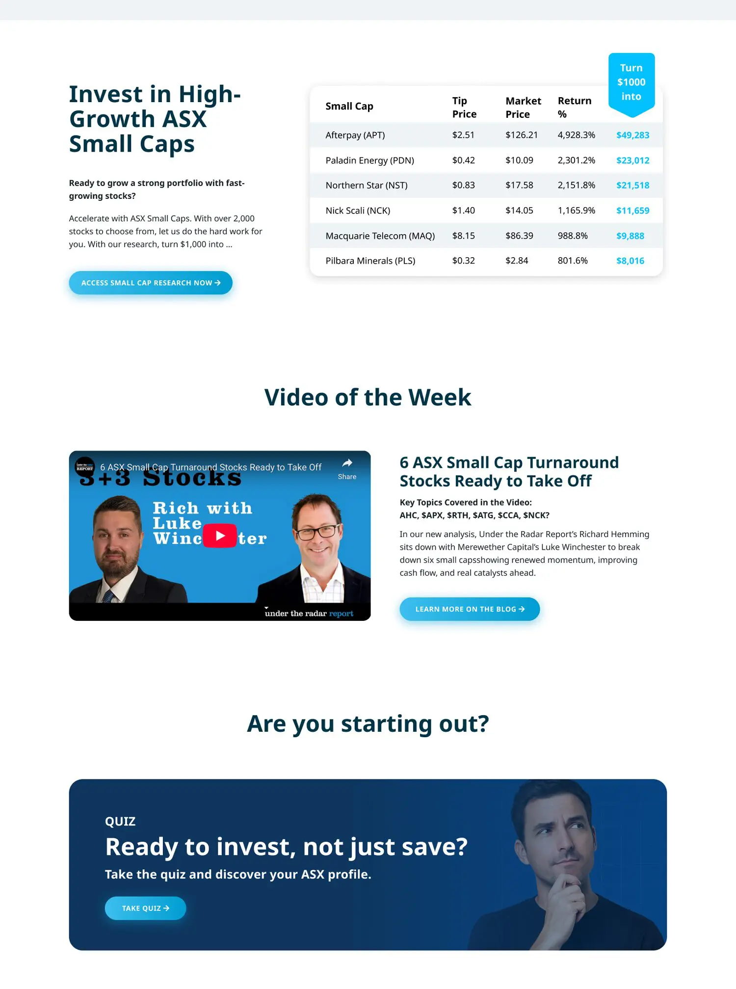
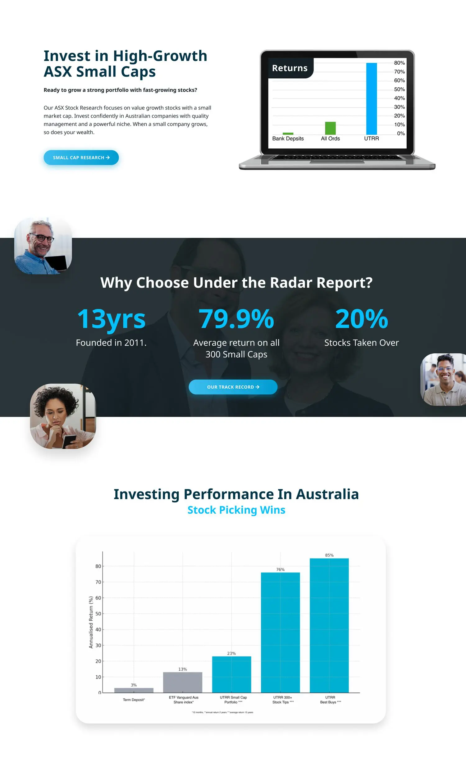
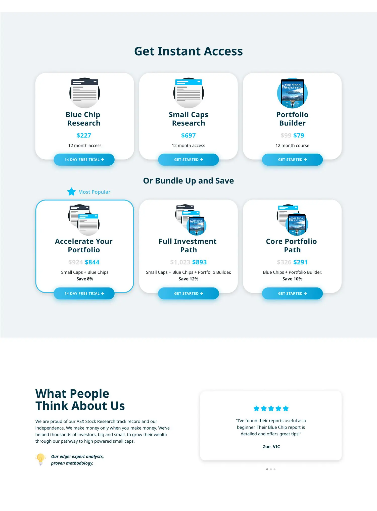
design
The website UI has been given an overhaul – spacious, clean cards and sections make information quick and easy to parse through. UI elements are are now primarily rounded and with large, soft shadows and gradients.
This UI direction was also applied to their UTRR Dashboard, cleaning it up and making it easy to navigate.
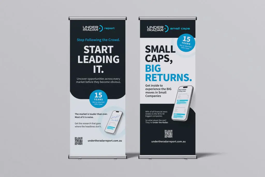
Marketing
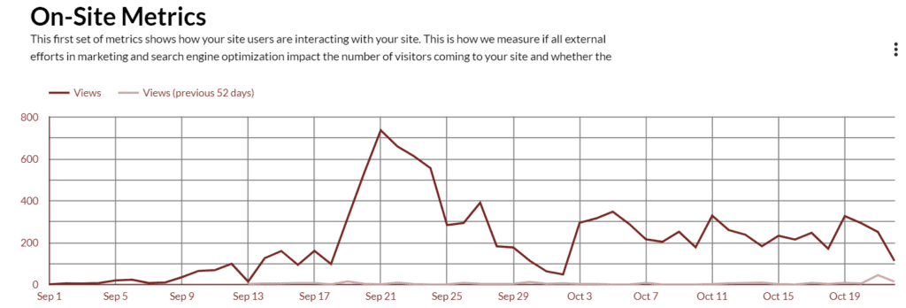
seo
Lorem ipsum dolor sit amet, consectetur adipiscing elit, sed do eiusmod tempor incididunt ut labore et dolore magna aliqua. Ut enim ad minim veniam, quis nostrud exercitation ullamco laboris nisi ut aliquip ex ea commodo consequat.
99%
increase in page traffic since 2025
15%
reduce in bounce rate since 2025
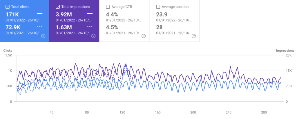
ppc
Lorem ipsum dolor sit amet, consectetur adipiscing elit, sed do eiusmod tempor incididunt ut labore et dolore magna aliqua. Ut enim ad minim veniam, quis nostrud exercitation ullamco laboris nisi ut aliquip ex ea commodo consequat.
99%
click-through rate
99
conversions over 3 months

print marketing
Lorem ipsum dolor sit amet, consectetur adipiscing elit, sed do eiusmod tempor incididunt ut labore et dolore magna aliqua. Ut enim ad minim veniam, quis nostrud exercitation ullamco laboris nisi ut aliquip ex ea commodo consequat.