
PACE Penticton
who they are
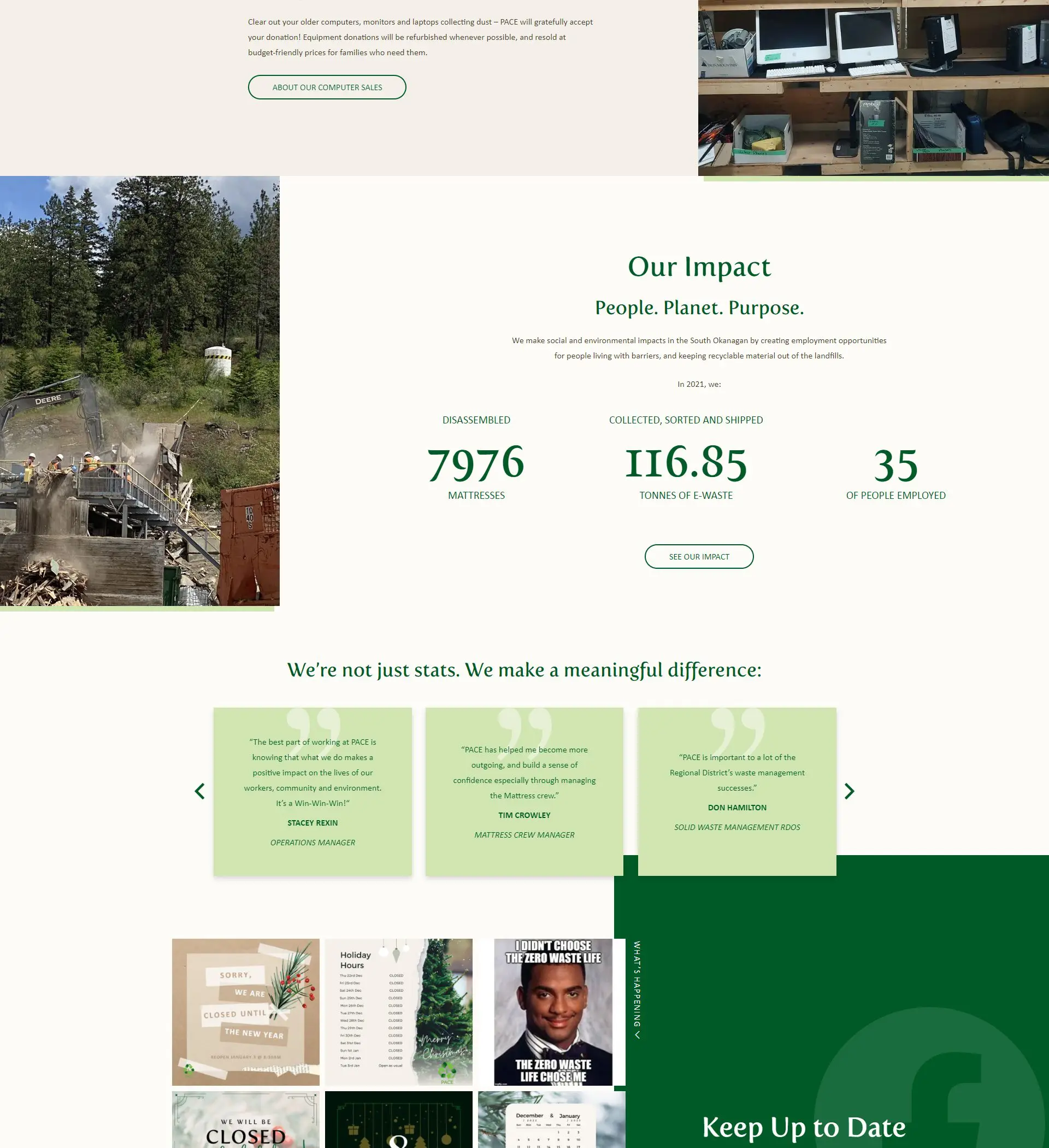
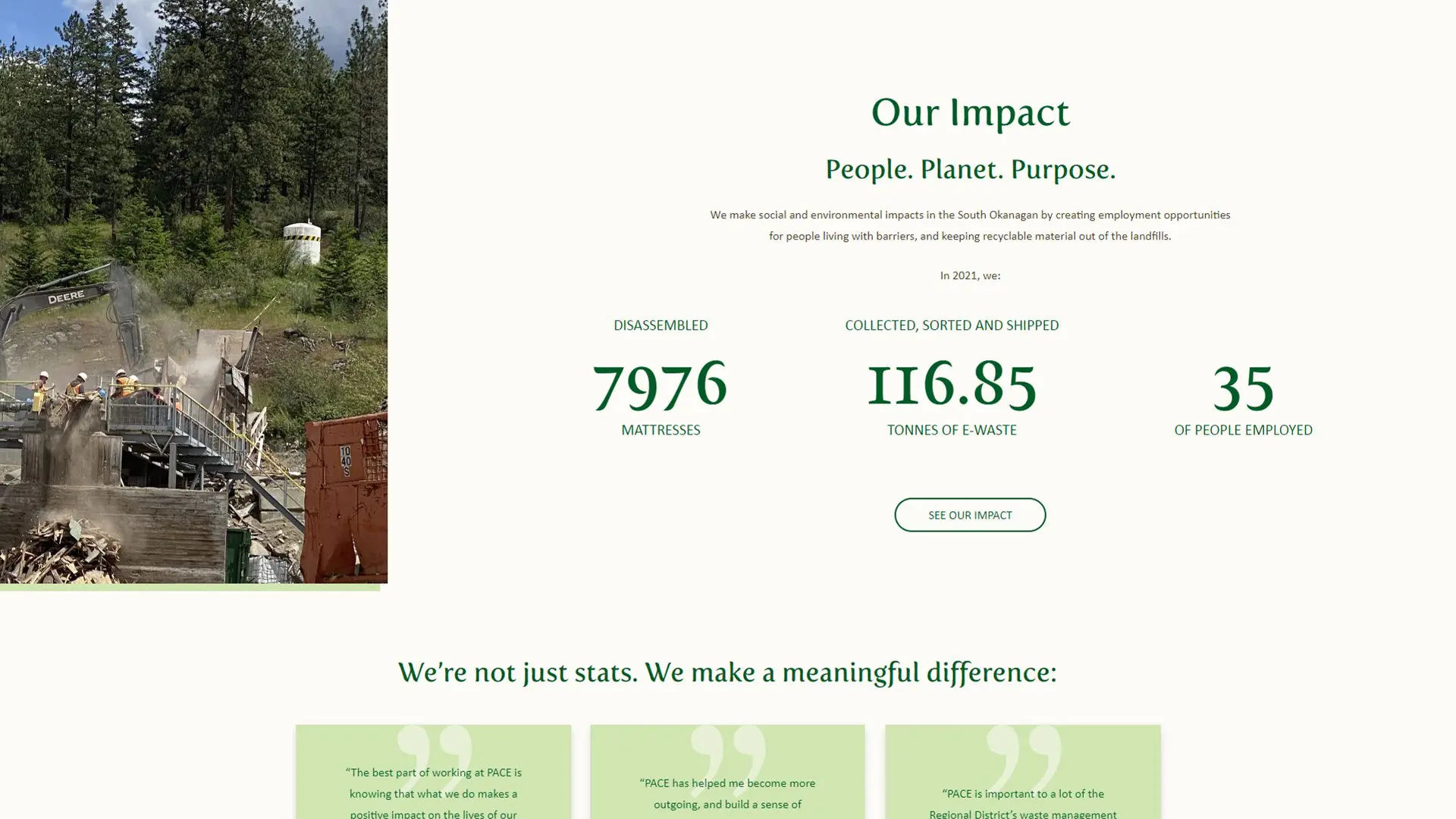
PACE Penticton (Penticton Area Cooperative Enterprises) is a worker-owned cooperative in operation for over 20 years. As a self-funded, for-profit social enterprise, the organization has become the go-to resource for recycling in the Penticton area. The valued employees, who live and work through barriers, make this possible. PACE offers inclusive and supportive employment opportunities. Its E-Waste Centre collects and sorts e-waste to help reduce waste going to landfills and to ensure that electronics are responsibly recycled. By recycling electronics with PACE, individuals can create sustainable jobs, save landfill space, conserve natural resources, reduce toxins in the environment, and ensure the safety of their data.
industry
package type
project type
contributors
 Vigilante Marketing
PUBLISHER
Publisher
 Tina Raposo
DESIGNER
Designer
 Ben Wilson
DEVELOPER
Developer
The Challenge
what they needed
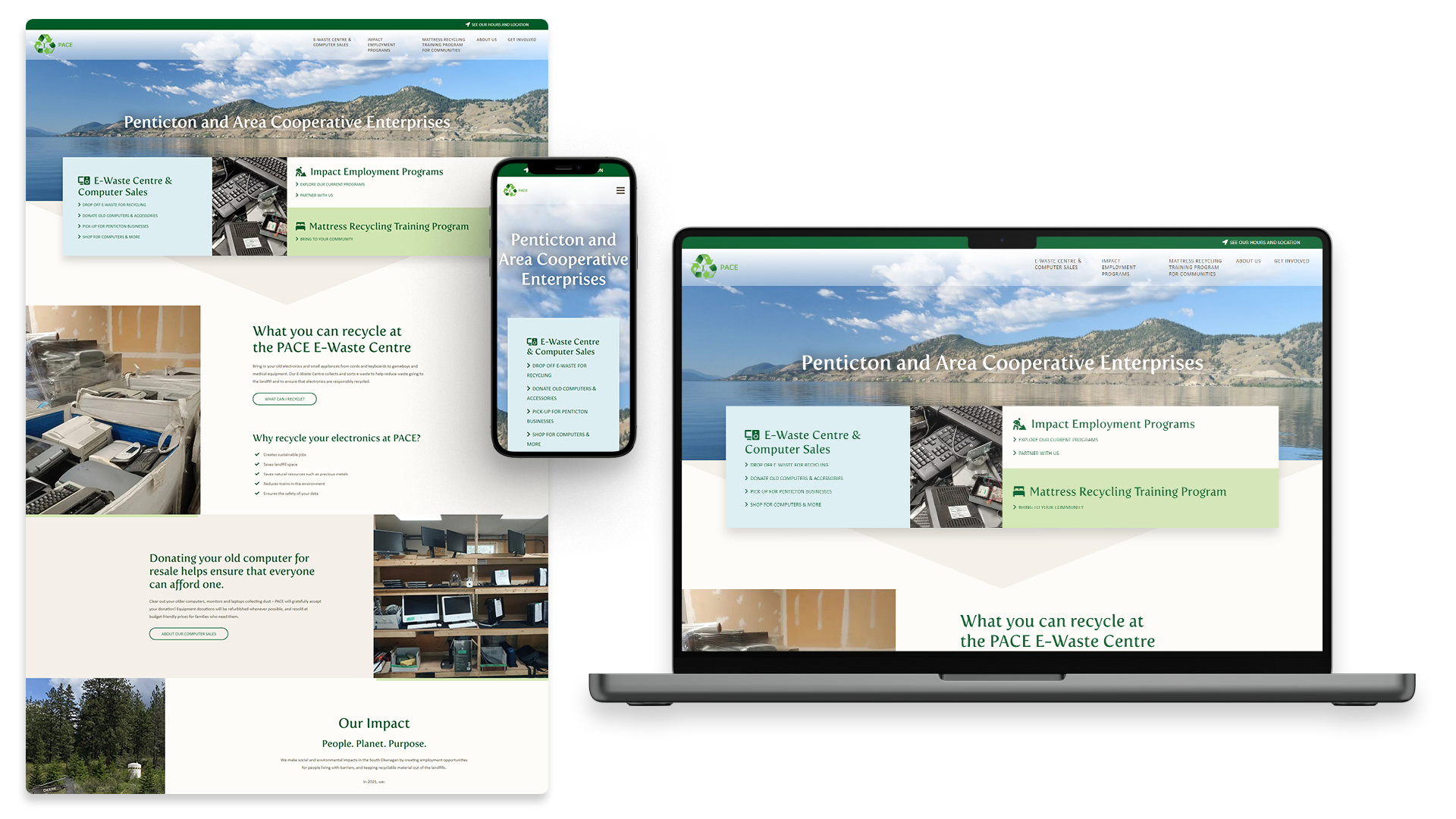
PACE’s previous website was in dire need of a redesign. The website was outdated and lacked modern functionality, which was essential for the organization’s growth. The website was not mobile-friendly, and the overall design was not appealing to the target audience. In addition, the navigation was confusing, making it difficult for users to find the information they needed.
how we tackled it
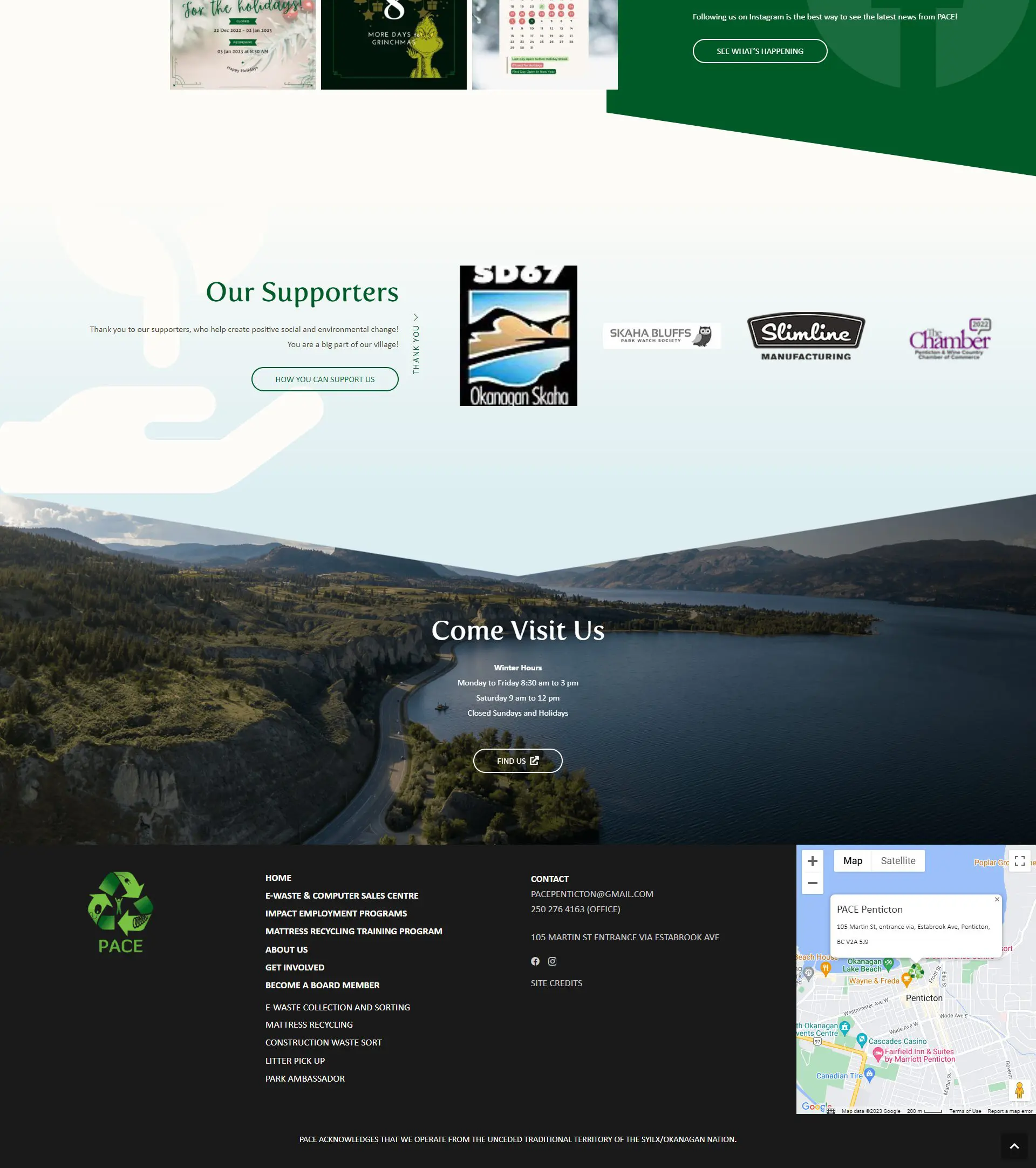
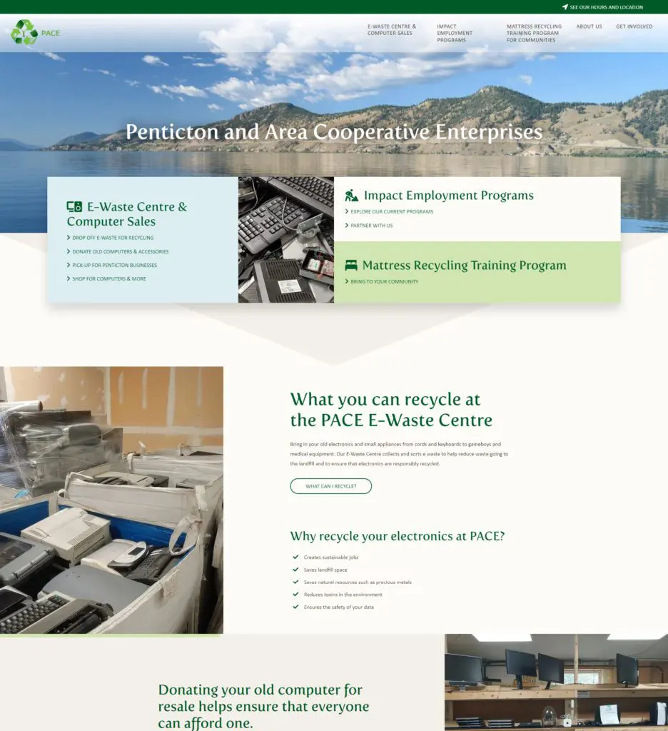
The new Penticton and Area Cooperative Enterprises website was designed to replace the old and tired website used in the past. The design of the new website, created by Tina Raposo, followed the existing brand guide and incorporated styling and motifs from their print materials. One of the main design challenges was to utilize the multiple brand colours together tastefully.
The website prominently features landscape imagery to highlight the environmental focus of the organization. The overall feeling of the design is clean, light, casual, with nature/green elements, approachable, and friendly. Tina paid particular attention to conveying that PACE is a little rough around the edges, using their photography and some quirky sideways text to achieve this aesthetic.
With a fresh and modern design, developer Ben Wilson brought to life a revitalized and updated design to better suit PACE as they expand. In addition, a custom hero menu was designed for clients to easily navigate the site and get the information they are looking for. With each page following a similar format, key information was clearly accessible for all those searching for it.
Testimonials from partners and team members like to give a personal feeling to the project. The group’s supporters are also displayed on carousels to promote the visibility of all involved.
We also included direct access to PACE’s social media feed by displaying their latest Instagram posts on-page to promote exposure to their other platforms.
The Website