The old site worked, in the sense that it took orders. It had been taking them since 2016. But it had aged in every direction at once.



 Vigilante Marketing
 Julien Stäheli
 Peter Vigilante
Lavish Fine Art Cards is a Canadian company that makes something genuinely uncommon: premium greeting cards built around original fine art photography, sold to financial advisors and professional service firms who use them to stay in front of their clients.
Founded and run by the Durrell family, with Glen Durrell behind the camera, the business has spent a decade turning landscapes, seasons and quiet moments into cards that arrive looking like something worth keeping. Their customers order in volume, personalise almost everything, and come back the same time every year. It is a business built on craft and on relationships, and both of those things needed to survive the move to a new website.
The old site worked, in the sense that it took orders. It had been taking them since 2016. But it had aged in every direction at once.
Every photograph was its own product. Adding a new image to the catalogue meant creating a new product, writing its details, setting its options and filing it correctly, and the catalogue had grown to several hundred of them. The customer’s experience mirrored that structure: browse hundreds of near-identical listings, pick one, then work through the personalisation options on that single product’s page.
Underneath, the platform had drifted years behind. The server was running a version of PHP that had been out of support for a long time, and the store was several major versions of WooCommerce behind current. That combination is a slow-moving risk rather than an emergency, but it closes doors: newer tools stop being installable, and the gap that has to be crossed grows every month it is left.
The brief that came out of discovery was refreshingly specific. Make the site look like the product. Make ordering take five minutes. Do not lose ten years of history. And keep the white-glove service that the business runs on, rather than automating it away.
The single most important decision was made before any design work started, and it was an architectural one.
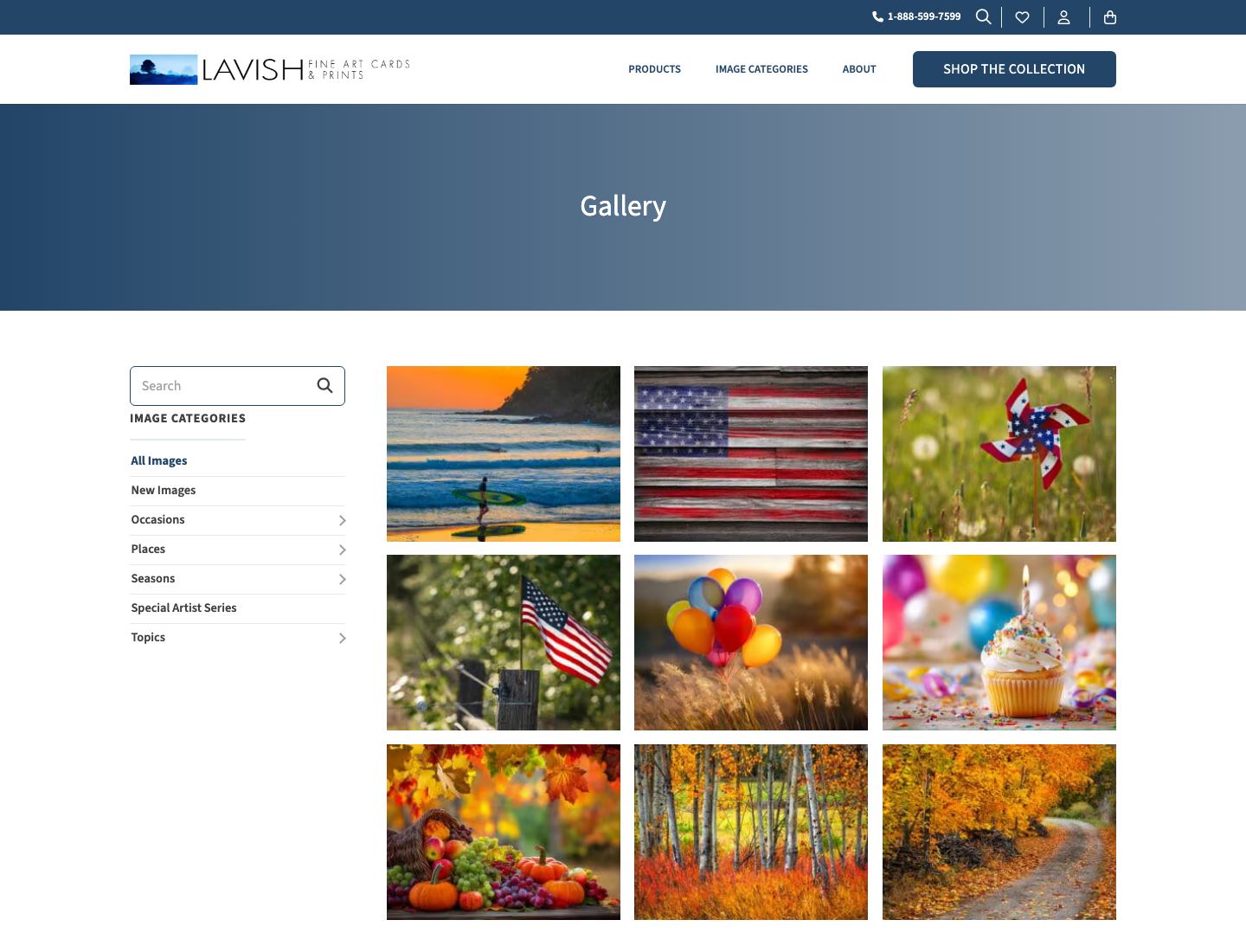
Instead of hundreds of products, the new site has effectively one, and a photography library behind it. Each image lives in the media library with categories describing what it is: the occasion, the season, the place, the subject. The gallery builds itself from those categories. So does the order form. So do the featured carousels.
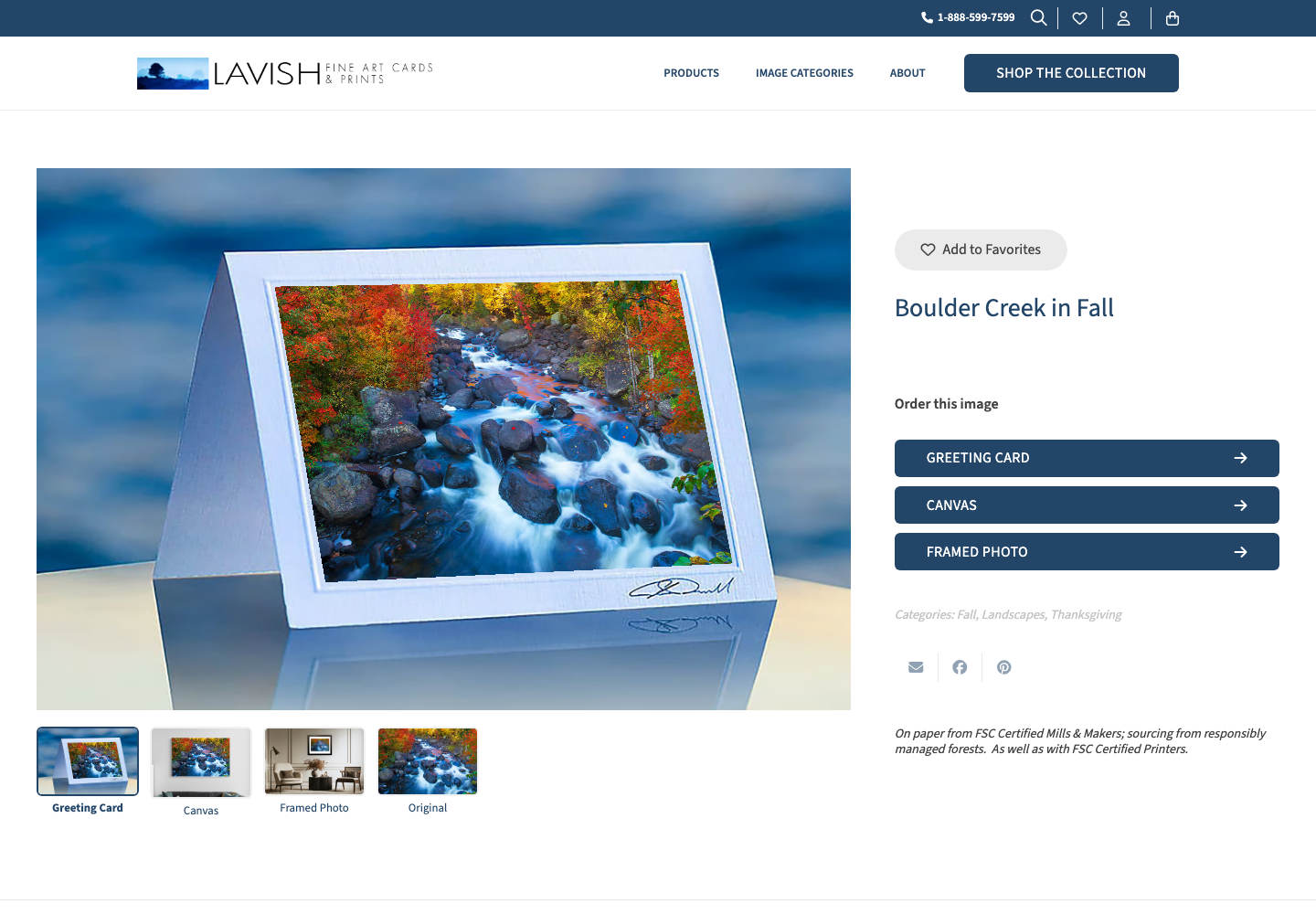
That one change is what makes everything else possible. Putting a new card on sale is now two steps: upload the photograph, tick the categories it belongs to. The gallery updates, the order form offers it, the “New Images” filter picks it up, and the related images carousel starts including it. Nobody creates a product. Nobody edits the order form. Nobody has to remember a checklist.
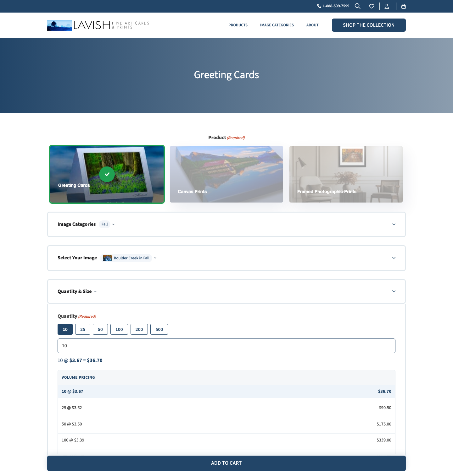
We proved this on the live site during handover: uploaded one image, ticked one category, and watched the order form’s count go from 69 to 70 with the new image appearing first, without a single edit to the form itself.

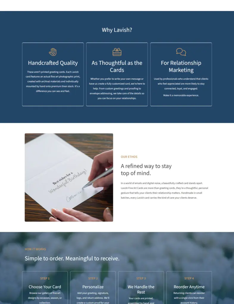
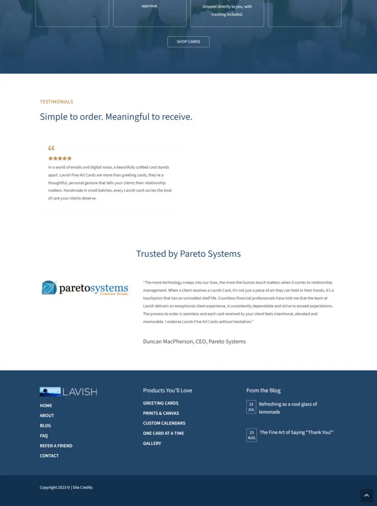
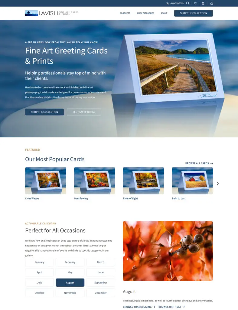
The design direction was set by the photography, which is the correct answer when the photography is this good. Generous space, restrained typography, a deep navy that lets the images carry the colour, and layouts that never compete with what is inside them.
The team was clear that they did not want something template-driven, and that mattered more than usual here. When you sell art, a site that looks like everyone else’s quietly argues against your own product.
The order form is where the real work went. A single guided flow replaced hundreds of product pages: choose a product type, choose a category, choose an image, then work through quantity, greeting, sentiment, personalisation, logo, signature and envelope options. It runs to more than eighty fields, but the customer never sees eighty fields. Each step opens as the previous one is answered, and closes once it is done.
Alongside it we built around forty-six custom extensions for the specific things this business does that no off-the-shelf plugin covers. Among them:
A live envelope preview, proportioned to a real 5×7 envelope, so customers can see their imprinting laid out before they commit to it
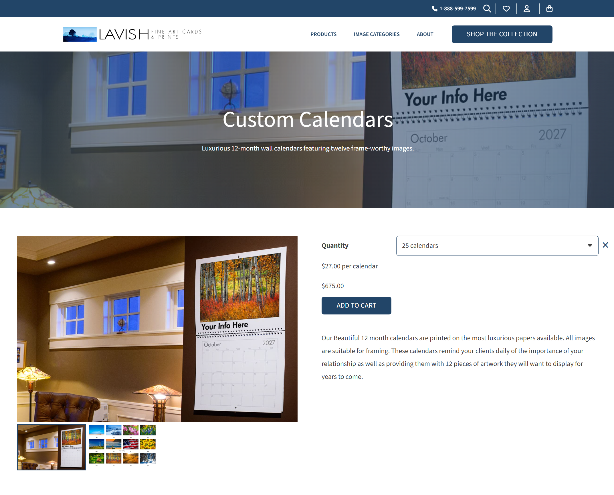
Card, canvas and framed mockups generated from the chosen photograph, so the customer sees their image as the finished product rather than as a flat file
Reorder from history, because a large share of this customer base orders the same thing every year and should not have to rebuild it
A discount rule that avoids charging a customer twice for reusing the same greeting
Order minimums enforced in plain language, explaining what is needed rather than simply refusing to proceed
A featured carousel that ranks images by what has actually sold, and falls back to the newest uploads until there is enough sales data to rank on
A decade of trading, thousands of orders and thousands of customer records, all moving from an old database structure to a modern one. Every order carried its personalisation details: the image chosen, the greeting, the sentiment code, the signature, the addresses. All of it had to arrive readable, because this is a business where customers ring up and ask about an order from three years ago.
Some of it arrived damaged in ways that only showed up on inspection. Line breaks inside customer addresses had been flattened at some point in the data’s history, running lines together. We wrote a repair pass for it and ran it across several thousand values, carefully enough to fix genuine breaks without mangling names that legitimately ran words together.
The old site’s product URLs are in Google, in customer bookmarks and in years of email campaigns. The new structure does not use them, and only around a third of the old addresses had an obvious equivalent, because the old slugs came from product names and the new ones come from filenames. A blanket redirect rule would have sent people to the wrong photograph, which is worse than a dead link. So we built an exact map from the old database, entry by entry, with anything genuinely retired pointing at the gallery rather than a dead end.
Lavish sells into Canada and the United States, and the requirement was unusual: the price must not appear to change. A card shown at one hundred dollars is a hundred Canadian dollars to a Canadian customer and a hundred US dollars to an American one, with the currency decided by their billing address and the number on screen staying exactly the same.
That is straightforward to display and genuinely awkward to settle. Their existing gateway, Chase Paymentech, handled it with two separate merchant accounts, but it could not support the modern order storage the new site needed. Moving to Stripe surfaced a constraint most projects never meet: Stripe’s multi-currency settlement, which lets one account hold balances in several currencies, is not offered in Canada. Except, as it turns out, for US dollars specifically. A Canadian account can attach a US dollar bank account and settle American payments in American dollars without conversion.
That single exception is what made a clean solution possible. One Stripe account, two bank accounts, currency chosen by billing address, and no conversion charges on the American side, which is the larger share of their business.
The site launched on 24 August 2026. It is early for performance figures, and we would rather report real ones later than invent them now. What we can say is what the build actually delivers:
We also handed over a written guide, built entirely from screenshots of their own site, so the team can run the catalogue themselves without needing us for routine work. That was deliberate. The measure of this project is not how often they have to call us.