

Have questions about paid ads, campaign optimisation, or platform features? Browse our knowledge base for step-by-step guides, FAQs, and expert insights to help you succeed.
Checking your changes on mobile
On This Page
Your site is one set of content that rearranges itself to fit the screen it is on, so there is no separate mobile version to update. What you are checking is not whether the change worked, but whether it still reads well once everything has stacked into a single column.
More than half your visitors are on a phone. For most VM clients it is between 55 and 70 percent. If you only ever check on a laptop, you are checking the version that fewer people see.
The quickest check: your own phone
- Publish or update the page as usual.
- Open your website on your phone.
- If you had already looked at the page recently, pull down to refresh, or your phone may show you the version it stored earlier.
- Read the part you changed.
Seeing the old version on your phone is almost always caching, not a failed save. Refresh first. If it is still old after a refresh, see clearing your website cache before assuming the change did not take.
Checking on your computer instead
You do not need a phone in your hand. Making the browser window narrow shows you the same layout.
- Open your page in a normal browser window, not the WordPress editor.
- Drag the right-hand edge of the window slowly to the left.
- Watch for the point where the menu turns into a button and the columns stack. That is the phone layout.
- Read your change at that width, then drag the window back.
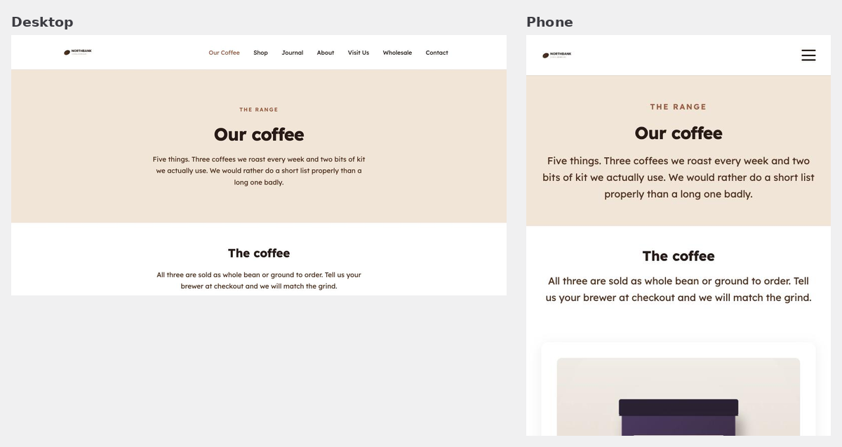
You cannot break anything by resizing your window. You are changing your own browser, not the website. Nobody else sees anything.
What to actually look for
Most things look after themselves. These four are where problems actually turn up, in rough order of how often.
| Check | What goes wrong |
|---|---|
| Long headings | A heading that fits one line on a laptop can run to four on a phone and push everything else down. Shorter is usually better anyway. |
| Text on top of an image | The image crops differently at narrow widths, so wording that sat neatly in a clear area can land on a busy part of the photo. |
| Buttons | Check the label still fits and has not wrapped awkwardly, and that it is comfortably tappable rather than tight against another one. |
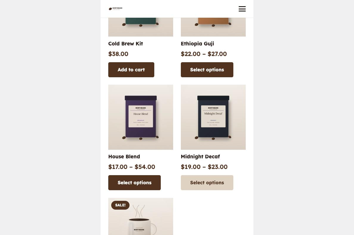
| Tables and price lists | These are the one thing that genuinely struggles on a narrow screen. If you have added a wide table, look at it on a phone before you leave it. |
After changing your menu
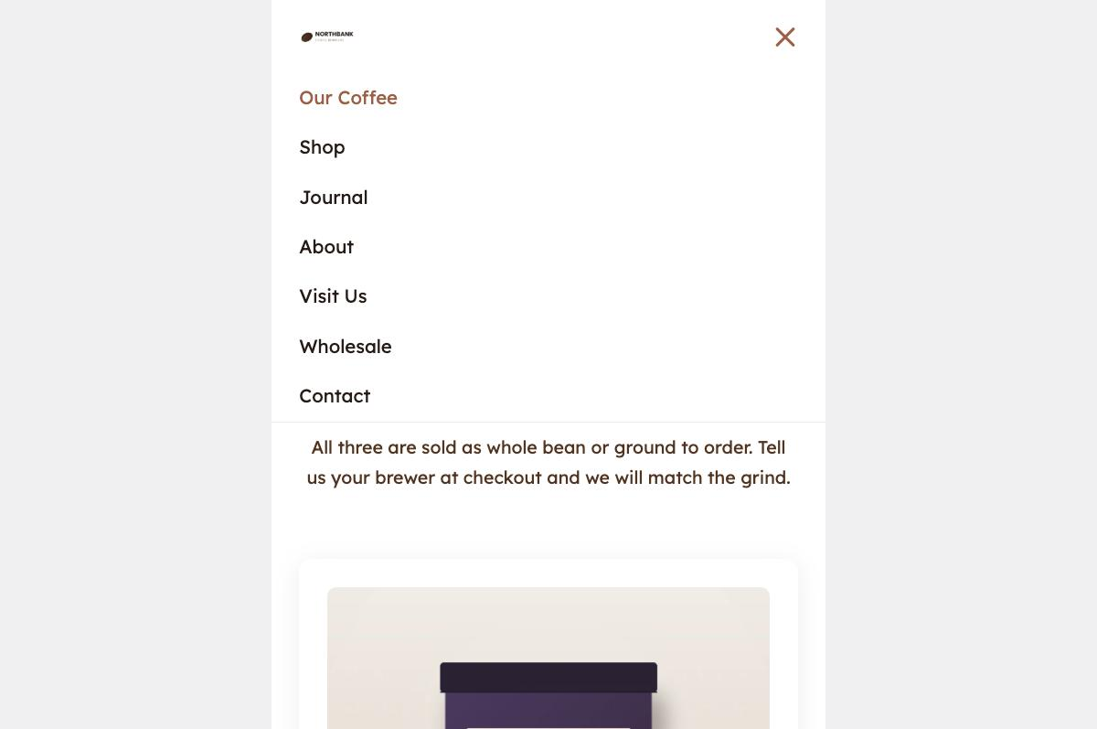
Menus deserve their own look, because the mobile version is a completely different shape from the row across the top.
After adding a product or a service
What is not worth worrying about
- Things being in a different order. Columns stack top to bottom on a phone. That is by design.
- Text and images being bigger relative to the screen. Also by design, and it is what makes the site readable in one hand.
- Small differences between phones. Screens vary. If it reads well on yours it will read well on most.
When to email us instead
Send us the page address and a screenshot from your phone if something overlaps, runs off the side of the screen, or is unreadable at narrow widths. A screenshot is genuinely the fastest thing you can give us, because it tells us your exact screen size without either of us guessing.
A layout that only breaks on mobile is usually a five-minute fix. It is nearly always one element needing a different setting at narrow widths, and it is our job rather than yours.
Related guides
Still haven’t found what you’re looking for?
Let us know and we’ll do our best to help out!