Client Case Study

Really Awesome Dope (RAD)

Web Design, Web Development

the client

Really Awesome Dope (RAD), a Canadian cannabis supply company, is a subsidiary of Heritage Cannabis. They offer many different strains and products that can be purchased at dispensaries across Canada. They pride themselves in committing to pricing themselves like it’s the 80s. With some of the most innovative and unique products on the market and the most fun branding in the biz, RAD is one to keep your eyes on!

what they needed

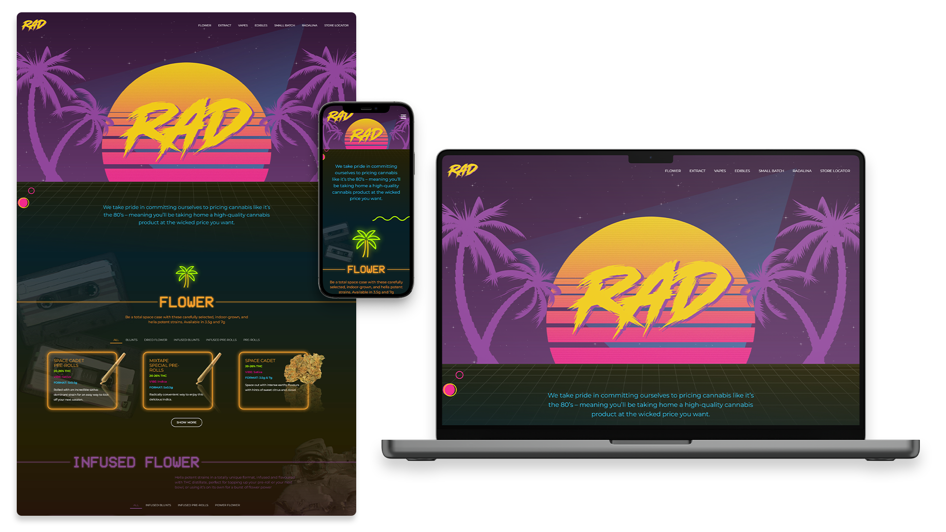
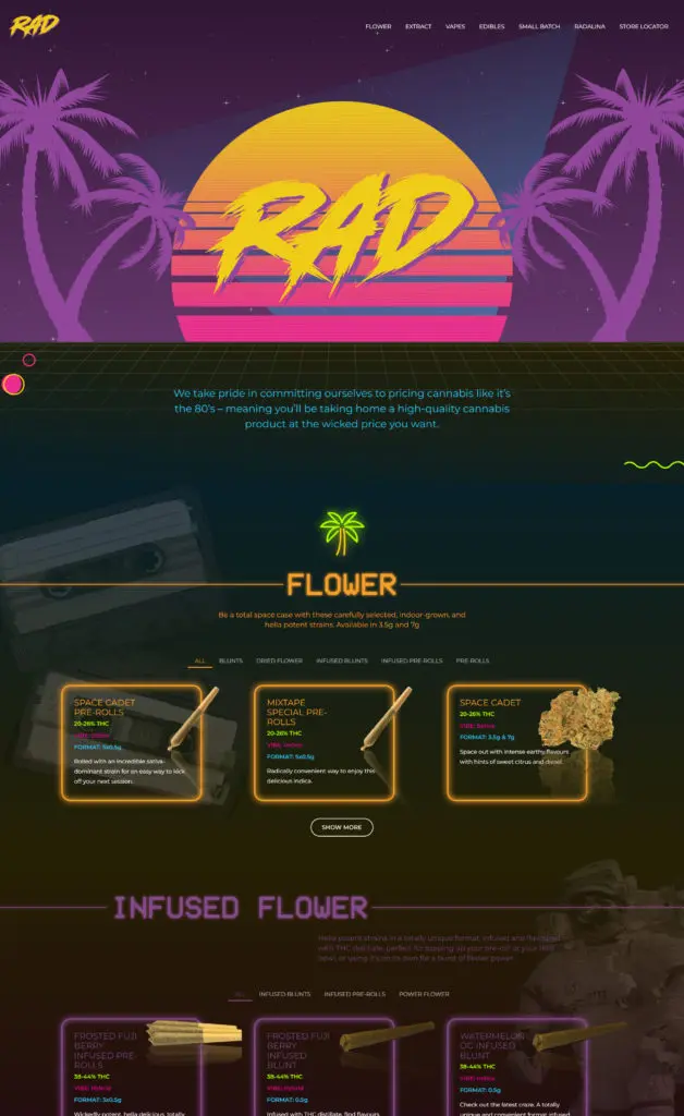
When RAD came to us, they had an older, generic online presence that did not emulate the exact style and flare they needed for their brand. They wanted a designer that could create a ridiculously radical design to invoke the feeling of the 1980s and a developer who had the skills to build this tubular website.

what we did

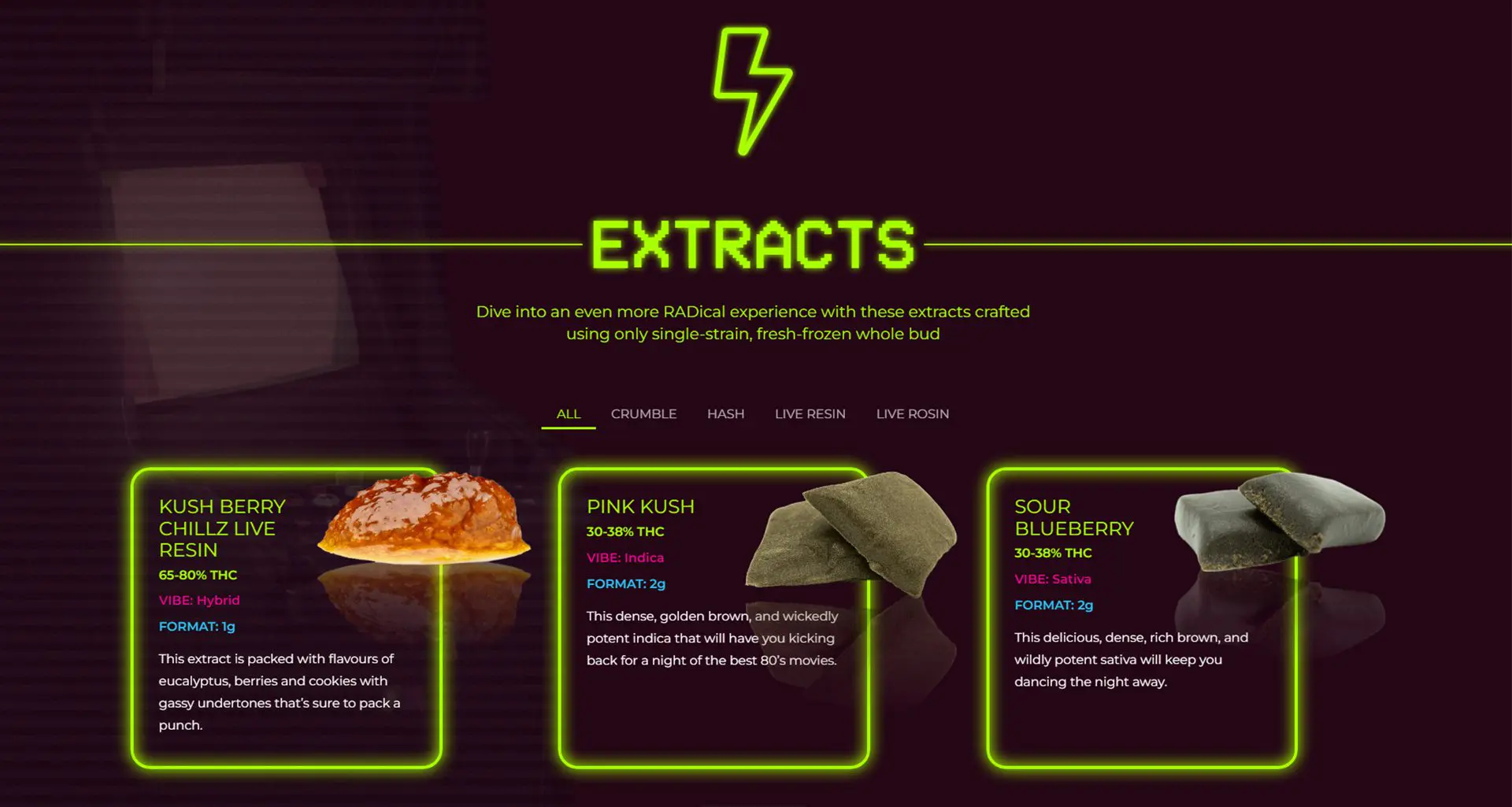
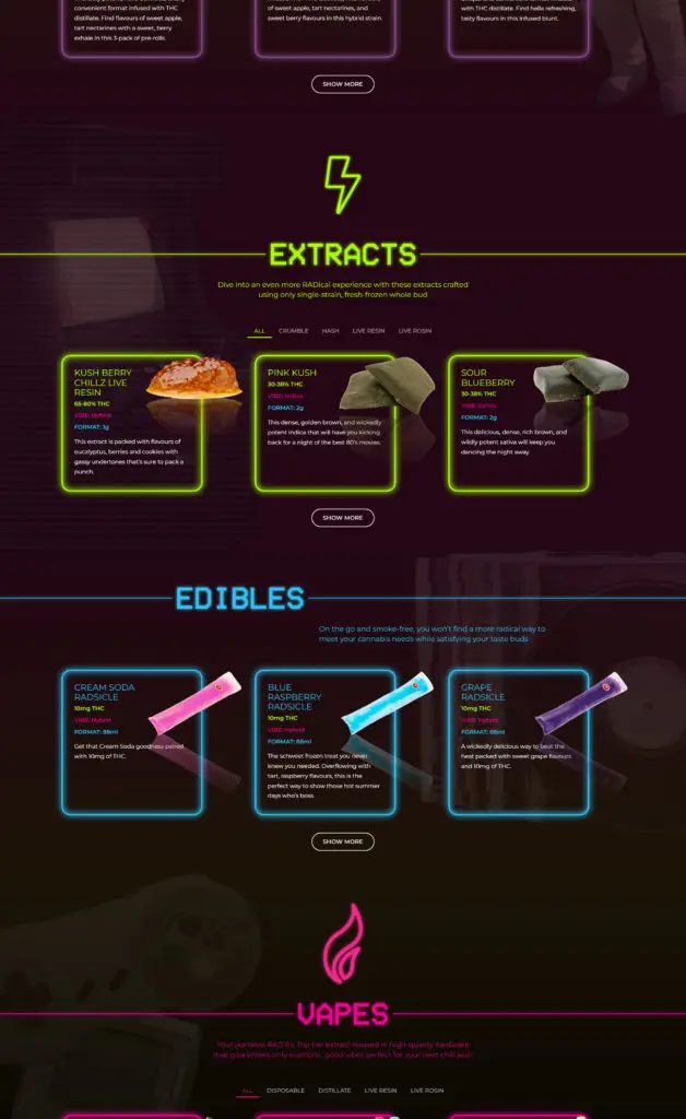
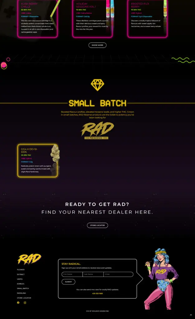
First, the VM design and development team sat down with RAD to discover and understand the direction they wanted their brand to take to best represent the 80s nostalgia feeling correctly. Next, our designer, Tina Raposo, researched popular design trends from the 1980s. She then used the information she gathered to produce a site design that contains bright, neon colors, 8-bit graphics, and textured backgrounds using faded 80s-themed objects such as cassette tapes and arcade games.

VM’s developer, Peter Vigilante, then took the design Tina created and brought it to life! He created movement on the site, such as flowing palm trees, using SVG animations built with SVGator. He also developed a flickering neon light effect on product borders using pure CSS animation and effects.

Altogether, VM was able to deliver a stand-out website to RAD that now perfectly fits their overall brand.
Vigilante MarketingVigilante Marketing
PUBLISHER

Tina RaposoTina Raposo
DESIGNER

Peter VigilantePeter Vigilante
DEVELOPER

more like this

Similar Projects

Vistara Growth
Forward Security
Previous Project
Vistara Growth
Next Project
Forward Security