Brother’s Coating
who they are
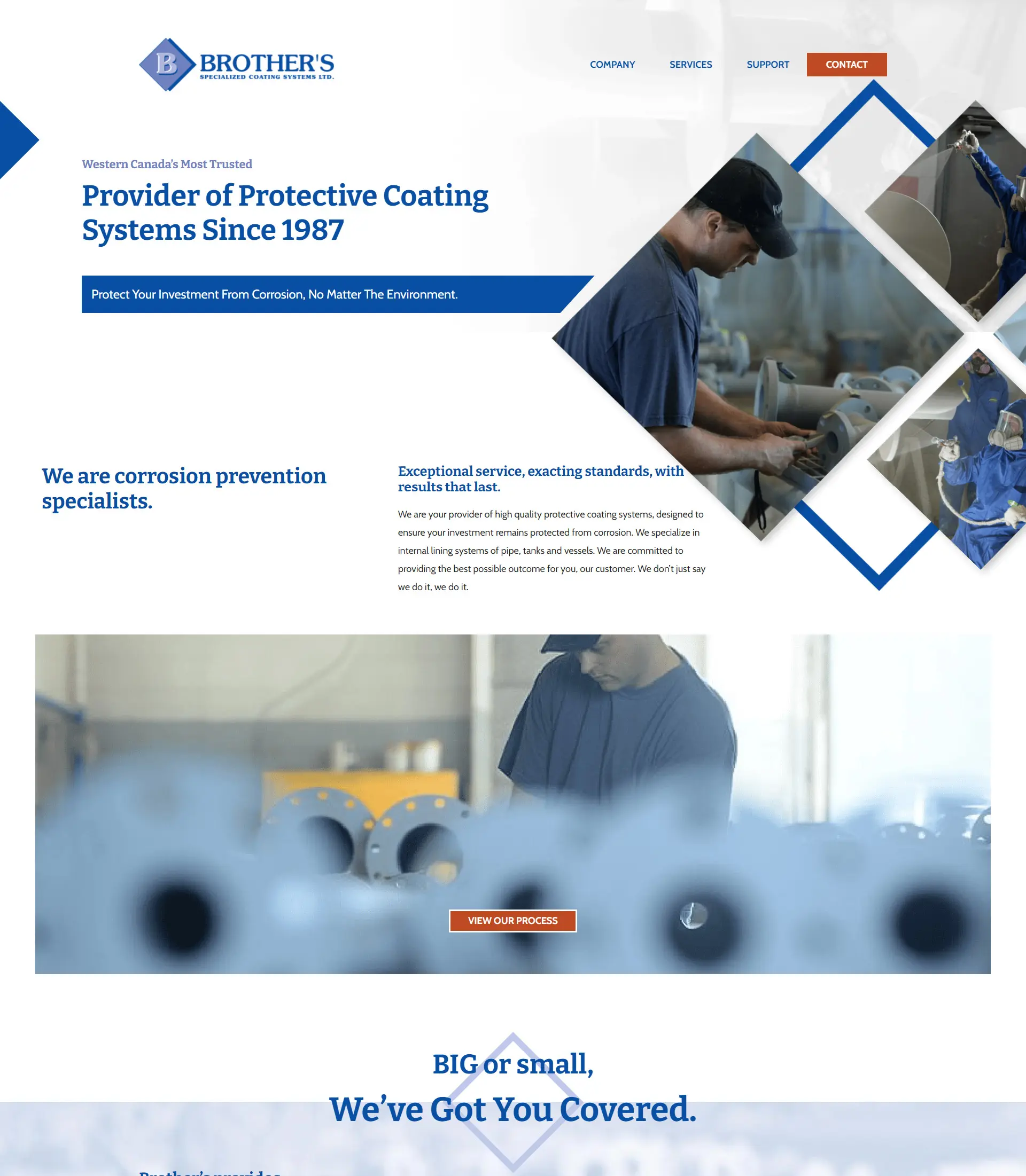
Brother’s Coating Systems has provided high-quality coating applications to Western Canadian clients in the oil & gas, water treatment, and wastewater industries since 1987. Making customer satisfaction their main goal, Brother’s Coating has built its reputation on being knowledgeable, honest, and straightforward, while ensuring client projects are finished on budget and on time. Brother’s Coating’s highly trained professionals and proven application lining process allow for clear direction and industry-leading application and quality control measures; with proven advantages in health and safety for employees and a strong commitment to the environment through effective environmental policies and waste management procedures.
industry
package type
project type
contributors
 Vigilante Marketing
PUBLISHER
Publisher
 Brother’s Coating
DESIGNER
Designer
 Brian Looney
DEVELOPER
Developer
The Challenge
what they needed
Brother’s Coating came to Vigilante Marketing with an outdated, disorganized website, that did not properly showcase their services and the support that Brother’s Coating offered clients. Website navigation was difficult, with a menu header that hid menu items in sub-menu dropdowns, making it more difficult for users to find what they needed, and when a user did navigate to multiple pages they would find branding and layouts that were inconsistent between pages. In addition to a more consistent design, Brother’s Coating also needed the website’s backend to be more manageable for their team to complete website updates when needed.
how we tackled it
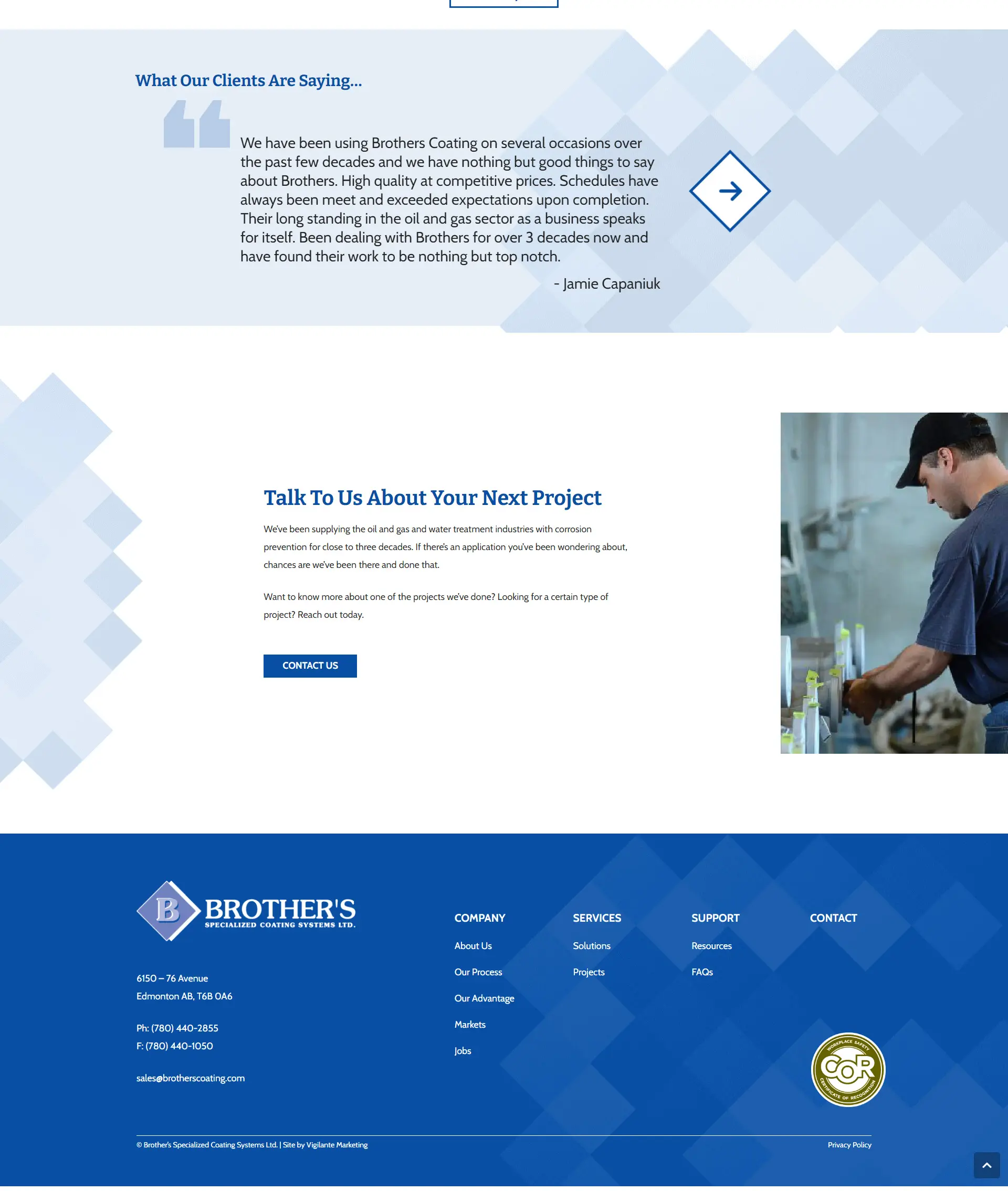
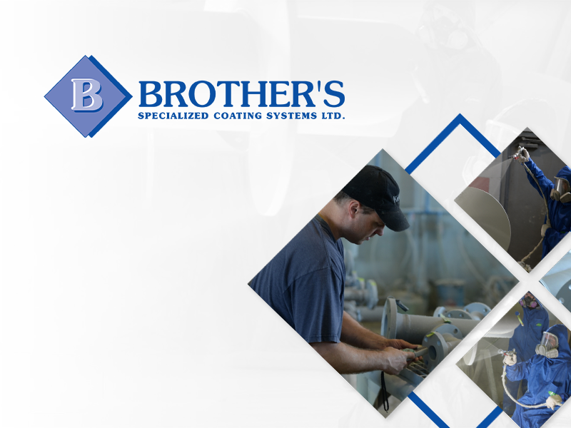
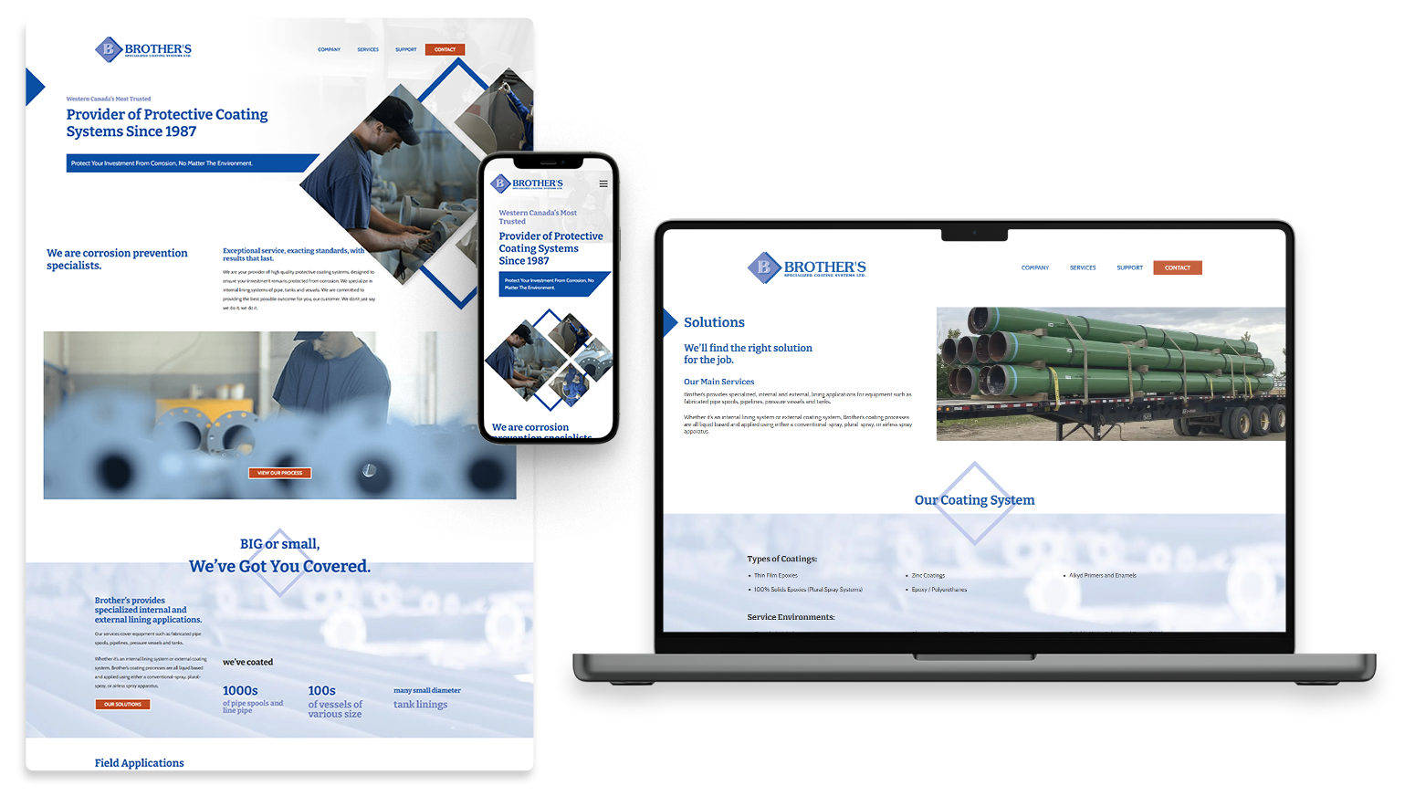
We wanted to completely redesign the look and feel of the website by designing the website to represent the outstanding level of service they provide to their clients. This started with David creating a recurring design pattern that would incorporate the diamond shape from their existing logo, which allowed for the site’s design to feel more cohesive and integrated throughout. This updated design allowed for consistent branding between their logo and website.
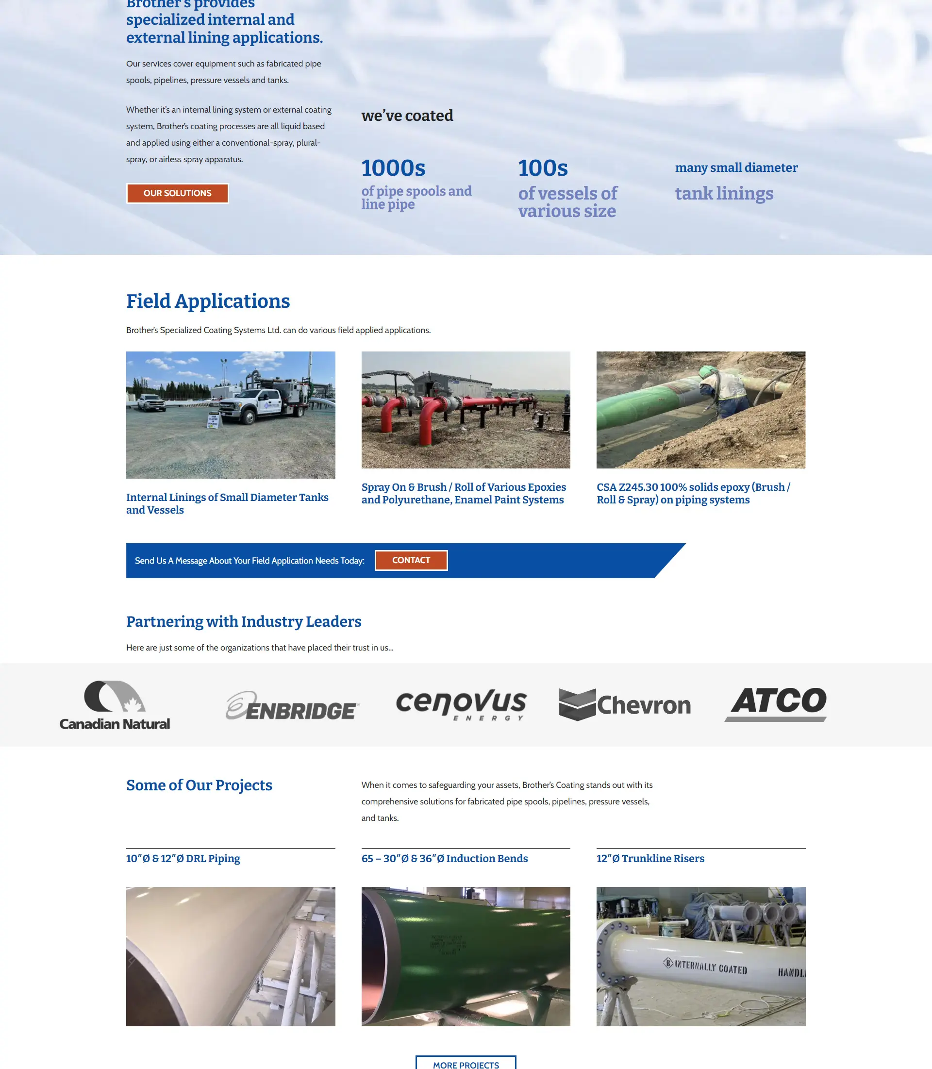
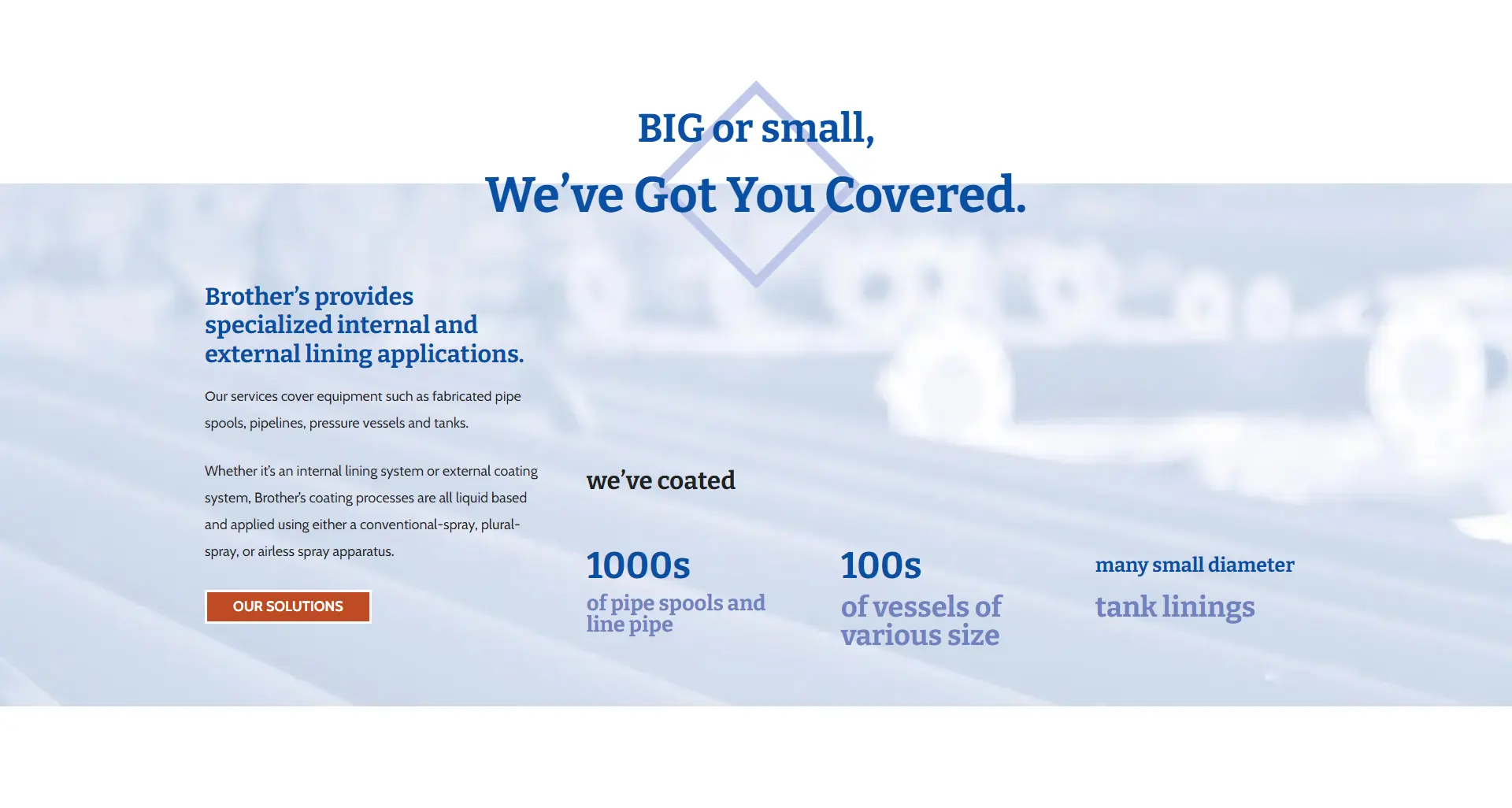
Positioning Brother’s Coating as a dependable and experienced brand was essential, so we ensured their new website copy reflected this. We marketed Brother’s Coating by showcasing their heritage and highlighting that they have been their client’s provider of protective coating systems since 1987. Establishing their business as an experienced brand was done by representing their experience through social proof statistics and figures while emphasizing the range of services they offer on the homepage of the website giving users the instant impression that Brother’s Coating was an industry leader.
We simplified the site map by adding all pages into one easy-to-navigate main header, which improved the ease with which users could immediately find what they were looking for. The website’s backend was also simplified, allowing anyone on the Brother’s Coating team to easily add new team members, services, resources, or project case studies whenever needed.
Following our design of the site, Brian developed the new Brother’s Coating website with ease. Brian implemented the new clean design while integrating interesting geometric imagery elements which created a more consistent look to all website pages, giving website users a better feel of the website that was more professional and put together.
The Website