

Have questions about paid ads, campaign optimisation, or platform features? Browse our knowledge base for step-by-step guides, FAQs, and expert insights to help you succeed.
Editing text boxes, icon boxes and flip boxes
On This Page
Most of what looks like “design” on your pages is one of three small building blocks repeated: a text box for words, an icon box for a symbol with words under it, and a flip box for a card that turns over. Each is a single element with a settings panel, and in every case the words are the part you can change freely.
All three follow the same pattern. Click the element, a panel opens on the right, the content fields are at the top and the appearance settings are behind other tabs. Learn one and you have learned all three.
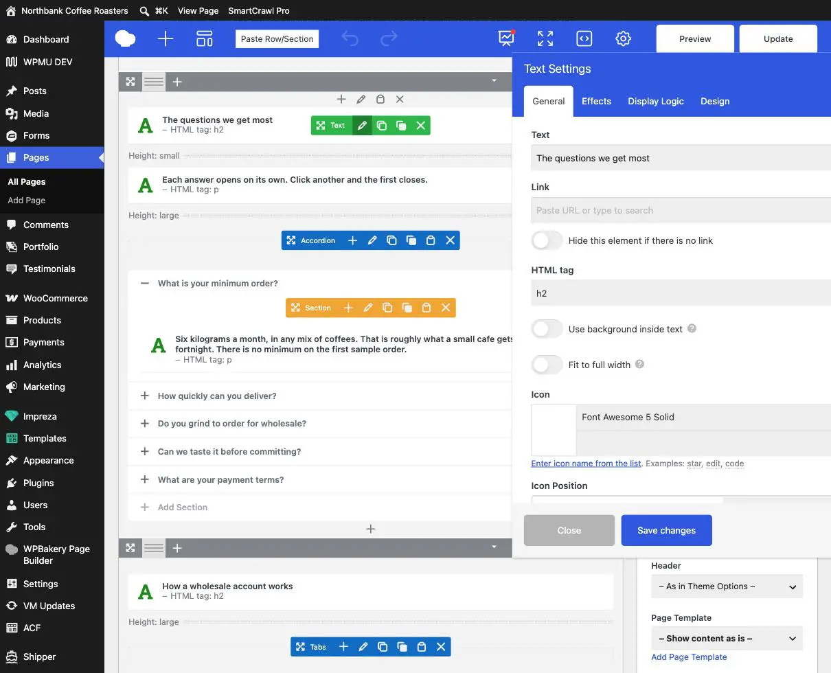
The settings panel, once
| Tab | What is in it |
|---|---|
| General | The words, the link, and the heading level. This is your tab. |
| Effects | Animations as the element scrolls into view. Fine to look at, best left as set. |
| Display Logic | Rules for showing or hiding the element. Leave alone; a wrong rule here makes content vanish with no clue why. |
| Design | Colours, spacing, borders. Covered in its own guide, and mostly ours. |
Text boxes
A text box is one or more paragraphs, or a heading. Two fields matter.
- Text is the wording. Edit it freely.
- HTML tag decides whether this is a heading or a paragraph:
h2andh3are headings,pis a paragraph. - Save changes, then Update.
Do not change the HTML tag to make text bigger. It is tempting, because an h2 does look bigger than a p. But headings are how Google and screen readers understand the shape of your page, so a paragraph promoted to a heading tells them a new section has started when it has not. If something needs to be bigger, ask us and we will make it bigger without breaking the structure.
Icon boxes
An icon box is a symbol, a title and a short paragraph. They are usually in a row of three, which is why editing one and not its neighbours looks obviously wrong.
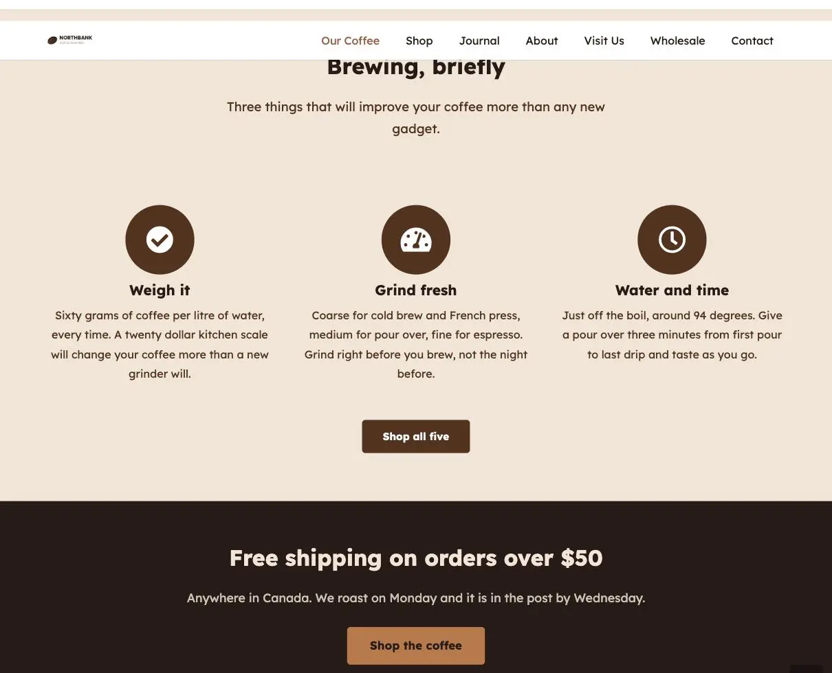
- Title and the body text: yours, edit away.
- Icon: changeable, but see the warning below.
- Alignment, size and style: leave these. They are what makes the three cards match.
Icon names are not guessable. The icons come from a set with specific names, and your site uses version 5 of that set. A name from a newer version, or a sensible-sounding name that does not exist, produces an empty square rather than an error. If you want a different icon, use the picker’s own list rather than typing a name, and check the page afterwards. If the square is empty, the name was wrong.
Keep the text lengths in a row similar. Three cards whose paragraphs are two, five and two lines long will sit at different heights and look untidy. Matching them roughly is the single easiest way to keep a section looking designed.
Flip boxes
A flip box has a front and a back. The front shows a teaser, and hovering turns the card over to reveal the back. In the builder both sides are listed together, which is why the panel looks twice as long as it needs to.
- Front title and front description: what everyone sees.
- Back title and back description: only seen by somebody who hovers.
- Animation and direction: how it turns. Leave as set, and particularly keep every card in a row turning the same way.
Never put anything essential on the back of a flip box. Hovering does not exist on a phone or tablet, so a large share of your visitors will never see the back at all. Prices, opening hours, phone numbers and anything else that matters must be on the front or somewhere else on the page entirely. Treat the back as a bonus, never as the place the information lives.
Which to use
| You want | Use |
|---|---|
| A paragraph or a heading | Text box |
| Three or four features, each a sentence long | Icon boxes in a row |
| The same, but with a bit more detail available | Flip boxes, with the essentials still on the front |
| A lot of detail per item | None of these. Use an accordion, which works on a phone. |
Adding another one to a row
Duplicate rather than build. The copy icon on the element’s toolbar gives you an identical card, and you then change its words. A card built from scratch will not match the others, because it will be missing whatever styling we applied.
Adding a fourth card to a row of three does not widen the row. The number of columns is set on the row, not on the cards, so a fourth card usually drops underneath on its own and looks stranded. If you want four across, that is a change to the row and it is quicker for us to do than to undo.
When to email us instead
- You want a different number of cards across a row.
- You want a colour, size or spacing changed. Ask, and it will be done consistently across the set rather than on one card.
- An icon has come out as an empty square and the picker is not helping.
- You want the same block of cards to appear on several pages, which is a job for a reusable block.
Related guides
Still haven’t found what you’re looking for?
Let us know and we’ll do our best to help out!