
Joe Loucks
who they are
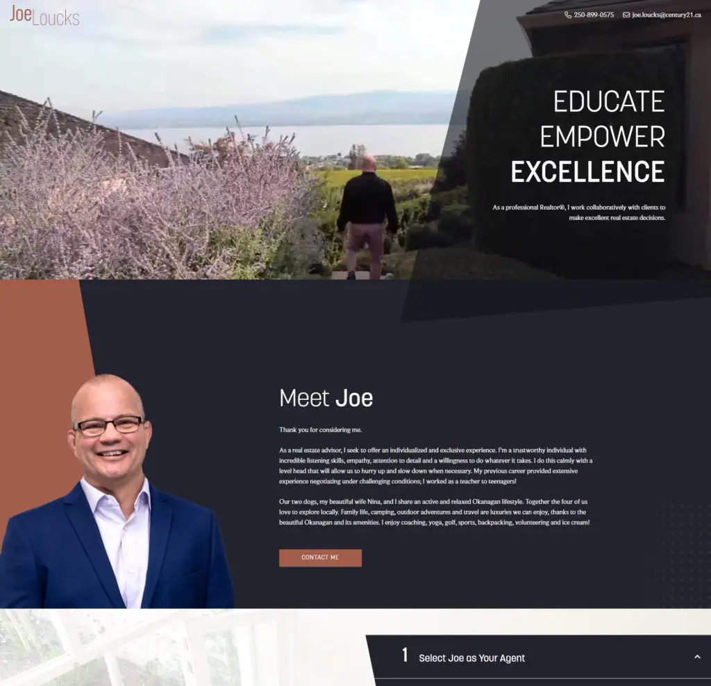
Joe Loucks, a new real estate advisor for the Okanagan area, works collaboratively with clients to make excellent real estate decisions. His extensive buying and selling processes promise to not only educate clients but empower them as well.
industry
package type
website
project type
contributors
The Challenge
what they needed
With Joe new to his real estate career, he needed to establish a well-branded and designed online presence to capture potential new clients. He came to us with perfected buying and selling processes and taglines; he just needed a way to display all of it on a website correctly.
how we tackled it
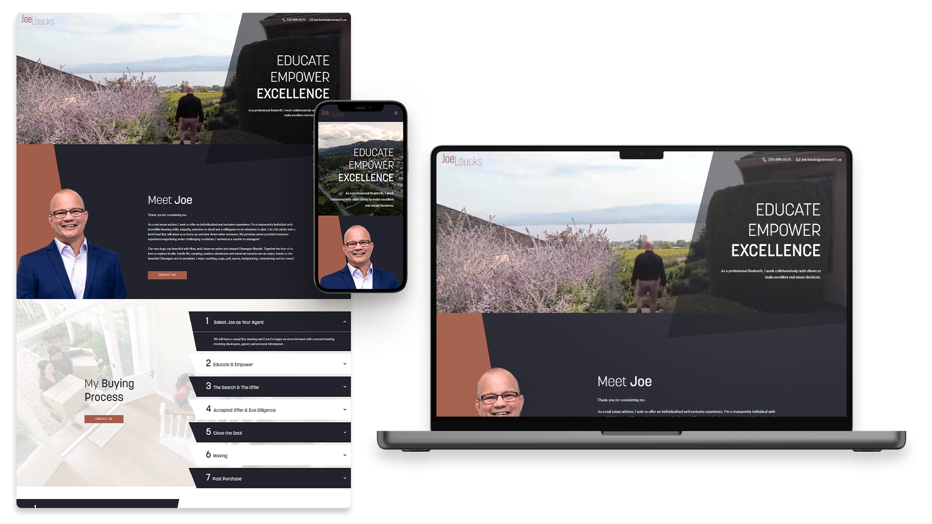
Designed and developed by Tina Raposo, she wanted the website to feel trustworthy and dependable. With that in mind, Tina chose a neutral colour palette using blue-tinted black and copper to emulate luxury and dependability. The design is simple, straightforward, and easy to follow, with labeled sections. She added angled shapes to make the design a little more playful/casual, but not too casual that it doesn’t fit in with the rest of their brand.
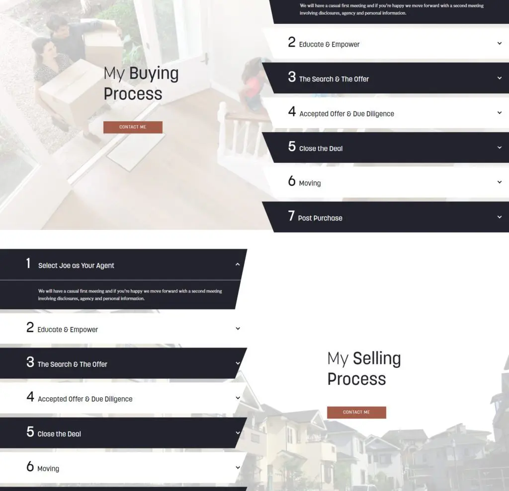
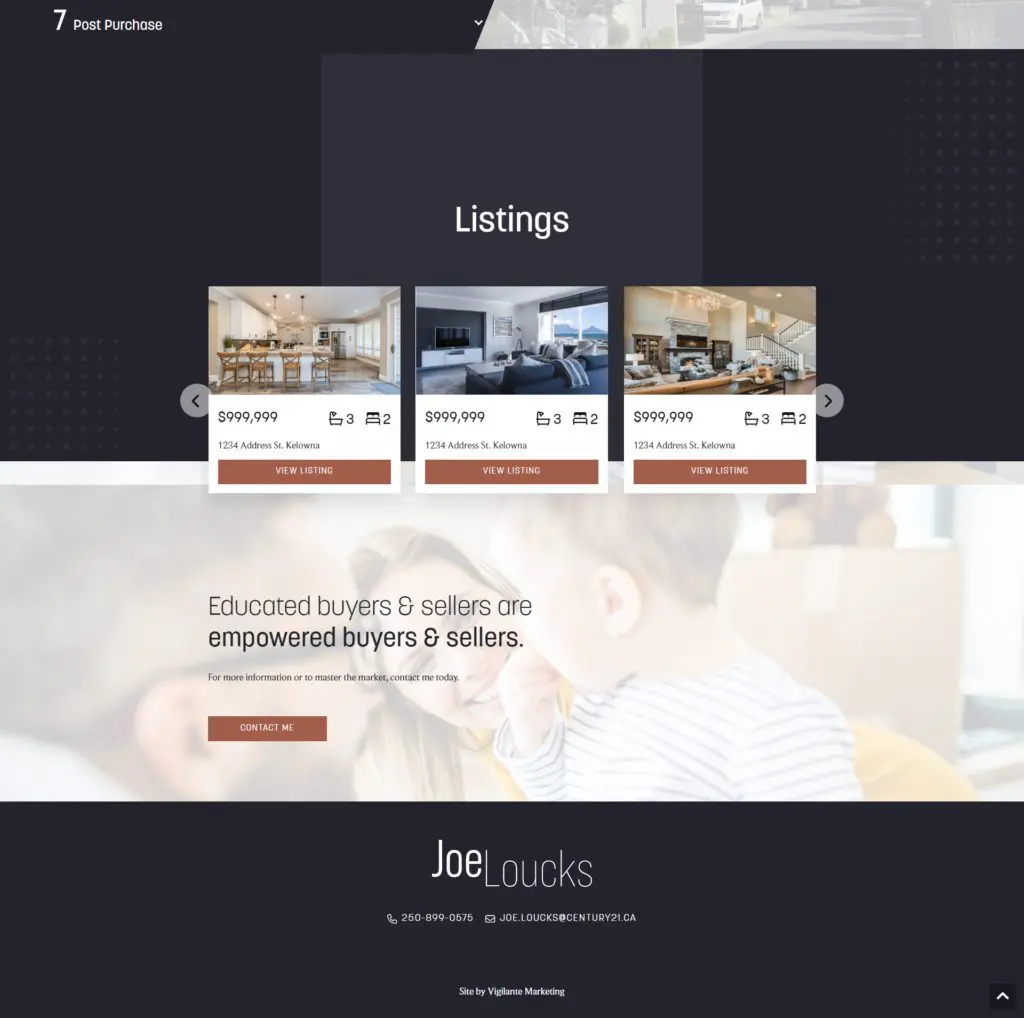
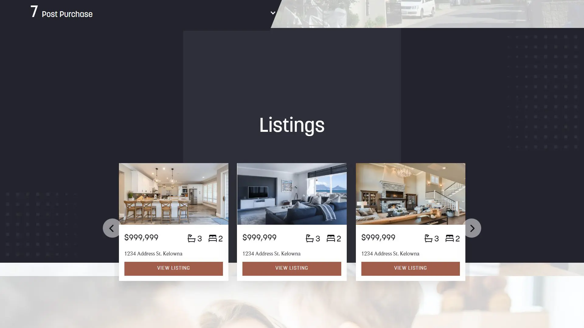
Tina also designed an infographic on the buying + selling process so that clients have a clear + honest picture of what they can expect when working with Joe Loucks. They need to understand precisely how Joe operates so they can make informed decisions about their purchases or sales. On the development side, Tina built the backend to be simple for Joe to use with custom post types that allow him to add and remove listings easily. In addition, the buying and selling sections were uniquely styled using CSS to add a fun way for clients to interact with Joe’s processes.
The Website
