It can be tempting to maximize available space in order to pack in information and dazzle the viewer. However, designing in this way can often have an adverse effect on conversions.
Often it is said that “less is more,” especially when it comes to design. Designing with white space in mind can improve user experience, accessibility, and positively influence the feel of your brand. Fortunately, there’s quick and easy ways to utilize white space in your work to make it stand out in the best way possible.
What is White Space?
White space is not literal gaps of white, but rather refers to the area in between and surrounding the elements of a design. It can be little things such as the gaps between lines of text, or the distance from heading to body copy. This is known as “micro” whitespace. On the other hand, “macro” whitespace includes things such as the area around entire text sections, and margins along the edges of pages.
How White Space Affects the User
User-Experience & Ease of Navigation
Ensuring that sections are clearly labeled and set apart from each other will help users flow through the page and find the information they’re looking for. Nothing is more frustrating than arriving at a website, feeling overwhelmed by the amount of info, and being unable to get what you need out of it. Whether you need to compile facts so you can make an informed purchasing decision, or know where the contact form is so you can learn more, the organization of the content can make or break your website. Use white space to create a visual hierarchy and make it easier to navigate through the page.

Legibility & Accessibility
What good is content if no one can actually read it? Paragraphs that are broken up effectively, with appropriate line height and distance from elements around it will be much more legible, especially to older audiences. The valuable information it contains will also be more easily absorbed, helping users to internalize it and remain in their memory even after they leave the page. Additionally, elements, particularly buttons, are also easier to interact with when they’re a reasonable distance from anything around them.
Focus
White space can effectively highlight important elements on the page, such as CTAs, or promote valuable selling points. It can both create emphasis and grab attention. Creative use of white space will help your design to stand out and keep users wanting more.
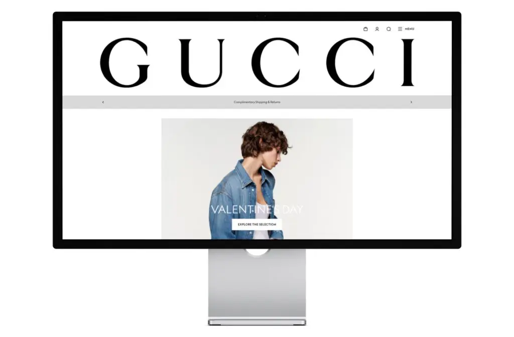
Brand Associations
Luxury and quality is often associated with brands that utilize plenty of white space. Examples include Apple, Tesla, and Rolex. They use simple headlines and stunning photography to draw attention to their products.
Common Mistakes
No Room to Breathe
Designs that put elements too close together can create a claustrophobic feeling, and make it difficult to know where one section ends and the next begins. If you have a lot to convey, try to break it up into bite-sized pieces.
Busy Banners
Fitting too many things “above the fold” can make the page feel cluttered and overwhelming. The term “above the fold” dates back as early as the birth of the printing press, and refers to content that can be seen before scrolling (or unfolding to the next page). Many people believe that this space must be maximized and promote every selling feature. However, this can immediately inundate users. As we’ve all become accustomed to mobile devices and social media, we are used to having to scroll to see more information. There’s nothing wrong with a bit of scrolling, so long as the content is laid out in a compelling way.
3 Easy Ways to Implement White Space
1. Text Treatment
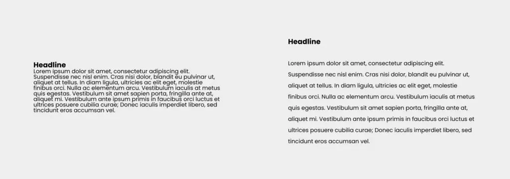
When it comes to body copy, the general rule of thumb is have your line height, also known as “leading,” 1.5x as much as the font size. For example, a font size of 16px (which is a great standard size for website body copy!) should have a line height of 32px for best legibility.
Break up long paragraphs into bite-sized pieces that are easier to absorb, around 5 to 6 sentences max.
2. Safety Bubbles

Unsure how much room to give your design elements? Try to imagine a safety bubble around each heading, paragraph, image. When elements stay out of each other’s safety bubble, designs feel much less “tight.”
3. Focal Point
Want to draw attention to something specific? Keep it short, sweet, and let it have its own space. You don’t always have to fit in all the facts. Ideally, the design should be able to catch a viewer’s eye and interest them in finding out more.
Embrace Space
Would you rather be greeted by a page packed full of articles, images, and CTAs, or met with a simple headline, intro statement and a logical CTA to find out more?
Try to consider your design from the perspective of an outsider. Oftentimes we get so caught up in the pursuit of successful conversions that we lose sight of the simplistic beauty of a good design. Don’t be afraid to let the elements speak for themselves, and be sure to give those visuals some air!


