GA4 Explained: What Businesses Still Get Wrong in…
Google Analytics 4 (GA4) has been the default analytics platform for more than a year now, yet many businesses are still struggling to trust their…

It’s easy to get swept up in using big, pretty words or rely only on flashy graphics. However, a successful landing page can be broken down into carefully planned sections, and if you want your landing page to actually convert, dissect your content using the following recommendations.
The banner should immediately captivate and lead the user into the rest of the page. Carefully consider: What message does your headline convey? Does the introductory paragraph clearly describe the product or service and compel the customer to read more? Is there an easy to find CTA?
Effective headlines are able to tap into customer psychology. Try playing into their self-interests, curiosity, or desire to be ahead of the curve. Alternatively, you could simply announce the convenience and unique benefits of your product that competitors don’t have. This headline should try not to be too wordy, nor too generic, and should avoid being abstract or exaggerated, as it can generate mistrust and confusion in the user.
Build on your headline with a succinct introductory paragraph, to further explain what you’re selling. Be careful not to over explain, as the following sections on the page will show, not just tell, why the user should want your product or service.

Complement this content with an image of your product or service. Bonus points if this includes a head or face, as this is a proven method to capture a viewer’s attention. The kind of stock photography recommended would be either:
The next sections will coax users from simply knowing about your product to needing it. By describing your product or service’s features, benefits, promotions, and potentially playing on the customer’s FOMO, you can boost more sales.
Features refer to the components of your product or service, such as a luxury car’s heated seats, a computer’s powerful graphics card, or a sweater’s luxury cashmere. On the other hand, benefits refer to how those features get the customer what they want out of it, like a comfortable drive even in extreme weather, a seamlessly vivid and high performance gaming experience, or being wrapped in quality you can both see and feel.
Customers want to experience your product or service making their life better. Describing it in beautiful detail can help them to picture themselves using it, which brings them one step closer to going through with the conversion.
Are there any promotions you can offer your customers to encourage them to follow through with the sale? Things like free trials, discounts, warranties, money back guarantees, freebies, samples, free shipping, and BOGO offers are all compelling bonuses to potential customers.
Some types of promotions can really light a fire under a consumer. Use limited time offers such as flash sales, member exclusives, and time-sensitive discount codes to create a sense of FOMO, or fear of missing out. The sense of urgency and feeling of exclusivity can lead to more conversions.
All that sounds great, but how can you prove to the user that your product or service actually delivers on what it says it does? Humans are social creatures by nature – and will often be inclined to like something that other people also like.
Show off the credibility of your product or service using positive reviews from other happy clients, or quotes from respected industry experts praising the product or service. The more people supporting your product, the more inclined a new buyer will want to give it a try.
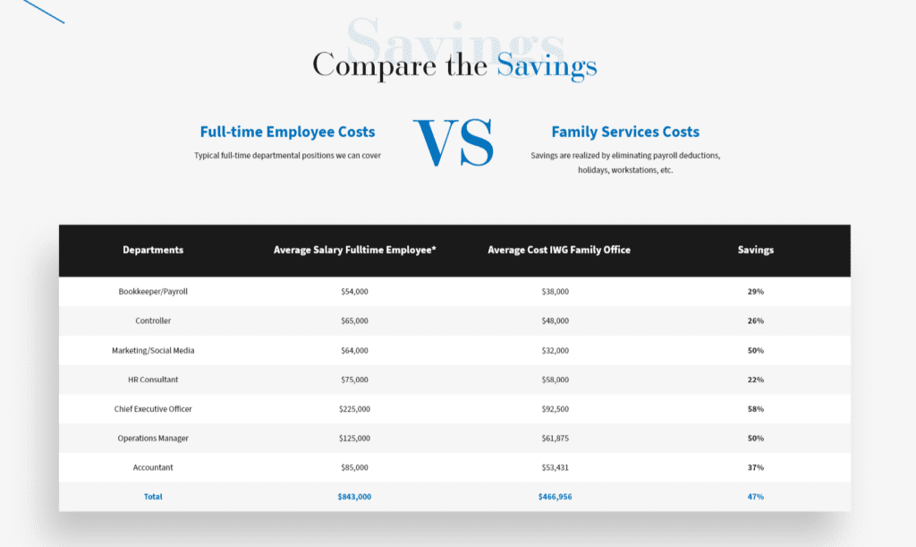
Present measurable statistics of pain points your product or service solves. Graphs, charts and percentiles are great ways to display this. Examples include:
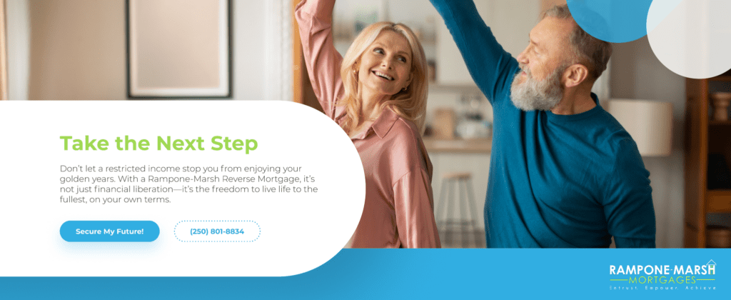
The final CTA should be very obvious on the page and easy to access. Ensure that there is always a way to access this objective by including buttons throughout the page, or a button that follows the user as they scroll. Additionally, completing this goal should be very easy: forms shouldn’t have an excessive amount of fields, and products should be quickly purchasable and allow as many convenient payment methods as possible.
It’s extremely common to find landing pages that do not link back to the company’s main website. What if the user is curious to see more about your company, or find more examples? Not having a way to reach that extra information leaves them at a deadend, and they likely won’t do any further research if it’s not easily accessible.
In this modern age of quick content, it’s easy to think less is always more. However, not providing enough info on your landing page could leave the potential customer unsatisfied or distrusting. Someone interested in your product or service should be able to read as much information as they want, and at any point be able to find the CTA once they’ve become convinced.
The team at Vigilante Marketing are experts at creating landing pages that convert. With our knowledgeable marketers, seasoned designers, and adept developers, we can bring your page from conceptual to converting. See our range of services, our past success stories, and contact us today to get your landing page off the ground.


