Have questions about paid ads, campaign optimisation, or platform features? Browse our knowledge base for step-by-step guides, FAQs, and expert insights to help you succeed.
How to use Grid Layouts
On This Page
When it comes to building a captivating website, having the right tools at your disposal is essential. You have information that your users want to know and you need to present it in a beautiful and cohesive way. That’s where Impreza’s Grid Layout feature comes into play!
Among the standout features, Impreza boasts a powerful grid layouts function that opens up a world of possibilities for web designers and developers. Whether you’re a seasoned pro or just starting out on your website-building journey, grid layouts provide a versatile and intuitive way to structure and present your content in rotating carousels or plain old grids.
In this article, we’ll delve into the realm of grid layouts, exploring their benefits and demonstrating how you can leverage this exceptional feature in Impreza.
Table of Contents
- What is a Grid Layout?
- Using Grid Layouts
- Building a Grid Layout
What is a Grid Layout?
A Grid Layout is a way of showing items (images, pages, portfolio pages, testimonials, products, and custom post types) inside a grid (list). In fact, Grid Layout is a set of post elements, their position, and their settings, which correspond to every grid item.
In this example, we have used a grid layout to display our portfolio of client projects.

Using Grid Layouts
In the Impreza WordPress theme, a grid layout can be viewed as a blueprint or a template for how your data is presented within different elements. Two of these elements that can utilize grid layouts are the carousel element and the grid / layout element.
Carousel Element
A carousel is a rotating set of items, used to display multiple pieces of content in a limited space. It’s interactive, letting users browse through the content items by clicking on navigation arrows or buttons. Carousels are great for showcasing multiple items, like a portfolio of work, customer testimonials, or a range of products in an e-commerce store.
For example, if you’re running an online clothing store, you might use a carousel on your homepage to highlight featured products. You could create a grid layout with the Product Image, Product Title, and “Add to Cart” Button elements and then apply this layout to your carousel. Each slide in the carousel would then show a featured product following this layout.
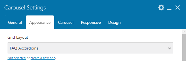
To set a grid layout for a carousel, simply select it under the carousel’s Appearance tab under the ‘Grid Layout’ option.
Grid / Layout Element
A grid / layout element, on the other hand, is a more static way of displaying multiple pieces of content. The content is organized into rows and columns, creating a clean, easily navigable layout. Grid / layout elements are ideal for situations where you have a lot of similar pieces of content, like a blog post archive, a product catalog, or a team members page.
For instance, if you’re creating a photography portfolio, you might use a grid layout to display your photographs. You could create a grid layout with a Post Image and Post Title for each photo’s title and image, then apply this layout to your grid / layout element.
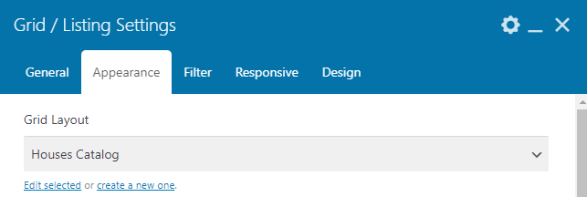
To set a grid layout for a grid / layout element, simply select it under the grid / layout’s Appearance tab under the ‘Grid Layout’ option.
Building a Grid Layout
To create a Grid Layout, you will want to navigate to VM Theme (or Impreza) > Grid Layouts. Once there, you can create new grid layouts or edit existing ones.
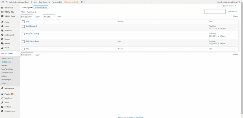
To create a new grid layout, simply click the ‘Add Grid Layout’ button at the top of the screen. You will then be navigated to the grid layout editing screen where you can build and edit your new grid layout. Don’t forget to give it a recognizable and relevant title too!
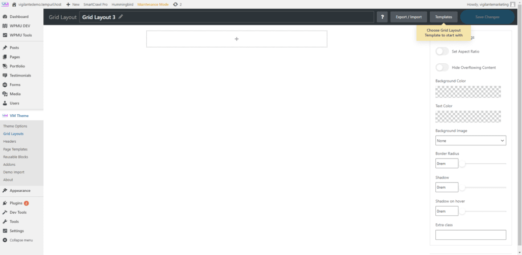
Click the big ‘+’ button to start adding elements. Keep reading to learn about each element and what they do!
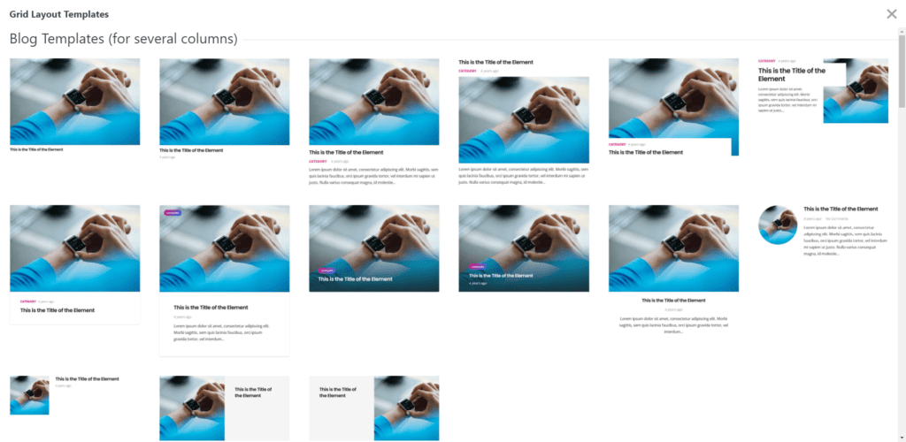
Grid Layout Templates
In addition to the option to create a grid layout from scratch, Impreza also offers a variety of pre-designed grid layout templates. These templates cover a wide range of use cases and can serve as a great starting point for your layout design.
To use a template, navigate to a Grid Layout or create a new one and then click ‘Templates’ from the option bar, Then select a template from the list. From there, you can use the template as-is or customize it to fit your needs.
By understanding and leveraging these settings, import/export options, and templates, you can master the powerful Grid Layouts feature in the Impreza WordPress Theme, creating stunning websites that captivate your audience.
Importing and Exporting Grid Layouts
Impreza’s Grid Layout feature also comes with the ability to import and export your grid layouts. This means that you can create a grid layout on one website and then export it for use on another website. Similarly, if you find a grid layout you like on another website, you can import it to your site.
Export
To export a grid layout, click on the ‘Export / Import’ button. A dialog box will open and you need to copy all of the data inside. The data that represents your grid layout will now be copied to your clipboard.
Import
To import a grid layout, navigate to the same section and click on the ‘Export / Import button again. Then, paste in the data that you copied from and click ‘Import Grid Layout’. Your new grid layout will appear right before your eyes!
Grid Layout Settings
Impreza’s Grid Layout Settings offer extensive options to manipulate your layout exactly the way you want. Let’s dive deeper into these customization settings:
Set Aspect Ratio
The Set Aspect Ratio is a toggle button that allows you to fix the ratio between the width and height of your grid cells, ensuring they all share the same proportions. Once this is toggled on, the ‘Hide Overflowing Content’ button disappears, replaced by a dropdown menu to select your preferred aspect ratio.
The available aspect ratios include:
- 1×1 Square
- 4×3 Landscape
- 3×2 Landscape
- 16:9 Landscape
- 2×3 Portrait
- 3×4 Portrait
- Custom (where you can enter your desired aspect ratio)
These predefined ratios cater to a variety of design needs, while the Custom option provides ultimate flexibility.
Hide Overflowing Content
If the ‘Set Aspect Ratio’ is not activated, you’ll see the Hide Overflowing Content toggle button. This setting enables you to hide any content exceeding the boundaries of a grid cell, ensuring a neat and consistent layout.
Background Color and Text Color
The Background Color and Text Color settings allow you to set the color scheme for your grid cells. You can match these colors with your overall site design, or use contrasting colors to make certain elements stand out.
Background Image
With the Background Image setting, you can choose to fill the background of a grid cell with an image. This can be a powerful tool for creating visually striking layouts or enhancing your brand presence.
Border Radius
The Border Radius setting allows you to adjust the curvature of your grid cell corners, giving your layout a softer, more rounded look if desired. This setting is controlled by a slider and is measured in REMs, a unit that is relative to the root element’s font-size.
Shadow and Shadow on Hover
The Shadow setting applies a drop-shadow effect to your grid cells, adding depth to your layout. The Shadow on Hover setting applies a drop-shadow effect only when the mouse cursor hovers over a cell. Both settings can be adjusted with a slider measured in REMs, allowing you to control the intensity of the shadow effects.
Extra Class
The Extra Class setting allows you to add custom CSS classes to your grid layout. With this, you can apply any additional styles or behaviors to your layout beyond what’s available in the standard settings. This can be useful for integrating your layout with other plugins or custom scripts.
Elements of a Grid Layout
Below you will find information on each of the available elements that can make up a grid layout. Each of the elements has its own specific settings, and some are shared between all of them.
Additionally, these elements will all have a ‘Design’ tab where you can edit the particular style of the element. You can read more about it in our Design Settings for Theme Elements article. You may also see a ‘Hover Effect’ tab where, when enabled, you can alter the style of the element for when it is being hovered over. The ‘Appearance’ tab contains some more appearance-related settings, and the ‘Display Logic’ tab contains settings on when or when not an element will be displayed.
Post Image
The Post Image block displays the featured image for a given post. It can be adjusted to any size and aligned in your layout as per your need. You might use this block in a portfolio grid layout, with each image linking to a detailed project description.
The Post Image block has many settings you can customize:
Post Image Options
- Show placeholder when post image is absent: This setting allows you to display the site’s set placeholder image when a post does not have a featured image. This ensures that your grid layout remains consistent even when a post image is missing.
- Show media preview for posts with video, audio and gallery format: With this setting enabled, posts that have a video, audio, or gallery format will display a preview of the media in place of the post image. This gives users a sneak peek of the multimedia content and can increase engagement.
- Enable rounded image: This setting lets you display the post image with rounded corners. Rounded images can give your layout a softer, more modern look.
- Set Aspect Ratio: Just like with the grid layout settings, this setting allows you to control the proportion between the width and the height of your post image. It ensures your images maintain a consistent size across all posts. When toggled, the ‘Stretch the image to the container width’ option disappears and you are given the option to select from various predefined aspect ratios or set a custom one.
- Stretch the image to the container width: If the ‘Set Aspect Ratio’ is not activated, you’ll see the Stretch the image to the container width toggle button. This setting allows you to make the post image take up the full width of its container. This can be useful when you want your images to stand out more in your layout.
- Disable Lazy Loading: Lazy loading is a technique where images are only loaded as they come into view on the user’s screen, which can improve page load speed. However, there might be instances where you want an image to load immediately, regardless of its position on the page. The ‘Disable Lazy Loading’ setting allows you to do just that.
- Image Size: The Image Size option allows you to define the dimensions of the images displayed within your grid layout. You can choose from a dropdown menu of predefined size options, including:
- Full Size: This option displays the image in its original dimensions without any cropping or resizing.
- 150×150 cropped: Selecting this option will crop the image to a square shape with dimensions of 150 pixels by 150 pixels.
- 300×300: This option resizes the image to have dimensions of 300 pixels by 300 pixels.
- 1024×1024: Choosing this option resizes the image to have dimensions of 1024 pixels by 1024 pixels.
- Link: The Link option offers various options to determine how the image behaves when clicked within the grid layout. When you open the dropdown menu, you will find the following choices:
- None: This option means that the image will not have any clickable link associated with it.
- To a post: Selecting this option will create a link that directs users to the post to which the grid layout is attached.
- Open original image in a popup: This option opens the original image in a popup window when the image is clicked, allowing users to view it in a larger size.
- Custom Link from custom appearances in grid: If you have defined a custom link in the custom appearances in Grid, this option allows you to link the image to that specific custom link.
- Custom fields: This option allows you to link the image to any applicable custom fields within your WordPress site.
- Custom: With this option, you can provide a custom URL to link the author element to any desired webpage. Additionally, you have the option to choose whether the link opens in a new tab.
- Open link in a new tab: By checking this checkbox, the linked image will open in a new browser tab when clicked, ensuring that users stay on your website.
Post Title
The Post Title block shows the title of your post. This is often used alongside Post Image and Post Content in a grid layout to provide an overview of blog posts, articles, or products. The Post Title block’s design can be customized, like its font style, size, and color, making it catchier. This could be used in a news site layout, where the title of each article draws readers’ attention.
Post Title Options
- Link: The Link option offers various options to determine how the title behaves when clicked within the grid layout. When you open the dropdown menu, you will find the following choices:
- None: This option means that the title will not have any clickable link associated with it.
- To a post: Selecting this option will create a link that directs users to the post to which the grid layout is attached.
- Custom Link from Custom appearances in Grid: If you have defined a custom link in the custom appearances in Grid, this option allows you to link the text to that specific custom link.
- Custom fields: This option allows you to link the text to any applicable custom fields within your WordPress site.
- Custom: With this option, you can provide a custom URL to link the author element to any desired webpage. Additionally, you have the option to choose whether the link opens in a new tab.
- Open link in a new tab: By checking this checkbox, the linked text will open in a new browser tab when clicked, ensuring that users stay on your website.
- Link Color: The Link Color toggle allows you to choose if the text will inherit the color from the surrounding text.
- Alignment: The Alignment option lets you choose the alignment of the post title text within its designated space. You can select between left alignment, center alignment, or right alignment. This option allows you to control the positioning of the post title and create a visually balanced grid layout.
- HTML Tag: The HTML Tag option enables you to specify the HTML tag that should be used for the post title. When clicked, a dropdown menu appears, offering various options. These options include:
- All heading tags (h1, h2, h3, h4, h5, h6): Each heading tag represents a different level of importance, with h1 being the highest and h6 being the lowest. Choosing the appropriate heading tag helps define the structure and hierarchy of your content.
- Div: Selecting the div tag allows you to enclose the post title in a divisional container, providing more flexibility for styling and formatting.
- Span: The span tag is an inline element that can be used to apply additional styling to specific parts of the post title or group multiple elements together.
- P: Choosing the p tag assigns the post title as a paragraph element, which is typically used for blocks of text.
- Show Number of Posts in the Current Term: Enabling this toggle displays the number of posts associated with the current term, such as a category or tag, alongside the post title. This option is particularly useful for organizing and presenting a list of posts within a specific term category.
Post Date
The Post Date block shows when a post was published. It’s useful for blog listings or news sites, helping users see the recency of your content. You can format the Post Date block in numerous ways to suit your design. For instance, in a grid layout for a travel blog, each post could display the date of the travel experience.
Post Date Options
- Show: The Show option allows you to choose between displaying the “Date of creation” or “Date of update” for the post. Depending on your preference, you can showcase either the original creation date or the most recent update date for the post.
- Date Format: The Date Format option offers a dropdown menu with various options to determine how the date and time are presented. The available choices are as follows:
- Human friendly: This option displays the date and time in a user-friendly format, such as “Today at 11:04” or “Yesterday at 08:55,” providing a more casual and readable representation.
- Time difference: Selecting this option shows the time elapsed since the post was created or updated, such as “5 hours ago” or “3 months ago,” providing a relative timeframe.
- Default: This option presents the date in a standard format, such as “June 1, 2023,” offering a traditional and recognizable style.
- DD M, HH:MM: Choosing this format displays the date in a shortened form with the month abbreviation and the time, like “1 Jun, 14:11.”
- DD/MM/YYYY: This format represents the date in the mm/dd/yyyy format, such as “06/01/2023,” commonly used in many regions.
- DD.MM.YY: This format presents the date with dots as separators, such as “1.06.23.”
- Custom: Selecting the custom option allows you to define your own format by following the guidelines provided in the WordPress documentation on formatting date and time. The custom format option provides flexibility to meet specific requirements.
- Icon: The “Icon” option enables you to choose a Font Awesome icon to be displayed before the post date. Font Awesome offers a wide range of icons that you can select from using the dropdown menu. This allows you to add visual elements and enhance the aesthetic appeal of the post date display.
- Text before value: The “Text before value” field allows you to enter text that will appear before the post date value. This option provides the flexibility to add context or additional information, such as “Posted on” or “Last updated”, giving your website visitors a clearer understanding of the displayed date.
Post Taxonomy
The Post Taxonomy block allows you to display categories or tags assigned to a post. This is beneficial for organizing your posts and helping users navigate your content. For instance, in a recipe blog, you might use Post Taxonomy to tag each recipe with its cuisine type. The design of the Post Taxonomy block can also be customized.
Post Taxonomy Options
- Show: The Show dropdown allows you to select which taxonomies should be displayed. You can choose from default WordPress taxonomies like categories or any custom taxonomies that you have created for your website.
- Display as: The Display as option lets you choose between displaying the post taxonomy as text or as a button. Selecting “Text” will show the taxonomy name in plain text, while choosing “Button” will present it as a clickable button element.
- Separator between items: The Separator between items option allows you to pick a symbol or character to be used as a separator between multiple taxonomies when they are displayed together. This helps visually distinguish between different taxonomies and enhances the readability of the content.
- Link: The Link option enables you to specify the link destination when the taxonomy element is clicked. You have the following choices:
- To a Post: This option links the taxonomy element to a specific post, allowing users to navigate directly to that post.
- To a Post Archive: Selecting this option links the taxonomy element to the corresponding post archive page, where all posts associated with that taxonomy are listed.
- Custom: The Custom option allows you to set a custom link for the taxonomy element. You can enter the desired URL to redirect users to any specific webpage.
- Open link in a new tab: By checking this checkbox, the linked taxonomy element will open in a new browser tab when clicked, ensuring that users stay on your website while exploring the linked content.
- Link Color: The Link Color toggle allows you to choose if the text will inherit the color from the surrounding text.
- Icon: The “Icon” option enables you to choose a Font Awesome icon to be displayed before the post taxonomy. Font Awesome offers a wide range of icons that you can select from using the dropdown menu.
- Text before value: The “Text before value” field allows you to enter text that will appear before the post taxonomy value. By utilizing the “Text before value” option , you can provide context or additional information to help users better understand the taxonomy value displayed within your grid layouts. This can be useful when showcasing categories, tags, or any other taxonomy types related to your posts.
Post Author
The Post Author block displays the author of a post. This is especially useful for multi-author blogs or online publications where individual author recognition is necessary. You can adjust the Post Author block’s design to make it more prominent. In a multi-author online magazine, you might use this block in a sidebar to highlight the authors of featured articles.
Post Author Options
- Link: The Link option allows you to add a clickable link to the author element. You have multiple options to choose from:
- To the page with the Author’s posts: This option creates a link to a page that displays all posts by the author.
- To the Author’s website (if specified on his profile): If the author has a website specified in their profile, this option creates a link to their website.
- To a Post: This option allows you to link the author element to a specific post within the grid layout.
- Custom: With this option, you can provide a custom URL to link the author element to any desired webpage. Additionally, you have the option to choose whether the link opens in a new tab.
- None: Selecting this option removes the clickable link from the author element.
- Link Color: The Link Color toggle allows you to choose if the text will inherit the color from the surrounding text.
- Profile Picture: Enabling the Profile Picture toggle displays the author’s profile picture within the grid layout. When clicked, this option allows you to specify the picture width in pixels. Additionally, you can choose whether the picture should be positioned at the top or left side of the author element.
- Post Count: Enabling the Post Count toggle shows the number of posts by the author within the grid layout. This option can be useful to highlight the author’s contribution or expertise.
- Website: Enabling the Website toggle displays the author’s website within the grid layout, provided it is specified in their profile. This option allows users to easily access the author’s website for more information or to explore their work further.
- Biographical Info: Enabling the Biographical Info toggle shows the author’s biographical information within the grid layout. This option provides additional context or background about the author, helping users to understand their expertise or interests.
- Icon: The “Icon” option enables you to choose a Font Awesome icon to be displayed before the post author. Font Awesome offers a wide range of icons that you can select from using the dropdown menu.
Post Comments
The Post Comments block shows the number of comments a post has received. This is a great way to engage your audience and show the level of discussion on your articles. Customizing the Post Comments block can stimulate reader interaction. For example, on a movie review website, showing the number of comments could encourage more readers to join the discussion.
Post Comments Options
- Hide this element if no comments: Enabling this option ensures that the comment section is hidden in the grid layout if there are no comments associated with the post. This can be useful to maintain a clean and streamlined appearance when there are no comments to display.
- Show only number: Enabling this option allows you to display only the number of comments associated with the post. This can be useful when you want to provide a quick visual indicator of the comment count without showing the actual comments themselves.
- Link: The Link option provides different options for linking the comment section within the grid layout. The available options are:
- To a Post comments: Selecting this option creates a link that directs users to the post’s comments section when clicked. This allows visitors to easily access and engage with the comments related to the post.
- Custom: With this option, you can provide a custom URL to link the author element to any desired webpage. Additionally, you have the option to choose whether the link opens in a new tab.
- None: Choosing this option means that no link will be associated with the comment section in the grid layout. This can be useful if you prefer not to provide a direct link to the comments or if the comment section is not applicable to your content.
- Link Color: The Link Color toggle allows you to choose if the text will inherit the color from the surrounding text.
- Icon: The “Icon” option enables you to choose a Font Awesome icon to be displayed before the post comments. Font Awesome offers a wide range of icons that you can select from using the dropdown menu.
Post Content
The Post Content block shows a snippet or the entirety of a post’s content. This is often used with the Post Title and Post Image to provide a preview of a post. You can also show an excerpt (if enabled) here. The Post Content block can be customized to show the exact amount of content you want. In a recipe blog layout, this could be used to show a brief introduction or key ingredients for each recipe.
Post Content Options
- Show: The Show option determines how much of the post content will be displayed. The available options are:
- Excerpt, if it’s empty, show part of a content: Enabling this option allows you to show a predefined portion of the post content as an excerpt. If the post has no excerpt, you can specify the amount of content to display using the “Amount of words in Excerpt” and “Amount of words in Content” sliders. HTML tags, line breaks, and shortcodes will be stripped in the displayed excerpt or content.
- Excerpt, if it’s empty, show nothing: Selecting this option ensures that only the excerpt of the post is displayed based on the specified number of words using the “Amount of words in Excerpt” slider. If the post does not have an excerpt, nothing will be shown.
- Part of a content: This option displays a portion of the post content based on the specified number of words using the “Amount of words in Content” slider. HTML tags, line breaks, and shortcodes will be stripped in the displayed content.
- Full content: Enabling this option allows you to display the entire content of the post. This option also provides additional customization choices, such as excluding rows and columns from the post content. Dropdown options for excluding rows and columns:
- None: Selecting this option means that no rows or columns will be excluded from the post content.
- Inside a content: This option excludes rows and columns that are located inside the post content.
- Around this element: Selecting this option excludes rows and columns that surround the post content.
- Toggle for stretching content of rows to the full width: Enabling this toggle ensures that the rows containing the post content stretch to the full width of the grid layout, creating a visually pleasing and cohesive design.
- Hide part of a content with the “Show More” link: Under the ‘More Options’ tab you will find this toggle which, when enabled, will hide part of the content behind a ‘Show More’ link. Options for this include:
- Height of visible content: Define the height of the visible content in pixels.
- Text when content is hidden: Set text to be shown when content is hidden.
- Text when content is shown: Set text to be shown when content is shown. Leave blank to prevent content from being hidden again.
- Alignment: Pick the text alignment between left, center, and right.
Post Custom Field
The Post Custom Field block lets you display custom fields from your post. This is a highly flexible feature that can be used in a variety of ways, such as showing additional product information on an e-commerce site. The Post Custom Field block can be tailored to show extra details. For example, in a real estate listing, this block could show key details like location, size, or price.
Post Custom Field Options
- Set Aspect Ratio: Just like with the grid layout settings, this setting allows you to control the proportion between the width and the height of your post image. It ensures your images maintain a consistent size across all posts. When toggled, the ‘Stretch the image to the container width’ option disappears and you are given the option to select from various predefined aspect ratios or set a custom one.
- Stretch the image to the container width: If the ‘Set Aspect Ratio’ is not activated, you’ll see the Stretch the image to the container width toggle button. This setting allows you to make the post image take up the full width of its container. This can be useful when you want your images to stand out more in your layout.
- Disable Lazy Loading: Lazy loading is a technique where images are only loaded as they come into view on the user’s screen, which can improve page load speed. However, there might be instances where you want an image to load immediately, regardless of its position on the page. The ‘Disable Lazy Loading’ setting allows you to do just that.
- Image Size: The Image Size option allows you to define the dimensions of the images displayed within your grid layout. You can choose from a dropdown menu of predefined size options, including:
- Full Size: This option displays the image in its original dimensions without any cropping or resizing.
- 150×150 cropped: Selecting this option will crop the image to a square shape with dimensions of 150 pixels by 150 pixels.
- 300×300: This option resizes the image to have dimensions of 300 pixels by 300 pixels.
- 1024×1024: Choosing this option resizes the image to have dimensions of 1024 pixels by 1024 pixels.
- Hide this element if its value is empty: Toggle that will hide this element if its value is empty.
- Link: The Link option offers various options to determine how the image behaves when clicked within the grid layout. When you open the dropdown menu, you will find the following choices:
- None: This option means that the image will not have any clickable link associated with it.
- To a post: Selecting this option will create a link that directs users to the post to which the grid layout is attached.
- Open original image in a popup: This option opens the original image in a popup window when the image is clicked, allowing users to view it in a larger size.
- Clickable value (email, phone, website): Uses the button label as a link. For example, “[email protected]” adds the “mailto:[email protected]”.
- Onclick JavaScript action: Execute a Javascript event or action on click, like returning a value.
- Custom Link from custom appearances in grid: If you have defined a custom link in the custom appearances in Grid, this option allows you to link the image to that specific custom link.
- Custom fields: This option allows you to link the image to any applicable custom fields within your WordPress site.
- Custom: With this option, you can provide a custom URL to link the author element to any desired webpage. Additionally, you have the option to choose whether the link opens in a new tab.
- Open link in a new tab: By checking this checkbox, the linked image will open in a new browser tab when clicked, ensuring that users stay on your website.
- Icon: Under the ‘Appearance’ tab you will find the “Icon” option which enables you to choose a Font Awesome icon to be displayed before the post custom field. Font Awesome offers a wide range of icons that you can select from using the dropdown menu.
- Text before value and Text after value: Under the ‘Appearance’ tab you will find the ‘Text before value’ and ‘Text after value’ options which lets you add any custom text to appear before or after the post custom field.
Button
The design of the Button block can be customized to match your website’s style. For instance, in a product grid layout, ‘Buy Now’ buttons could be colored to stand out.
Button Options
- Button Label: The Button Label option allows you to enter the text that will be displayed on the button. You can customize the label to suit your desired call-to-action or message.
- Link: The Link option offers various options to determine how the button behaves when clicked within the grid layout. When you open the dropdown menu, you will find the following choices:
- None: This option means that the button will not have any clickable link associated with it.
- To a post: Selecting this option will create a link that directs users to the post to which the grid layout is attached.
- Clickable value (email, phone, website): Uses the button label as a link. For example, “[email protected]” adds the “mailto:[email protected]”.
- Onclick JavaScript action: Execute a Javascript event or action on click, like returning a value.
- Custom Link from custom appearances in grid: If you have defined a custom link in the custom appearances in Grid, this option allows you to link the button to that specific custom link.
- Custom fields: This option allows you to link the button to any applicable custom fields within your WordPress site.
- Custom: With this option, you can provide a custom URL to link the author element to any desired webpage. Additionally, you have the option to choose whether the link opens in a new tab.
- Open link in a new tab: By checking this checkbox, the linked button will open in a new browser tab when clicked, ensuring that users stay on your website.
- Icon: The “Icon” option enables you to choose a Font Awesome icon to be displayed before the button. Font Awesome offers a wide range of icons that you can select from using the dropdown menu.
- Icon Position: The Icon Position lets you determine the placement of the icon in relation to the button’s text. You can choose between displaying the icon before the text or after the text to achieve the desired visual arrangement.
Custom HTML
The Custom HTML block lets you add any HTML code to your layout. This can be used to integrate third-party widgets, add custom styles, or embed multimedia content. The Custom HTML block lets you add your own styling or embed other content. For example, in a music blog layout, you might use this block to embed a music player for each post.
Horizontal and Vertical Wrappers
The Horizontal Wrapper and Vertical Wrapper blocks allow you to group other blocks together in a horizontal or vertical arrangement, respectively. This is useful for structuring your layout and aligning blocks as per your design needs. These wrapper blocks help structure your layout. For example, in a news article layout, a Horizontal Wrapper might contain the Post Title, Post Date, and Post Author, while a Vertical Wrapper holds the Post Image and Post Content.
Horizontal Wrappers Options
- Items Horizontal Alignment: The “Items Horizontal Alignment” setting for the horizontal wrapper in a Grid Layout allows you to control the horizontal positioning of the items within the wrapper.
- Left: Selecting the “Left” alignment option positions the items to the left side of the horizontal wrapper. This means that the items will be aligned along the left edge of the grid, creating a left-aligned layout.
- Center: Choosing the “Center” alignment option centers the items horizontally within the horizontal wrapper. This means that the items will be evenly distributed with equal spacing on both sides, resulting in a centered layout.
- Right: Selecting the “Right” alignment option positions the items to the right side of the horizontal wrapper. This means that the items will be aligned along the right edge of the grid, creating a right-aligned layout.
- Justify: The “Justify” alignment option distributes the items evenly within the horizontal wrapper, filling the entire width of the grid. This means that the items will have equal spacing between them, resulting in a fully justified layout.
- Items Vertical Alignment: The “Items Vertical Alignment” feature for the horizontal wrapper in a Grid Layout allows you to control the vertical alignment of the items within the wrapper.
- Top: Selecting the “Top” alignment option vertically aligns the items to the top within the vertical wrapper. This means that the items will be positioned at the top of the wrapper, creating a layout where the top edges of the items are aligned.
- Middle: Choosing the “Middle” alignment option vertically centers the items within the vertical wrapper. This means that the items will be positioned in the middle vertically, resulting in a layout where the items are centered within the wrapper.
- Bottom: Selecting the “Bottom” alignment option aligns the items to the bottom within the vertical wrapper. This means that the items will be positioned at the bottom of the wrapper, creating a layout where the bottom edges of the items are aligned.
- Justify: Choosing the “Justify” alignment option distributes the items evenly along the vertical axis within the vertical wrapper. This means that the items will be spaced out evenly, filling the entire height of the wrapper.
- Gap between Items: The “Gap between Items” option for the vertical wrapper in a Grid Layout allows you to control the spacing between the items within the grid horizontally. This feature provides a slider that measures the gap in REM units. By adjusting the “Gap between Items” slider, you can increase or decrease the vertical spacing between the items, creating different levels of visual separation. Here’s an explanation of how this feature works:
- Decreasing the value: Moving the slider towards the left or decreasing the value reduces the gap between the items. This means that the items will be positioned closer together vertically, resulting in a tighter layout with minimal spacing between the elements.
- Increasing the value: Moving the slider towards the right or increasing the value widens the gap between the items. This means that the items will have more vertical spacing between them, creating a more visually separated layout with increased whitespace.
Vertical Wrappers Options
- Items Horizontal Alignment: The “Items Horizontal Alignment” setting for the horizontal wrapper in a Grid Layout allows you to control the horizontal alignment of the items within the wrapper.
- None: Selecting the “None” alignment option means that no specific horizontal alignment will be applied to the items within the vertical wrapper. The items will maintain their default horizontal positioning.
- Left: Choosing the “Left” alignment option aligns the items horizontally to the left within the vertical wrapper. This means that the items will be positioned along the left edge of the wrapper, creating a left-aligned layout.
- Center: Selecting the “Center” alignment option horizontally centers the items within the vertical wrapper. This means that the items will be positioned in the middle of the wrapper horizontally, resulting in a centered layout.
- Right: Choosing the “Right” alignment option aligns the items horizontally to the right within the vertical wrapper. This means that the items will be positioned along the right edge of the wrapper, creating a right-aligned layout.
- Items Vertical Alignment: The “Items Vertical Alignment” feature for the horizontal wrapper in a Grid Layout allows you to control the vertical positioning of the items within the grid. This feature provides options to align the items based on your design preferences and requirements.
- Top: Selecting the “Top” alignment option positions the items at the top of the vertical space within the horizontal wrapper. This means that the items will be aligned along the top edge of the grid, creating a top-aligned layout.
- Middle: Choosing the “Middle” alignment option centers the items vertically within the horizontal wrapper. This means that the items will be vertically aligned in the middle of the grid, resulting in a centered layout.
- Bottom: Selecting the “Bottom” alignment option positions the items at the bottom of the vertical space within the horizontal wrapper. This means that the items will be aligned along the bottom edge of the grid, creating a bottom-aligned layout.
- Baseline: The “Baseline” alignment option aligns the items based on their baseline, which is the imaginary line upon which characters in a line of text rest. This option is particularly useful when aligning text elements within the grid, ensuring consistent alignment along the baseline.
- Stretch: The “Stretch” alignment option stretches the items vertically to fill the entire height of the horizontal wrapper. This means that the items will expand vertically to occupy the available space within the grid, resulting in a stretched layout.
- Gap between Items: The “Gap between Items” option for the horizontal wrapper in a Grid Layout allows you to control the spacing between the items within the grid horizontally. This feature provides a slider that measures the gap in REM units. By adjusting the “Gap between Items” slider, you can increase or decrease the horizontal spacing between the items, creating different levels of visual separation. Here’s an explanation of how this feature works:
- Decreasing the value: Moving the slider towards the left or decreasing the value reduces the gap between the items. This means that the items will be positioned closer together horizontally, resulting in a tighter layout with minimal spacing between the elements.
- Increasing the value: Moving the slider towards the right or increasing the value widens the gap between the items. This means that the items will have more horizontal spacing between them, creating a more visually separated layout with increased whitespace.
Text
The Text block allows you to add arbitrary text to your layout. This can be used to add headings, captions, or body text to your layout. The Text block can be used anywhere you need extra information. For instance, in an e-commerce product layout, you could use a Text block to highlight a product’s unique feature.
Text Options
- Text: Type the text you want to display.
- Link: The Link option offers various options to determine how the text behaves when clicked within the grid layout. When you open the dropdown menu, you will find the following choices:
- None: This option means that the text will not have any clickable link associated with it.
- To a post: Selecting this option will create a link that directs users to the post to which the grid layout is attached.
- Onclick JavaScript action: Execute a Javascript event or action on click, like returning a value.
- Custom Link from Custom appearances in Grid: If you have defined a custom link in the custom appearances in Grid, this option allows you to link the text to that specific custom link.
- Custom fields: This option allows you to link the text to any applicable custom fields within your WordPress site.
- Custom: With this option, you can provide a custom URL to link the author element to any desired webpage. Additionally, you have the option to choose whether the link opens in a new tab.
- Open link in a new tab: By checking this checkbox, the linked text will open in a new browser tab when clicked, ensuring that users stay on your website.
- HTML Tag: The HTML Tag option enables you to specify the HTML tag that should be used for the post title. When clicked, a dropdown menu appears, offering various options. These options include:
- All heading tags (h1, h2, h3, h4, h5, h6): Each heading tag represents a different level of importance, with h1 being the highest and h6 being the lowest. Choosing the appropriate heading tag helps define the structure and hierarchy of your content.
- Div: Selecting the div tag allows you to enclose the post title in a divisional container, providing more flexibility for styling and formatting.
- Span: The span tag is an inline element that can be used to apply additional styling to specific parts of the post title or group multiple elements together.
- P: Choosing the p tag assigns the post title as a paragraph element, which is typically used for blocks of text.
- Icon: The “Icon” option enables you to choose a Font Awesome icon to be displayed before the text. Font Awesome offers a wide range of icons that you can select from using the dropdown menu.
- Icon Position: The Icon Position lets you determine the placement of the icon in relation to the text. You can choose between displaying the icon before the text or after the text to achieve the desired visual arrangement.
Image
The Image block allows you to add arbitrary images to your layout. This can be used to add informational decorative images to your layout. The Image block can be used anywhere you need extra some extra visual information. For instance, in an e-commerce product layout, you could use an Image block to show a related product.
Image Options
- Image Selector: Click the ‘+’ to select an image from the Media Library or upload something new!
- Set Aspect Ratio: Just like with the grid layout settings, this setting allows you to control the proportion between the width and the height of your post image. It ensures your images maintain a consistent size across all posts. When toggled, the ‘Stretch the image to the container width’ option disappears and you are given the option to select from various predefined aspect ratios or set a custom one.
- Disable Lazy Loading: Lazy loading is a technique where images are only loaded as they come into view on the user’s screen, which can improve page load speed. However, there might be instances where you want an image to load immediately, regardless of its position on the page. The ‘Disable Lazy Loading’ setting allows you to do just that.
- Image Style: The Image Style option lets you pick from a list of pre-made styles for your image. These include None, Circle, Outlined, and many more.
- Image Size: The Image Size option allows you to define the dimensions of the images displayed within your grid layout. You can choose from a dropdown menu of predefined size options, including:
- Full Size: This option displays the image in its original dimensions without any cropping or resizing.
- 150×150 cropped: Selecting this option will crop the image to a square shape with dimensions of 150 pixels by 150 pixels.
- 300×300: This option resizes the image to have dimensions of 300 pixels by 300 pixels.
- 1024×1024: Choosing this option resizes the image to have dimensions of 1024 pixels by 1024 pixels.
- Link: The Link option offers various options to determine how the image behaves when clicked within the grid layout. When you open the dropdown menu, you will find the following choices:
- None: This option means that the image will not have any clickable link associated with it.
- To a post: Selecting this option will create a link that directs users to the post to which the grid layout is attached.
- Open original image in a popup: This option opens the original image in a popup window when the image is clicked, allowing users to view it in a larger size.
- Onclick JavaScript action: Execute a Javascript event or action on click, like returning a value.
- Custom Link from custom appearances in grid: If you have defined a custom link in the custom appearances in Grid, this option allows you to link the image to that specific custom link.
- Custom fields: This option allows you to link the image to any applicable custom fields within your WordPress site.
- Custom: With this option, you can provide a custom URL to link the author element to any desired webpage. Additionally, you have the option to choose whether the link opens in a new tab.
Product Data and “Add to Cart” Button
The Product Data block displays specific information about a product, such as its price or rating. The “Add to Cart” Button allows users to directly add a product to their cart. Both of these are particularly useful for e-commerce sites. The design of both can be customized to match your website’s style. For example, in a product grid layout, the “Add to Cart” button could be highlighted while the Product Data block shows key information like price and ratings.
Product Data Options
- Show: This option lets to select what product data you want to show. You can pick from the following options:
- Price
- Rating
- SKU
- Sale Badge
- Weight
- Dimensions
- List of attributes
- Stock status
- Actions for plugins compatibility
“Add to Cart” Button Options
- Show link to cart when adding products: This option allows you to show a link to the cart when adding products to it.
Still haven’t found what you’re looking for?
Let us know and we’ll do our best to help out!