Have questions about paid ads, campaign optimisation, or platform features? Browse our knowledge base for step-by-step guides, FAQs, and expert insights to help you succeed.
Design Settings for Theme Elements
On This Page
One of the standout features of Impreza is its robust ‘Design’ tab, which provides a comprehensive set of tools to customize the appearance of various elements throughout your website. Whether you want to tweak the typography, adjust spacing, apply stylish borders, or unleash captivating animations, the ‘Design’ tab has you covered.
In this article, we will delve into the depths of the ‘Design’ tab, uncovering its vast array of options and explaining how to harness its power to transform your website’s look and feel. We will also explore how to access the ‘Design’ tab for different elements, ensuring you have the knowledge to modify each element to your liking.
So, whether you’re a beginner eager to learn the basics or an experienced designer seeking to master the intricacies of Impreza’s design customization, this guide will equip you with the necessary knowledge to unleash your creative potential. Let’s dive in and explore the boundless possibilities offered by Impreza’s ‘Design’ tab.
Table of Contents
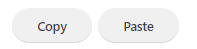
Copy / Paste
The ‘Copy/Paste Design Options’ feature in the Impreza theme is a great tool for streamlining your website design process. It allows you to easily replicate the design settings from one element and apply them to another, saving you the time and effort of manually setting each design option for every element.
- Copying Design Options: First, you need to copy the design settings from the element that has the desired design. To do this, navigate to the ‘Design’ tab of the element you want to copy. Here, you should see an button that labeled ‘Copy’. Clicking on this button will copy all the design options for the element to your clipboard.
- Pasting Design Options: Once you’ve copied the design options, you can paste them onto another element. To do this, go to the ‘Design’ tab of the element where you want to apply the copied design settings. Click on the button labeled ‘Paste’ and a dialog box will appear. Paste the design options you copied earlier over the any existing options (note that this will overwrite any options currently set) and click the button labeled ‘Apply’. You can also click ‘Close’ if you want to abort the changes.
Responsive Options
Responsive design is a way to design websites so that they scale and adapt to different screen sizes, ensuring that users have a high-quality experience no matter what device they are using. A key part of implementing responsive design is adjusting the design and layout of your website based on the viewport, which is the visible area of the web page on a device.
In the Impreza theme, implementing responsive design is made easy with a host of options under the ‘Design’ tab. To make sure your designs adapt well to different screen sizes, many options in the ‘Design’ tab, including ‘Text’, ‘Background’, ‘Sizes’, ‘Spacing’, ‘Border’, ‘Position’, ‘Text Shadow’, ‘Box Shadow’, ‘Overflow’, and ‘Animation’, come with a little icon representing a laptop or phone.
Clicking on this icon allows you to set specific design options for different viewports: Desktop, Laptop, Tablet, and Mobile. This way, you can customize how each element appears on different devices. For example, you might want to use larger text sizes on desktop and laptop, smaller text sizes on tablet, and even smaller on mobile to account for the differences in screen size.
Design Options
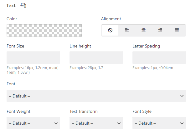
Text
This option allows you to change the text’s font, size, weight, line-height, letter spacing, and color. You can apply these changes to titles, paragraphs, or any other text within your selected element. The result can dramatically change the overall appearance and readability of your content.
Text Options
Color: Choose the color of your text. You can select a color from a color picker or enter a specific hex code, RGB, or RGBA value. Ensure it contrasts well with your background for readability.
Alignment: Control over the horizontal positioning of your text within an element. This element could be a text box, a column, a row, or any other component that contains text. Here are the five primary options you will encounter:
- Default: The default setting will typically inherit the alignment set by the global theme options or the parent element. It offers a way to maintain consistency across your site. If no alignment is set at either the global or parent level, it usually defaults to left alignment for most languages.
- Left Alignment: This aligns the text along the left margin of your element. The right edge of your text does not align, unless the text spans the full width of the element. This is a common choice for languages that read left-to-right.
- Center Alignment: This positions the text equally distant from both sides of your element. The text will appear to be in the middle of the element, creating a balanced and symmetrical look. Center alignment is often used for titles, headers, or short lines of text.
- Right Alignment: This option aligns the text along the right margin of your element. Just like left alignment, the left edge of your text does not align, unless the text spans the full width of the element. Right alignment is often used for languages that read right-to-left, but it can also be used for design purposes in left-to-right languages.
- Justify Alignment: Justify alignment ensures that your text spans the full width of the element by adjusting the space between words. The left and right edges of your text align with the element’s boundaries, creating a block of text that can look clean and organized. This is often used in newspaper-style columns to give a neat appearance. However, it’s important to be careful when using justify alignment, as it can lead to irregular spacing between words in narrow columns, potentially impacting readability.
Font Size: Determine the size of your text; larger text may be more readable, but also takes up more space. You can define these dimensions using a variety of units, including pixels (px), ems (em), rems (rem), percentages (%), and viewport heights/widths (vh/vw).
Font Family: The font-family property specifies the font for an element.
- Google Fonts: Google Fonts is a library of free, open-source fonts that is integrated with many WordPress themes, including Impreza. With over 1000 font families available, it provides a wide range of typography options to help you find the perfect look for your site. To use a Google Font, simply find it in the dropdown menu within the ‘Font Family’ tab.
- Custom Fonts: If you can’t find the perfect font within the preloaded or Google options, Impreza allows you to upload and use custom fonts. You can do this through the theme options panel. This is an excellent option if you’re looking for a unique font, have specific typography in line with your branding, or if you want to use a licensed font that isn’t available through Google Fonts.
Font Weight: This option allows you to control the thickness or boldness of your text. It can be set using either descriptive terms or numerical values, with typical options including:
- ‘Thin’ or ‘100’
- ‘Extra Light’ or ‘200’
- ‘Light’ or ‘300’
- ‘Regular’ or ‘400’
- ‘Medium’ or ‘500’
- ‘Semi Bold’ or ‘600’
- ‘Bold’ or ‘700’
- ‘Extra Bold’ or ‘800’
- ‘Black’ or ‘900’
The higher the number, the thicker the stroke of the characters. Not all fonts will support every weight, so the options available will depend on the particular font you have selected.
Text Transform: This setting allows you to control the capitalization of your text. The usual choices include:
- ‘None’: This leaves the text as you’ve typed it.
- ‘Uppercase’: This transforms all text to capital letters.
- ‘Lowercase’: This transforms all text to lowercase letters.
- ‘Capitalize’: This capitalizes the first letter of each word.
Line Height: Control the vertical distance between lines of text. More line-height can improve readability.
Letter Spacing: This is the horizontal space between individual letters. Spacing can affect the overall appearance and readability of your text.
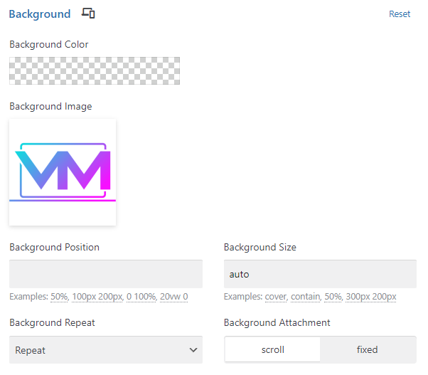
Background
The Background option permits you to set a background color or image for your selected element. This can greatly enhance your element’s visual appeal and set the mood or tone for a section of your page.
Background Options
Background Color: This setting lets you choose the color of the background. You can select a color from a color picker or enter a specific hex code, RGB, or RGBA value. A transparent background is also an option, which allows underlying elements or colors to show through.
Background Image: This setting lets you choose a background image. If you select a background image, additional options become available:
Background Position: This setting determines the starting position of your background image. Options include:
- ‘Left Top’
- ‘Left Center’
- ‘Left Bottom’
- ‘Right Top’
- ‘Right Center’
- ‘Right Bottom’
- ‘Center Top’
- ‘Center Center’
- ‘Center Bottom’
Background Size: This setting controls how the background image should be sized within the element. There are several predefined options and the possibility to specify custom values:
- Auto: This displays the background image in its original dimensions. If the element is smaller than the image’s original size, the image will overflow the element and won’t be fully visible. If the element is larger, you’ll see empty space around the image.
- Cover: This option scales the image as large as needed so that it fully covers the element’s area. Both the height and the width of the image will be equal to or larger than the corresponding dimension of the element. It maintains the image’s aspect ratio, so some parts of the image may not be visible if the image’s aspect ratio doesn’t match that of the element.
- Contain: This scales the image as large as possible so that both its width and its height can fit inside the content area. This also maintains the image’s aspect ratio. If the image’s and element’s aspect ratios aren’t the same, the image will be letterboxed.
- Custom Values: This is where you can enter specific dimensions for the background image. You can define these dimensions using a variety of units, including pixels (px), ems (em), rems (rem), percentages (%), and viewport heights/widths (vh/vw). The first value specified is the width, and the second value is the height.
- Pixels (px) are a fixed unit of measurement and represent a single dot on the screen.
- Ems (em) are relative to the font-size of the parent element.
- Rems (rem) are relative to the font-size of the root element.
- Percentages (%) are relative to the size of the parent element.
- Viewport heights/widths (vh/vw) are relative to the size of the viewport – vh is based on the height of the viewport, and vw is based on the width.
Background Repeat: This setting determines how the image repeats within the element. Options include:
- ‘No Repeat’: The image will not be repeated and will appear only once.
- ‘Repeat’: The image will be tiled both horizontally and vertically.
- ‘Repeat-X’: The image will be tiled horizontally but not vertically.
- ‘Repeat-Y’: The image will be tiled vertically but not horizontally.
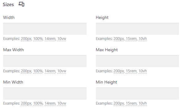
Sizes
This option helps you control the width and height of your selected element. By tweaking the sizes, you can determine how much space the element occupies on the page, which is vital for layout and composition.
Size Options
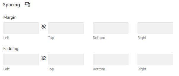
- Margin: Margin is the space outside an element, between the element and the surrounding elements. It’s the area that visually separates an element from its neighbors. If you have two elements next to each other and you add a margin to one of them, it will push the other element away. You can set different margin values for the top, right, bottom, and left sides of an element. This is useful when you want to control the distance between an element and the elements around it in each direction individually.
- Padding: Padding, on the other hand, is the space inside an element, between the element’s content and its border. If you increase the padding of an element, it will expand the space between the content (like text or an image) and the edge of the element, but it won’t affect the position of the surrounding elements. You can set different padding values for the top, right, bottom, and left sides of an element in the ‘Spacing’ tab. This allows you to control the space between the content of the element and its border in each direction individually.
The key difference between margin and padding lies in where they add space. Margin adds space outside the element, effectively pushing other elements away. Padding adds space inside the element, increasing the space between the content of the element and its border.
Spacing
Under Spacing, you’ll find options for adjusting the padding and margin of your selected element. Padding is the space between the content and its border, while margin is the space outside the element’s border. Adjusting these can help improve the readability of your content and the overall aesthetics of your layout.
Spacing Options
Width: This setting allows you to control the width of the element. You can specify an absolute width (in pixels), a relative width (as a percentage of the container or viewport), or you can leave it as ‘auto’ to let the browser calculate the width based on the element’s content and the theme’s layout constraints. The ability to use different units (px, em, rem, %, vw) gives you flexibility to create responsive designs that work well on all device sizes.
Height: This controls the height of the element. Similar to width, you can set an absolute height (in pixels), a relative height (as a percentage of the container or viewport), or leave it as ‘auto’. ‘Auto’ allows the browser to calculate the height based on the content and layout rules defined by the theme. Using different units (px, em, rem, %, vh) allows you to create layouts that adapt to different viewport sizes and orientations.
Min-Width: This setting allows you to specify the minimum width that an element can shrink to. It’s useful to ensure that elements maintain a usable size on smaller screens or when the browser window is resized.
Min-Height: Similar to min-width, this setting allows you to specify the minimum height an element can have. This can be useful to ensure that elements maintain a minimum level of visibility or usability regardless of how the browser window is resized.
Max-Width: This setting allows you to specify the maximum width an element can grow to. It’s useful for ensuring that your content doesn’t stretch too much on larger screens, which can hurt readability.
Max-Height: Similar to max-width, this setting allows you to specify the maximum height an element can have. It’s helpful for ensuring that content does not occupy too much vertical space on the screen, which can lead to excessive scrolling.
Border
With this option, you can add a border around your element and customize its style (e.g., solid, dashed), width, and color. Borders can be used to make an element stand out or to separate it from other elements.
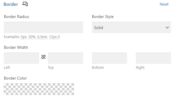
Border Options
- Border Radius: The ‘Border Radius’ property controls the roundness of the corners of an element. It defines the radius of the element’s corners, and a larger value will make the corners more rounded, while a smaller value will make them more square. If you set the border radius to ‘0’, the corners of the element will be perfectly square. As you increase the border radius value, the corners become more rounded. If you set a very large border radius (larger than half the element’s width or height), the element will take on a circular or elliptical shape. You can set the border radius individually for each corner (top-left, top-right, bottom-right, bottom-left), or you can set one value to apply to all four corners.
- Border Style: The ‘Border Style’ property defines the style of the element’s border. There are several common styles you can choose from:
- ‘None’: No border is displayed.
- ‘Solid’: A simple, unbroken line is displayed as the border.
- ‘Dotted’: The border is composed of a series of small dots.
- ‘Dashed’: The border is composed of a series of short lines or dashes.
- ‘Double’: The border is composed of two parallel lines.
- For each border style, you can set the width (or thickness) of the border and the color. Note that if you choose ‘None’ as your border style, the border width and color settings won’t have any effect because no border will be displayed.
Position
The Position option is used to control the location of an element within a row or column. You can align your elements vertically or horizontally, even setting a stacking order, according to your design needs.
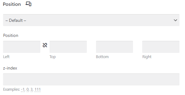
Position Options
- Position Type: The position type determines the positioning method used for an element. There are five different position types:
- Static: This is the default value. Elements with position static are not affected by top, right, bottom, and left properties, and are positioned according to the normal flow of the page.
- Relative: An element with position relative is positioned relative to its normal position. Setting top, right, bottom, and left properties will cause it to be adjusted away from its normal position in the document layout.
- Absolute: An element with position absolute is removed from the normal document flow, and no space is created for the element in the page layout. It is positioned relative to the nearest positioned ancestor (instead of positioned relative to the viewport, like fixed). However, if an absolute positioned element has no positioned ancestors, it uses the document body.
- Fixed: An element with position fixed is positioned relative to the viewport, which means it always stays in the same place even if the page is scrolled. Like the absolute model, it’s also removed from the normal document flow; no space is created for the element in the page layout.
- Sticky: An element with position sticky is positioned based on the user’s scroll position. It is treated as relative positioned until a given offset position is met in the viewport, and then it “sticks” in place (like position fixed).
- Top, Right, Bottom, Left: These properties are used in conjunction with the position property to determine the final position of the element. They specify the offset of an element from the edge of its containing element. The top property affects the vertical position of the element, whereas the right property affects the horizontal alignment. The bottom and left properties work similarly but from the opposite directions. Note that the values for these properties can be specified in different units, such as pixels (px), ems (em), or percentages (%).
- Z-Index: The z-index property specifies the stack order of an element. An element with greater stack order is always in front of another element with a lower stack order. This is especially useful when elements overlap each other, as it allows you to control which elements are displayed in front and which are behind. Note that z-index only works on positioned elements (position: absolute, position: relative, position: fixed, or position: sticky).
Text Shadow
This option allows you to apply a shadow to the text within your element. You can customize the shadow’s color, blur, and the direction in which it falls. Text shadow can make your text more readable against its background or create a specific aesthetic effect. The Text Shadow option typically has four properties that you can adjust: Horizontal Offset, Vertical Offset, Blur, and Color.
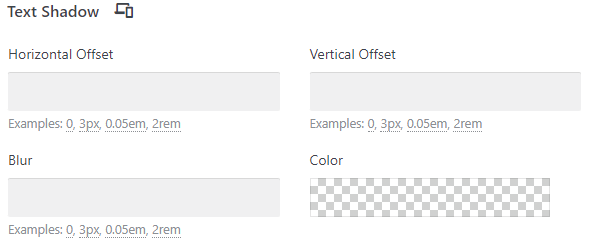
Text Shadow Options
- Horizontal Offset: This property determines how far to the right or left the text shadow will be. A positive value will push the shadow to the right of the text, while a negative value will push the shadow to the left. The greater the value, the further the shadow will be from the text.
- Vertical Offset: This property determines how far up or down the text shadow will be. A positive value will push the shadow below the text, while a negative value will push it above. The greater the value, the further the shadow will be from the text.
- Blur: The Blur property determines the amount of blur applied to the text shadow. A higher value will create a larger, more diffused shadow that appears softer, while a lower value will create a smaller, sharper shadow.
- Color: This property determines the color of the text shadow. You can typically choose from a color picker or enter a specific color code. The color of your text shadow can significantly impact the visibility and aesthetic of the shadow, so choose a color that complements your text and overall design.
Box Shadow
Similar to Text Shadow, the Box Shadow option applies a shadow around the entire element, creating a 3D effect that can make your element stand out against the background. The Box Shadow option typically has five properties that you can adjust: Horizontal Offset, Vertical Offset, Blur, Spread, and Color.
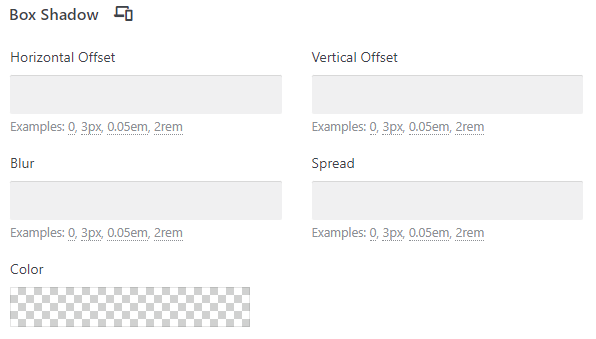
Box Shadow Options
- Horizontal Offset: This property determines how far to the right or left the box shadow will be. A positive value will push the shadow to the right of the box, while a negative value will push the shadow to the left. The greater the value, the further the shadow will be from the box.
- Vertical Offset: This property determines how far up or down the box shadow will be. A positive value will push the shadow below the box, while a negative value will push it above. The greater the value, the further the shadow will be from the box.
- Blur: The Blur property determines the amount of blur applied to the box shadow. A higher value will create a larger, more diffused shadow that appears softer, while a lower value will create a smaller, sharper shadow.
- Spread: The Spread property determines how much the box shadow expands. A positive value will cause the shadow to expand and grow larger, while a negative value will cause the shadow to contract and grow smaller.
- Color: This property determines the color of the box shadow. You can typically choose from a color picker or enter a specific color code. The color of your box shadow can significantly impact the visibility and aesthetic of the shadow, so choose a color that complements your box and overall design.
Overflow
This option determines what happens when content within an element exceeds the element’s size.
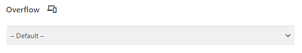
Overflow Options
- Default: This option usually inherits the overflow behavior from the parent element or the global theme settings. If no specific overflow is set for the parent or the theme, it typically behaves as ‘Visible’. In other words, the content will be displayed in its entirety, even if it exceeds the element’s dimensions, potentially causing it to overflow and overlap with other content.
- Hidden: Choosing ‘Hidden’ clips any content that exceeds the element’s dimensions, essentially hiding the overflow. This means that any content that goes beyond the boundaries of the element will be hidden from view. This can be useful when you want to create a fixed-size container and do not want any overflowing content to be visible.
- Visible: With ‘Visible’, the content that exceeds the element’s dimensions is fully visible, even if it extends beyond the element’s boundaries. This may cause the content to overlap with other elements or extend beyond the visible area of the webpage. Use this option when you want the overflow content to be visible and don’t mind the potential impact on layout and design.
- Auto: Selecting ‘Auto’ adds scrollbars to the element if the content exceeds its dimensions. This means that if the content extends beyond the element’s boundaries, the scrollbars will allow users to scroll and view the hidden content. ‘Auto’ is useful when you want to retain the ability to view the complete content within a confined space.
Animation
The Animation option allows you to apply different animation effects to your selected element. This can add dynamism and engagement to your website, catching your visitors’ attention.
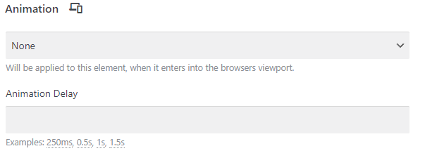
Animation Options
- Animation Type: You can choose from various transitions (like fade, slide, or bounce) that will be triggered when the element comes into view.
- Animation Delay: Set the duration of the delay. You can enter a specific time value, such as ‘0.5s’ for half a second or ‘1000ms’ for one second, or you can use decimal values for more precise timing.
Classes and IDs
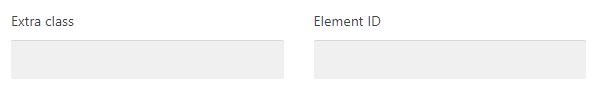
Extra Class: The ‘Extra Class’ section allows you to add custom CSS classes to the element. CSS classes are used to target specific elements and apply custom styling or functionality. By adding an extra class to an element, you can create a more specific selector in your custom CSS code, which can be useful for making targeted style modifications.
To utilize the ‘Extra Class’ feature:
Enter a class name in the input field provided. Make sure to use only alphanumeric characters and hyphens (-), without any spaces or special characters. Apply the same class name in your custom CSS file or in the theme’s custom CSS section. Use the extra class as a selector to style the element according to your specific requirements. Adding an extra class allows you to extend the default styling capabilities of the theme and achieve a more personalized design.
Element ID: The ‘Element ID’ section allows you to assign a unique identifier (ID) to an element. Unlike classes, IDs must be unique within a webpage, meaning no other element can have the same ID.
Using an element ID can be beneficial in several ways:
- Styling: You can target the specific element using the ID selector in CSS, allowing you to apply custom styles to that particular element.
- JavaScript Manipulation: If you want to apply JavaScript functionality to a specific element, assigning it a unique ID makes it easier to target and manipulate through JavaScript code.
- Link Anchors: IDs are commonly used to create internal anchor links within a webpage. By assigning an ID to a section or element, you can link to it from other parts of the same page, allowing users to navigate directly to that section.
To assign an element ID, enter a unique identifier in the input field provided. Similar to classes, make sure to use only alphanumeric characters and hyphens (-), without any spaces or special characters. Use the ID in your custom CSS or JavaScript code by referencing it as a selector or target.
Hiding on Different Devices
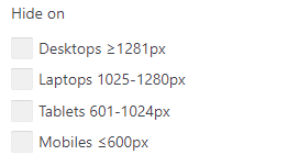
The ‘Hide On’ field in the Impreza theme’s ‘Design’ options allows you to selectively hide an element based on different device breakpoints. This feature is particularly useful for optimizing the display of your website on various devices with different screen sizes. The available options in the ‘Hide On’ field represent common device breakpoints. Let’s explain each option:
- Desktops ≥1281px: Selecting this option will hide the element when the viewport width is equal to or greater than 1281 pixels. In other words, the element will not be displayed on desktop screens with larger resolutions.
- Laptops 1025-1280px: This option will hide the element when the viewport width falls within the range of 1025 to 1280 pixels. It specifically targets laptops or devices with intermediate screen sizes.
- Tablets 601-1024px: Choosing this option will hide the element when the viewport width falls within the range of 601 to 1024 pixels. It targets tablets or devices with medium-sized screens.
- Mobiles ≤600px: This option will hide the element when the viewport width is equal to or less than 600 pixels. It targets mobile devices with smaller screens.
Still haven’t found what you’re looking for?
Let us know and we’ll do our best to help out!