Enhancing Engagement and User Interaction
Creating a captivating website involves more than just blending colours and fonts; it’s about understanding and implementing critical User Interface (UI) and User Experience (UX) principles. These laws or principles guide you in creating an engaging, user-friendly site, encouraging visitors to interact more and become customers. It’s vital to note that these laws are not ironclad, but flexible guidelines that can be bent or even broken once their essence is understood, creating room for unique and innovative design solutions.
1. Fitt’s Law
This first law is the cornerstone of intuitive design and underscores the importance of positioning and size of interactive elements on a webpage. It suggests that clickable items should be placed near the targeted messaging inciting an action, to help users smoothly transition from receiving the message to performing the intended action. Placement plays a critical role in creating a seamless user experience.
However, placement is only half the equation. Fitt’s law also emphasizes that interactive elements must be large enough for users to engage with comfortably. If you are using multiple buttons, they need to be positioned close to one another for easy access. Yet, it’s equally crucial to have enough space between them to avoid any accidental clicks or user frustration. Designing with Fitt’s Law in mind ensures your site is accessible and easy to navigate.

2. Hick’s Law
Hick’s Law is a design principle rooted in cognitive psychology. It suggests that the more choices users have, the longer they take to make a decision. Therefore, to create a more streamlined user experience, you should aim to keep choices to a minimum. Simplifying decision-making for users can significantly improve the efficiency and enjoyment of their experience on your website.
Proper user flow charts are integral to implementing Hick’s law effectively. These charts should outline clear, simple paths for users to take without overwhelming them with an abundance of choices. Binary choices, like “Yes” or “No”, or “Save” or “Cancel”, are ideal. By reducing decision fatigue, you can create a website that is not only user-friendly but also conducive to user engagement.

3. Law of Common Region
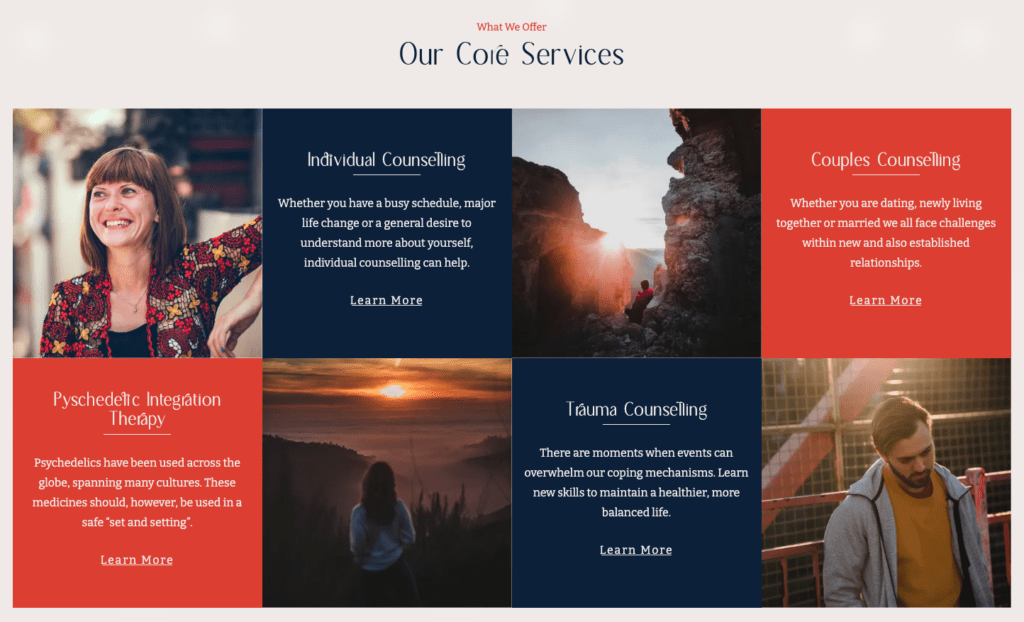
The Law of Common Region suggests that objects grouped together are perceived as connected. This principle underpins many modern design elements, such as navigation bars and tile layouts for articles, blogs, or product listings. The fundamental idea is to use visual boundaries to group related items together, aiding the user in understanding the structure and hierarchy of information on the page.
This principle is clear in team bio tiles laid out in a grid format, where each tile represents an individual, and the grid as a whole represents the team. The law plays a vital role in organizing information, enabling users to digest and interact with content more efficiently. By properly grouping related elements, you can facilitate user navigation and enhance the overall user experience.
4. Jakob’s Law
This law is rooted in the notion of user expectations and familiarity. The principle suggests that users expect your site to function like others they’re accustomed to using. This consistency in web design helps users feel at home on your website, enabling them to interact more easily and stay on your site longer.
Headers, for example, are typically found at the top of web pages, while mobile sites commonly use hamburger menus. Sticking to these familiar patterns reduces the learning curve for your users, allowing them to focus more on your content and less on navigating your site. However, it’s also important to strike a balance between familiarity and uniqueness to avoid making your site feel stale or generic.

5. Law of Pragnanz
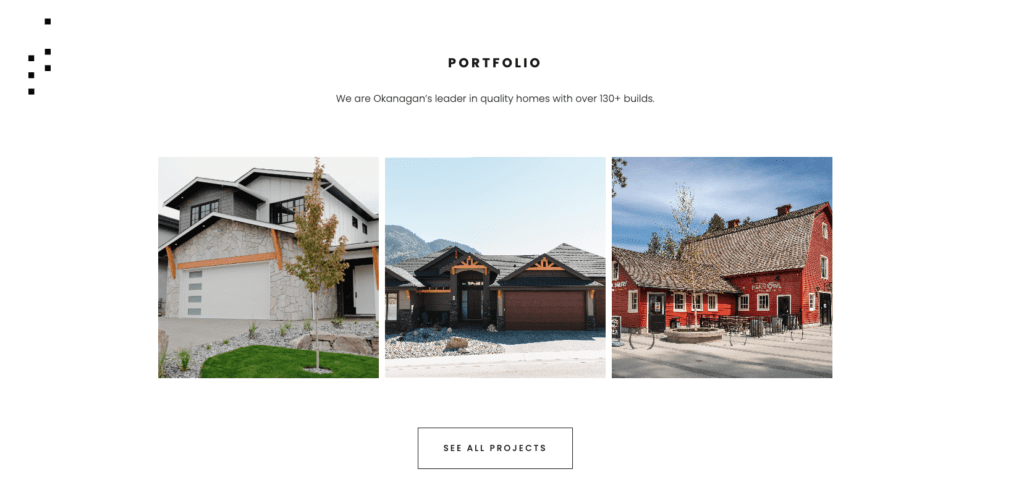
The Law of Pragnanz, or the Law of Simplicity, dictates that people will perceive and interpret ambiguous or complex images as the simplest form possible. This principle is a significant driver behind the widespread use of grid layouts across various mediums, including websites. The grid system helps break down complex designs into simpler shapes, making content more manageable and digestible.
For example, Apple’s iconic minimalistic design heavily employs this law, presenting complex technology and information in a simple, easy-to-understand format. By incorporating this law into your web design, you can create a cleaner, more user-friendly site that conveys information effectively without overwhelming your users.
6. Law of Proximity
The Law of Proximity posits that items placed near one another are perceived as a group. This principle is critical in helping users understand the relationship between different elements on your site. By grouping related items close together, you can create a sense of organization and hierarchy, making your site easier to navigate.
Consider an e-commerce site. Within its navigation bar, related items such as ‘Laptops’, ‘Mobile Phones’, and ‘Cameras’ are grouped together under the broader ‘Electronics’ category, illustrating the Law of Proximity. On the product pages, elements such as images, descriptions, and “Add to Cart” buttons are grouped closely for each product, while different products are clearly separated. This application of the Law of Proximity ensures an intuitive and streamlined shopping experience.
7. Law of Similarity
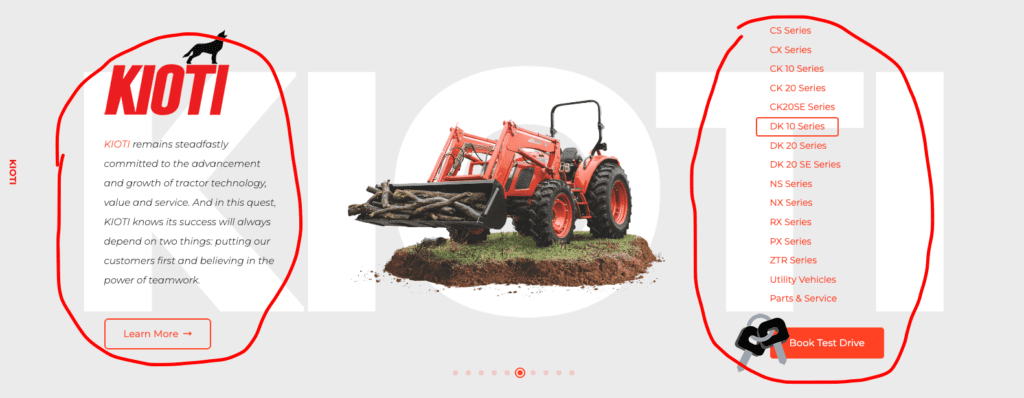
This law states that elements sharing visual characteristics like shape, color, size, or orientation are perceived as related, even if they are not physically grouped together. This law helps establish connections between different parts of your site, creating a sense of cohesion and unity in your design.
For instance, title bars with the same font, shape structure, colors, etc., at the top of a page can create a thematic connection across different sections of your site. By consciously applying the Law of Similarity, you can make your site feel more integrated and harmonious, improving the overall user experience.
8. Law of Uniform Connectedness
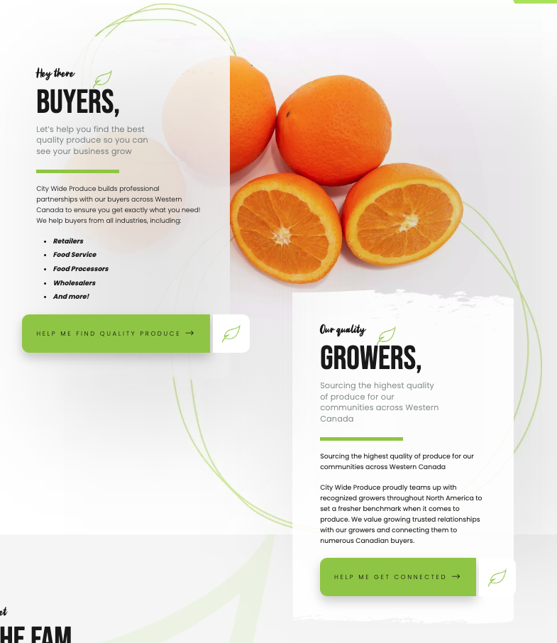
The Law of Uniform Connectedness postulates that elements that are physically connected or touching each other are perceived as related. This law is especially helpful in creating a sense of progression or sequence in your design.
For example, timelines and progress bars utilize this principle to visually represent a sequence of events or steps. By incorporating this law into your design, you can guide users through a process or journey, making complex tasks seem more manageable and understandable.

9. Miller’s Law
Miller’s Law is derived from the psychological theory that the average person can retain 5 to 9 pieces of information in their working memory at once. In terms of web design, this means that content should be divided into small, manageable chunks to aid comprehension and recall.
By structuring your content in accordance with Miller’s Law, you can make your site more digestible and engaging. Breaking down a lengthy checkout process into multiple steps with a progress bar, for instance, can make the process feel less daunting and more manageable to users, thereby improving their overall experience.
10. Serial Position Effect
The Serial Position Effect suggests that users are most likely to remember the first and last items in a series. For website design, this means that important content or calls-to-action (CTA) should be strategically positioned at the beginning or end of a page to increase their impact.
For instance, placing a clear headline and call-to-action at the top of your homepage can immediately engage visitors. Likewise, including a CTA at the bottom of the page serves as a final prompt to inspire action, making the most of this psychological principle to boost user engagement and conversion rates.

The world of website design is complex, requiring not only creativity but also a deep understanding of several guiding principles. Our graphic designers at Vigilante Marketing are trained in these principles and can ensure your website design not only looks aesthetically pleasing but is functional, user-friendly, and maximizes conversion potential. By integrating these ten laws into your design strategy, you can create a more engaging website that captivates your audience. Remember, these laws are not set in stone, and understanding their essence allows for innovation and creativity. Our designers are adept at experimenting with your design, manipulating and sometimes breaking these rules to create unique or creative solutions. They skillfully strike the balance between following these laws and introducing your distinctive design elements. However, our services don’t end at design. We offer continuous website support to keep your site updated, secure, and performing at its best. This ensures your website’s longevity and consistent user engagement.
Moreover, we believe that a successful website is one that can be accessed and used by everyone. To assure that your site is as user-friendly as possible, we prioritize making your website accessible to all users, regardless of their physical or technical abilities. We understand the importance of accessibility in today’s digital world, and we implement strategies to ensure that your website complies with the ADA Guidelines, providing a stellar user experience for everyone. With Vigilante Marketing, you don’t just get a website—you get a distinctive digital representation of your brand that’s engaging, accessible, and designed for success.


