


Have questions about paid ads, campaign optimisation, or platform features? Browse our knowledge base for step-by-step guides, FAQs, and expert insights to help you succeed.
Designing for Web
On This Page
When planning your website, there are a number of basic pages and elements that are generally always included and are expected UI elements by users. And since our sites are on WordPress, there are some dynamic pages that we need to take into account, such as archive pages, or pages that show your search results. Let’s outline all the pages we’ll need to take into account for our site, and the elements that should be included. This can be used as a checklist when designing these page types for other websites that you may build in the future 😉.
Any items with an asterisk ( * ) should be considered a required element on a page, otherwise, any other elements are up to you and the design aesthetic you are going for.
Document Size Considerations
When creating a design file for the web, it is important to note the size and resolution of your document so that you are accurately portraying a web environment. It is also very important to consider the responsive nature of web design, and that a majority of users are on smaller screens, not larger, thus designing for mobile resolutions should trump designing for desktop resolutions. A good way to plan for this is to design within the constraints of a 12 column grid system. This allows developers and designers to predict how content that starts as being spread horizontally across a screen, may then stack vertically as the screen size shrinks.
Document Size for Standard Resolution : 1920px x 1080px+ at 72ppi
Default Font Size in Design Doc: 16px
Default Font Size in Web: 16px
The 1920 resolution is the largest monitor size you should design for, though this also assumes a lower resolution display. If you are wanting to have crisper fonts and images for high-resolution monitors, use the high-resolution standard.
Document Size for High Resolution : 3,840px x 2160px+ at 144ppi
Default Font Size in Design Doc: 32px
Default Font Size in Web: 16px
Warning! When designing at this higher resolution, all default sizes that would normally be used for web are doubled. So the default font size of 16px would become 32px. The designer and developer need to be constantly aware of this size discrepancy when translating measurements to the web, as all websites still assume the 72ppi resolution standard even on high resolution displays. So all measurements from a PSD must be cut in half, and if a designer is creating a web document on a standard monitor in Photoshop, they should be zoomed in to 50% so they are designing at the size that will be translated to the web.
Even though we will be using the High-Resolution standard for design documents, we’ll always refer to the web standard resolution, so 1920px wide.
Designing in Grid
To make sure that designs don’t only tailor to large monitors, all content spreading across the screen should consider if the content will actually fit within most smaller screens. For example, a header with lots of menu items across the top of the screen that fills a 1920px monitor will immediately need to scale to the hamburger menu to fit on 75% of other screens. So ideally, you want your content to be able to reasonably fit within a width of 1140px (2280px at 144ppi). This is referred to as “designing in grid”. This also goes for the height of elements, for instance, if you want a section that fills the full height of a screen you must take into account the many possible screen heights your content needs to scale down to fit. So instead of cramming stuff into a screen height of 1080px, shoot more for 768px (the standard tablet computer height in landscape mode).
So our design document resolutions to take into account are:
Document Size: 3,840px x 2160px+ at 144ppi (1920 x 1080 x 72ppi for web)
Default Font Size: 32px (16px web)
Grid Width: 2,280px (1,140px web)
Average Screen Height: 1,536px (768px for web)
All design documents (PSD or XD) should show that they follow the grid by including their “in-grid grid”, and for full-screen elements, a “full-width grid”. This can be achieved with multi-coloured guides or shapes.
It is important that all designs follow standard grid practices to ensure their compatibility for being built with responsive web practices. Designs that don’t follow the grd format typically don’t convert well to mobile devices later.
Designing elements for Web
When designing for a website, it’s important to make sure that all the elements of your PSD are created in such a way that they can be exported by the web developer “for web”, which means certain things that may create cool effects in Photoshop may not be able to be exported to give the same desired result when put onto a website. Here are some things to avoid in a PSD document when designing for the web:
- Avoid Blending Modes
Blending modes such as “multiply” and “overlay” can create some great effects, but are typically not possible on the web (even the CSS3 filter effect does not work the same way as some designers may think). Blending modes are okay on an element that will in the end just be a single image that will be exported as a JPEG, but not for overlapping dynamic content or elements. Blending Modes should not be used to “cut” out images (such as using the “multiply” mode to extract the whites from an image), instead you must actually crop out the intended area using layer masks so that the image can be exported as a transparent PNG. - Make sure Layer Masks start all Black
To avoid having the developers have to remake layer masks so they can be exported properly, just make sure that when creating them, the entire mask area is all Black (hiding all elements) then reveal just the area you need. This prevents the layer being exported from being the size of the entire artboard (as all masks use the entire artboard space, not just the layer they are attached to). - Avoid Large/Complex Transparent images
Even though the PNG can do transparency at grading values, this can result in very large file sizes that can slow down a website’s performance, especially when the image is complex like a photo of a person. If complex photos can be designed in such a way that they can be exported as a JPEG, then website performance won’t have to suffer. But when the image is expected to overlap content and be perfectly cut out and have a complex shadow, the file size can grow exponentially.
Something like this image that appears to require to be exported with all the roots cut out and include a drop shadow would be in very large file sizes. Instead, the image would have to be exported as a JPG and include the background elements, though this may not result in the designed effect when scaling the site to a mobile device.
In conclusion, keep your cut-out images simple and clean (such as for smooth shapes, icons or logos). - Avoid Non-Web Fonts or Icons
One of the worst things that can be done in a PSD design is to use fonts that are not supported by the Web (non-WOFF fonts). This is very frustrating for a developer to receive as they will typically have to send it back to the designer to pick a new font after the design was already approved. It is up to the designer to be responsible and use approved font libraries from Google Fonts, or Adobe Fonts, or to ensure that the font being used has a WOFF format available BEFORE continuing to use it within a design. This also includes the use of menu or social icons, which should be based on the standard web libraries of either Font-Awesome or the Material Icons libraries. Any icons in a design that do not use one of these libraries are likely to be swapped out for the closest alternative from these libraries. - Avoid Layouts that don’t tailor to Mobile Devices
It may look good within a magazine, or other large-format static media, but the reality is that websites are dynamic in their scaling and content. A layout like this for example relies on the subjects in the background images being perfectly placed in the center of the screen with the boxes arranged strategically around them.
But this layout would be near impossible to gracefully scale to a mobile device and achieve the same effect of keeping the content elements situated around the background image subject, not to mention that it does not actually follow the 12-column Grid. Think about how your design will scale, otherwise the developer may have to send it back to design to rethink.
Just be aware of how your background elements or other overlapping elements scale when put onto mobile, and do not get too attached to the subject of a background image as it may not “make the cut”.
“Designers must design for the medium, like architecture designer, or car designer. Designers may push the limits of their medium, but they still must understand the limitations of it, and design with those always in mind”.
Another consideration is the type of elements that are included in a standard website build. It may be thought that nearly anything is possible with enough code, but when you are on a budget and deadline, you have to avoid sending requests to your developers that leave them ripping their hair out for days to build. Talk with your developer before designing in technical elements.
Here is an ongoing list of some elements that will not be accepted in a standard web build without much discussion with your developers:
- Custom Page Scrollers.
- Fonts without a WOFF file.
- Custom Icon libraries (non approved libraries)
- Non-standard Carousel layouts (talk to your developer)
Standard Elements
Font Elements
Every HTML-based website allows you to format your content with a specific set of formatting elements. Starting with our Heading elements (also referred to as your <H1> through to <H6>), each heading element goes from the largest and most important size <H1> down to the smallest, least important <H6>. Typically your page title should always be an <H1> element, and you should only ever use one per page (for SEO reasons, Google uses the first H1 it finds as the title of your page). Any additional titling should use a <H2> or below.
Font Elements to include:
- Heading 1
- Heading 2
- Heading 3
- Heading 4
- Heading 5
- Heading 6
- Paragraphs
- Text Links (default/hover states)
- Blockquotes
PSD web designs should always include a Style Guide artboard that clearly shows the font styling that will be used across a website. These styles are very important to layout as they will show how the hierarchy of headings will display for the website, specifically when publishing articles or other content.
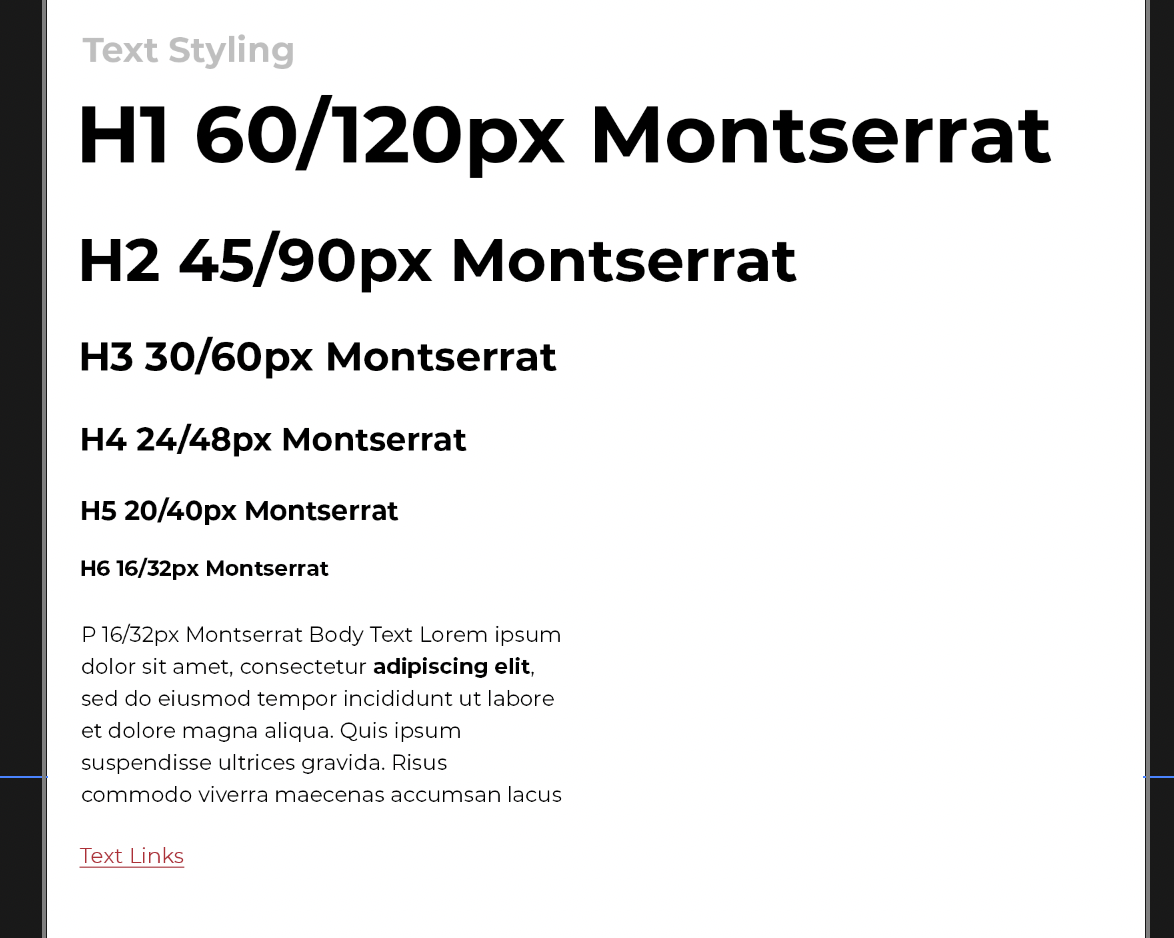
As you can see in the example above, the hierarchy clearly shows descending importance of the headers. A Heading 3 for example, should very be bigger than the Heading 2 or be visually more important.
This visual hierarchy also assists the designer in making sure their font styles and sizes are consistent across the other page designs of the site. Nothing is worse than a design with too many inconsistencies in font sizes and styling, and is typically frowned upon by the website developers that need to try and find that consistency to set the defaults of a website.
Though aside from the Heading styles, the most important style to define is the Paragraph style, as it will dictate the standard style of all standard blocks of content, including the font size, line height, and font family. The default font size typically should stay at 16px (32px in a high-resolution PSD) and should never be smaller than 14px. All other font sizes and spacing in a website is usually a percentage of the default font size (of which there can only be one set for the entire website), so getting this down at the start is important. For example, if we want the Heading 1 to be 60px large, we actually set it to 3.75rem which means 375% or 3.75 times 16px. And even when spacing elements, we use 2rem which means 2x the default font size of 16px. If the default font size is changed at anypoint, all the sizing and spacing done throughout a website is subject to change, with potentially undesired results.
Buttons
A site should typically have 3 button types. The default button should be a simple style that can be used for all standard buttons that don’t need to draw too much attention to themselves ,and is also used for key form actions like the “Submit” button of a form. Your Primary button acts as the button you want to draw more attention to. The secondary button can be used as an inverse button, like when you have to put a button against a dark background.
Button Elements include:
- Default Button*(Submit Buttons)
- Primary Button*
- Secondary Button* (basically inverse of default)
It is also important within the design to illustrate how a button should hover or interact. In a PSD this can be illustrated in the following table format of displaying each of your button’s normal state, and hover state.
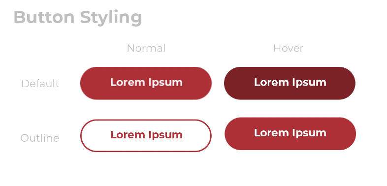
Button animations can usually be extrapolated by the developer based on the differences between the two button states.
Favicon
The Favicon is used to identify a website within browser tabs. It can be a variation of the site’s logo/brand that must fit in a small square. The resolution of this square can be upto 64px x 64px, but do remember that the final output will be in an area of around 16px x 16px, so avoid cramming too much detail into your favicon. Include you favicons with your main site designs as a separate artboard that can be exported.
Site Header
This is the first area your users see, and it serves some very important functions. First, it needs to immediately establish your brand and let users know they made it to the right site. Second, it is where you want to store the most important information that you expect your users to be looking for, such as a phone number if you are a local professional. Our header consists of some key elements, including your site logo and main navigation.
Header Elements to include:
- Logo*
- Main Menu links*
- Second Level Menu Links (dropdown menus)
- Third Level Menu Links
- Search Icon
- Shopping Cart Link
Header Top Area
This is where we can hold information for power users (users that already know what they are looking for), such as the company phone number, social media links, or if you have user accounts you can have links such as “Login”, “My Account”, etc…
Page Title
Other than the home page of your site, nearly every page on your site should have a standard page title. These can be optional, and custom designed on a per page basis. But with the potential of so much dynamic content being created, it would be best to have a standard page title design to be used by default.
Certain page types have additional requirements for their page title. For example, the Archive, Knowledge base, and Shop pages usually include breadcrumbs in the title area. Single blog posts and Single Product should have a “Back to Shop” or “Back to Blog” link also included.
The page title is always set as a Heading 1 ( <h1> ) element, but can be styled completely independently from your standard Font Element <h1>.
Page Title Elements may include:
- Breadcrumbs
- “Back to …” link
Footer
The footer is the second most viewed area of any website. This is typically because most sites would store a more detailed site map to important pages in the site. Some links you should always include are your “Privacy Policy” and “Terms & Conditions” pages.
Footer Elements to include:
- Detailed site navigation
- Social icons
- Privacy Policy link*
- Terms & Conditions link (required for e-commerce)
- Contact information (email, phone, address)
- Copyright text*
Standard Pages
Home Page*
The home page must act as a hub for all the services and other areas of your site. Each section of your site from a portfolio, store, blog, testimonials, real estate listings, services, should all be represented with their own section on the home page that gives a brief description or preview of the sections contents and prompts users to click to see/learn more.
Elements may include:
- Featured Slider/Banner
- Testimonial Slider
- Recent Post
- Portfolio Slider/Grid
- Subscribe to Newsletter
- Contact CTA
Default Page*
The standard content page is to use for all default content pages, so it must be designed in such a way that any site author can easily create new pages and add content without having to worry about layout or having to apply additional design. This template will also be used for all pages across a site that do not otherwise have a custom design applied. Pages may include:
- About page
- Terms & Conditions page
- Privacy Policy page
- Ect…
Elements to include:
- Page Title
- Content Area
Contact Page/Popup
The contact page is the end goal of any site for getting leads. This may also be in the form of a pop-up so that users never have to navigate away from the current page to get a hold of you.
Elements to include:
- Contact Form
- Phone/Email links
- Company Address/Map
- Social Media Links
404 Error Page
Elements to include:
- “Page Not Found” error message*
- Search bar
- Site Map
Blog Pages
Archive Page (Blogroll)
The blog roll, or archive page, is the template used for when listing your blog posts, or when viewing posts for a specific category, tag, date, or search results.
Elements to include:
- Archive Title*
- Blog Sidebar
- Blog Post Snippet
- Title*
- Post Date
- Post Categories
- Author
- Featured Image
- Excerpt
- Read More link
- Category Filter
- Pagination*
Single Post
Elements to include:
- Post Title*
- Back to Blog link
- Breadcrumbs*
- Blog Post Sidebar
- Post Date*
- Post Categories*
- Post Tags*
- Author
- Featured Image*
- Post Content*
- Next/Previous post links
- Related Posts slider
- Comments (Disqus.com)
Author Page
These pages are only used if you would like to feature the authors from a blog.
Elements to include:
- Page Title (Author name)*
- Profile Picture
- Author Bio*
- Author Social Media links
- Blog Post Snippets*
- Title*
- Post Date
- Post Categories
- Featured Image
- Excerpt
- Read More link
- Pagination*
Custom Post Type Pages
Custom post types include anything from portfolios, testimonials, real estate listings, team members, ect…
Like blog posts, custom post types typically include an archive page for showing a list of all the posts or the custom posts types taxonomy.
Custom Post Archive Page
The custom post type archive page, is the template used for when listing your custom posts, or when viewing posts for a specific category, tag, date, or search results.
Elements to include:
- Archive Title*
- Archive Sidebar
- Post Snippet
- Title*
- Post Date
- Post Categories
- Author
- Featured Image
- Excerpt
- Read More link
- Taxonomy Filter
- Pagination*
Single Custom Post
Elements to include:
- Post Title*
- Back to Archive link*
- Post Sidebar
- Post Date*
- Post Categories*
- Post Tags*
- Author
- Featured Image*
- Post Content*
- Next/Previous post links
- Related Posts slider
- Comments
Ecommerce Pages
Shop Page
Elements to include:
- Page Title*
- Breadcrumb links
- Shop Sidebar
- Filters/Search
- Product Snippet
- Product Title*
- Product Price *
- Product Categories
- Featured Image*
- Excerpt
- Add to Cart/Select Options button*
- Pagination*
Single Product
Elements to include:
- Product Title*
- Breadcrumb links
- Product Image Gallery*
- Product Short Description*
- Product Price*
- Variation Selectors
- Quantity field*
- Add to Cart button*
- Product Categories*
- Product SKU
- Product Description Tab*
- Product Reviews Tab
- Additional Information Tab
- Related Products
Other Elements
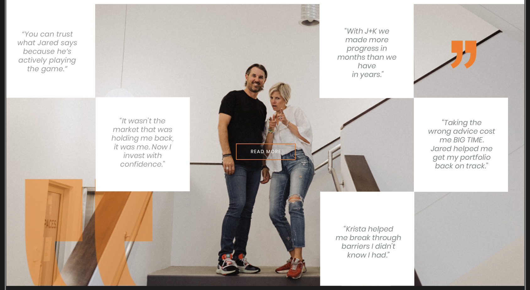
Testimonials Slider
- Author Name
- Author Role
- Star Rating
- Author Picture
- Testimonial Text
Blog Post Slider
- Title
- Featured Image
- Categories
- Date posted
- Excerpt
- Read More link
Video Slider
- Video Title
- YouTube Video Embed
Still haven’t found what you’re looking for?
Let us know and we’ll do our best to help out!